Customizing Charts
Ferrum gives you fine-grained control over chart appearance — axis formatting, legend layout, annotations, secondary axes, broken axes, and inset panels — without breaking out of its declarative model. Every customization is a value you compose with your chart; nothing mutates global state, and no chart is secretly reconfigured by an import side-effect.
The Configuration Cascade
When ferrum resolves how an element should look, it walks a six-level precedence stack. Higher levels win.
1. chart.override(...)            ← spec-path escape hatch (last resort)
2. Per-channel axis= / legend=    ← "this specific axis or legend"
3. chart.configure_*() / Configure  ← "all matching elements on this chart"
4. chart.theme(...)               ← per-chart visual identity
5. set_default_theme(...)         ← session / notebook ambient default
6. Rust renderer defaults         ← built-in fallback
A quick example that exercises the three most common levels:
import ferrum as fm
import polars as pl

df = pl.DataFrame({
    "month": ["Jan", "Feb", "Mar", "Apr", "May", "Jun"],
    "revenue": [12000, 15400, 11200, 18600, 21000, 19500],
})

chart = (
    fm.Chart(df)
    .mark_bar()
    .encode(
        x="month:N",
        y=fm.Y("revenue:Q", axis=fm.Axis(label_format="$,.0f")),  # level 2: per-channel
    )
    .configure_axis(label_angle=-30)                          # level 3: all axes
    .theme(fm.themes.minimal)                                 # level 4: per-chart theme
)
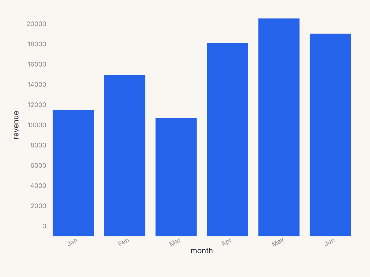
The per-channel Axis(label_format=...) on y wins over anything configure_axis sets for the
y axis. The theme's grid and padding preferences apply where neither level 2 nor 3 set a
value. Rust defaults fill the rest.
Theme vs Configure
Both tools change how a chart looks; they serve different purposes.
Theme is for visual identity: background color, typography, palette, opacity, and the stylistic decisions you want consistently across many charts. A theme is a portable value you can share, version-control, and apply to whole notebooks or dashboards.
brand = fm.Theme(
    background="#f8f4ef",
    mark_color="#1a5fb4",
    grid_color="#e0dbd4",
    color_scheme="tableau10",
)
Configure is for structural decisions about a specific chart: how the x axis labels should angle when they collide, whether the legend belongs at the bottom, what tick count the y axis should use. These are chart-specific tweaks that vary based on the data and context, not your brand identity.
chart = (
    fm.Chart(df)
    .mark_bar()
    .encode(x="long_category_name:N", y="value:Q")
    .theme(brand)                            # identity
    .configure_axis(label_angle=-45)         # structural tweak for this chart
    .configure_legend(orient="bottom")       # structural tweak for this chart
)
A good rule of thumb: if the setting belongs in your style guide, it belongs in a theme. If it depends on the shape of the data (label length, axis range, legend density), use configure.
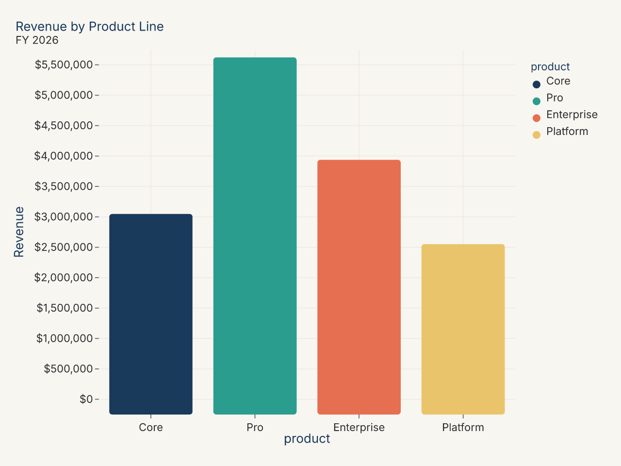
Recipe: brand theme with custom palette
import polars as pl
import ferrum as fm

BRAND_COLORS = ["#1a3a5c", "#2a9d8f", "#e76f51", "#e9c46a"]

brand_theme = fm.Theme(
    background="#f8f6f1",
    mark_color=BRAND_COLORS[0],
    font_color="#2d2d2d",
    grid_color="#e8e4da",
    grid=True,
    axis_line=False,
    title_font_weight="bold",
    title_color="#1a3a5c",
)

df = pl.DataFrame({
    "product": ["Core", "Pro", "Enterprise", "Platform"],
    "revenue": [3_200_000, 5_800_000, 4_100_000, 2_700_000],
})

chart = (
    fm.Chart(df)
    .mark_bar(corner_radius=3)
    .encode(
        x=fm.X("product:N", sort="-y"),
        y="revenue:Q",
        color="product:N",
    )
    .theme(brand_theme)
    .configure_color(range=BRAND_COLORS)
    .configure_axis(y=True, x=False, label_format="currency")
    .configure_title(anchor="start")
    .configure_legend(orient="none")
    .labs(title="Revenue by Product Line", subtitle="FY 2026", x=None, y="Revenue")
)
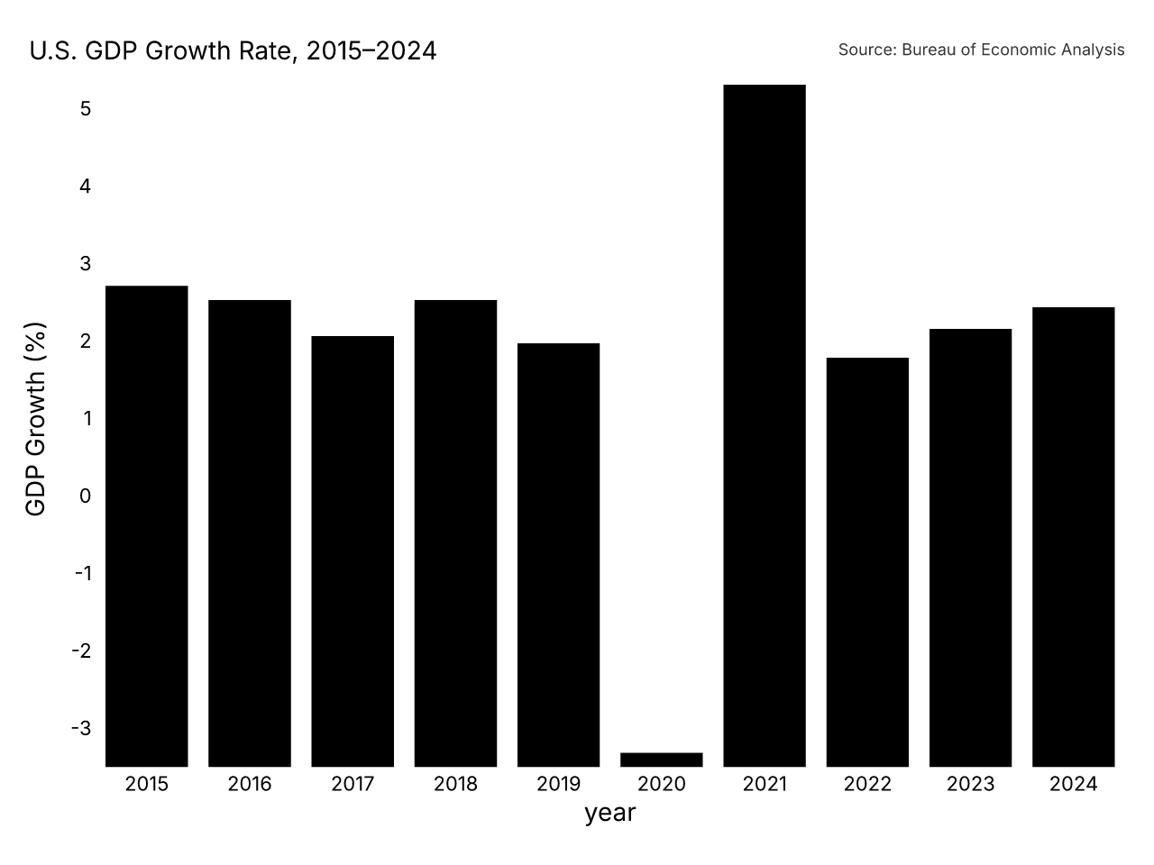
Recipe: publication-ready chart
import polars as pl
import ferrum as fm
import ferrum.annotation as ann

df = pl.DataFrame({
    "year": [str(y) for y in range(2015, 2025)],
    "gdp_growth": [3.1, 2.9, 2.4, 2.9, 2.3, -3.4, 5.9, 2.1, 2.5, 2.8],
})

chart = (
    fm.Chart(df)
    .mark_bar()
    .encode(
        x=fm.X("year:N", axis=fm.Axis(label_angle=0)),
        y=fm.Y("gdp_growth:Q", axis=fm.Axis(title="GDP Growth (%)")),
        color=fm.Color(
            "gdp_growth:Q",
            scale=fm.DivergingScale(scheme="rdbu", domain=[-4, 4]),
            legend=None,
        ),
    )
    .theme(fm.themes.publication)
    .configure_axis(domain=False, tick_size=0)
    .configure_title(anchor="start", font_size=14)
    .configure_legend(orient="none")
    .labs(title="U.S. GDP Growth Rate, 2015–2024")
    + ann.text(
        fm.norm(0.0), fm.norm(1.03),
        "Source: Bureau of Economic Analysis",
        font_size=9, color="#666", anchor="start",
    )
)
Configuration Methods
Six .configure_*() methods cover the main configuration domains. Each returns a new
Chart — the original is not mutated.
.configure_axis()
Controls tick labels, tick marks, axis lines, gridlines, and scale domain.
chart.configure_axis(
    label_angle=-45,          # rotate labels
    label_format="currency",  # named preset
    tick_count=6,
    domain=False,             # hide axis line
    grid=True,
    grid_color="#eee",
)
To target x and y independently, use the lower-level .configure():
from ferrum import AxisConfig

chart.configure(
    axis_x=AxisConfig(label_angle=-45, label_format="date_short"),
    axis_y=AxisConfig(label_format="si", tick_count=5),
)
See Axis Configuration for the full parameter list.
.configure_legend()
Controls legend position, layout, and typography.
.configure_title()
Controls chart title styling.
.configure_grid()
Controls gridlines independently from axis configuration. This is a chart-level override
and styles the major gridlines. For two-level (major + minor) gridlines, set a
Grid value on the theme instead.
.configure_padding()
Controls plot-area margins. With auto=True (the default), ferrum expands margins
automatically when labels or annotations would be clipped.
.configure_color()
Controls default color scales across the chart.
Using Configure Objects Directly
The .configure_*() sugar is convenient for one-offs. When you want to reuse a
configuration across many charts, build a Configure object and compose it with +:
from ferrum import Configure, AxisConfig, LegendConfig

report_config = Configure(
    axis=AxisConfig(label_font_size=11, grid_color="#f0f0f0"),
    legend=LegendConfig(orient="bottom", direction="horizontal"),
)

chart1 = fm.Chart(df1).mark_bar().encode(...) + report_config
chart2 = fm.Chart(df2).mark_line().encode(...) + report_config
The + operator on Chart dispatches on the operand type: a Configure merges config,
an annotation primitive appends to the annotation layer, and a Chart adds a mark layer
(the existing layering behavior). All operands are immutable; + always returns a new
object.
Format Presets
Instead of memorizing d3-format strings, use named presets in label_format:
| Preset | Example output | Notes |
|---|---|---|
"integer" |
1,234 | Thousands-separated integer |
"decimal" |
1,234.56 | Two decimal places |
"decimal1" |
1,234.6 | One decimal place |
"percent" |
45.2% | One decimal place |
"percent_int" |
45% | No decimal places |
"si" |
1.2k | SI prefix abbreviation |
"currency" |
$1,234 | Dollar, no cents |
"currency_cents" |
$1,234.56 | Dollar with cents |
"compact" |
1.2k | Trailing zeros suppressed |
"scientific" |
1.23e+3 | Scientific notation |
"ordinal" |
1st, 2nd, 3rd | Ordinal suffixes |
"date_short" |
Jan 5 | Short date |
"date_long" |
January 5, 2026 | Long date |
"date_iso" |
2026-01-05 | ISO 8601 |
"month" |
Jan | Month abbreviation |
"month_year" |
Jan 2026 | Month and year |
"year" |
2026 | Year only |
"time" |
14:30 | 24-hour time |
"time_12h" |
2:30 PM | 12-hour time |
"datetime" |
Jan 5, 14:30 | Date and time |
When you need something a preset doesn't cover, use label_format_raw with a d3-format
string directly:
label_format and label_format_raw are mutually exclusive. Setting one clears the other.
See Format Presets for the full reference.
Annotations
Ferrum's annotation layer lets you add text, arrows, shapes, and callouts to a chart without leaving the declarative model. All annotations are positioned in one of three coordinate systems:
- Data coordinates (default): bare
floatorint. Moves with the data scale. - Pixel coordinates:
fm.px(n). Fixed offset from the plot-area origin. - Normalized coordinates:
fm.norm(f). Fraction of the plot area (0.0 to 1.0).
df = pl.DataFrame({
    "x": [1.0, 1.5, 2.0, 2.5, 3.0, 3.5, 4.0, 4.5, 5.0, 5.5],
    "y": [2.1, 3.0, 3.5, 4.0, 4.5, 8.2, 5.0, 5.5, 6.0, 6.5],
})

chart = (
    fm.Chart(df)
    .mark_point()
    .encode(x="x:Q", y="y:Q")
    + fm.annotation.text(3.5, 8.2, "Anomaly", color="#c0392b", font_size=13)
    + fm.annotation.arrow(3.5, 8.0, 3.5, 6.5)
    + fm.annotation.span("x", 3.0, 4.5, fill="#fee2e2", opacity=0.08, label="Anomalous region")
)
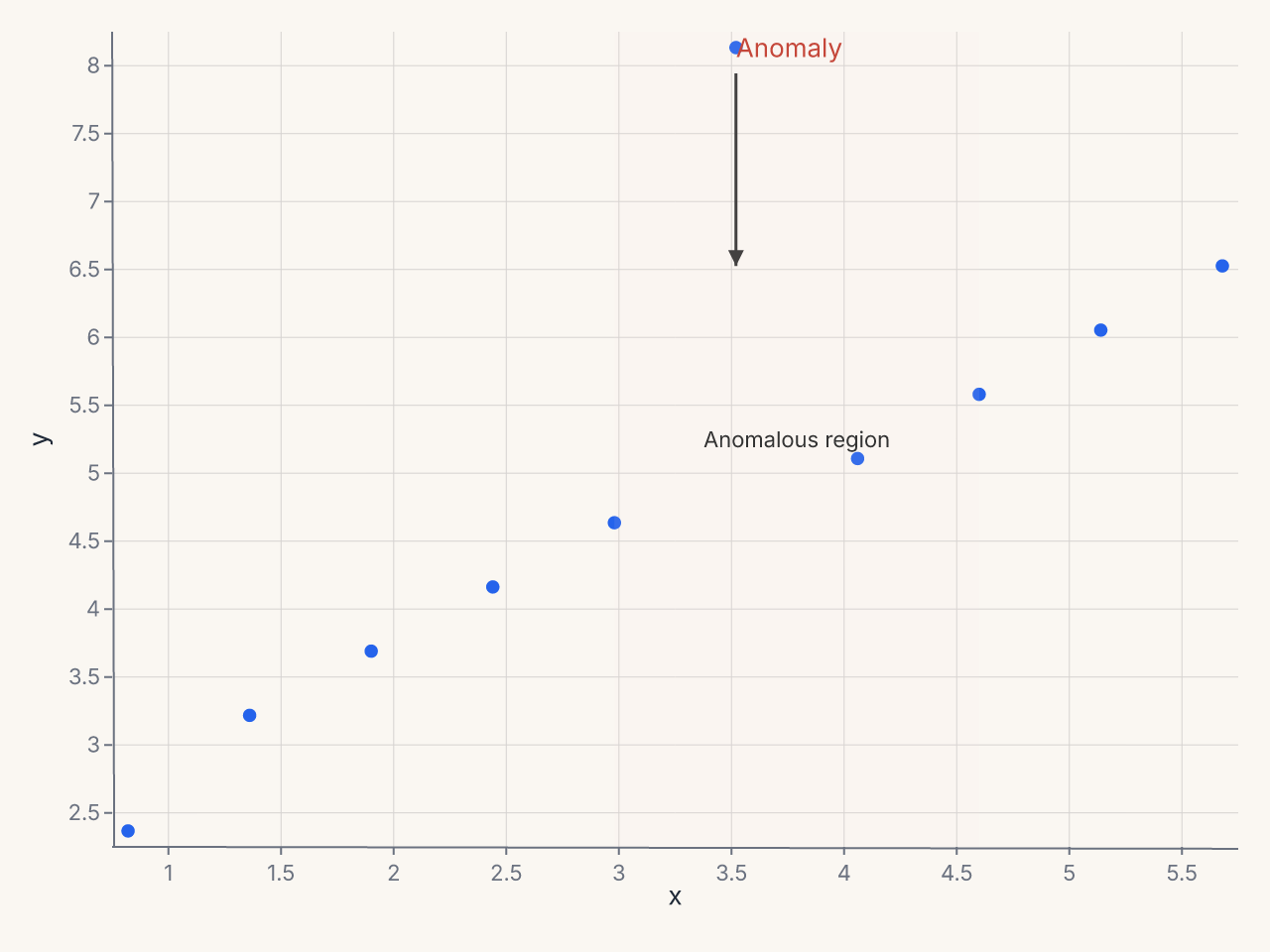
Eight annotation primitives are available: text, arrow, rect, line, span,
bracket, callout, and image.
See Annotations for detailed usage of each primitive.
Structural Features
Three structural features extend charts beyond simple axes:
SecondaryY — Dual Axes
SecondaryY adds an independent right-side y axis bound to a different field:
chart = (
    fm.Chart(df)
    .mark_bar()
    .encode(x="month:N", y="revenue:Q")
    + fm.SecondaryY(field="growth_rate", mark="line", color="#e74c3c")
)
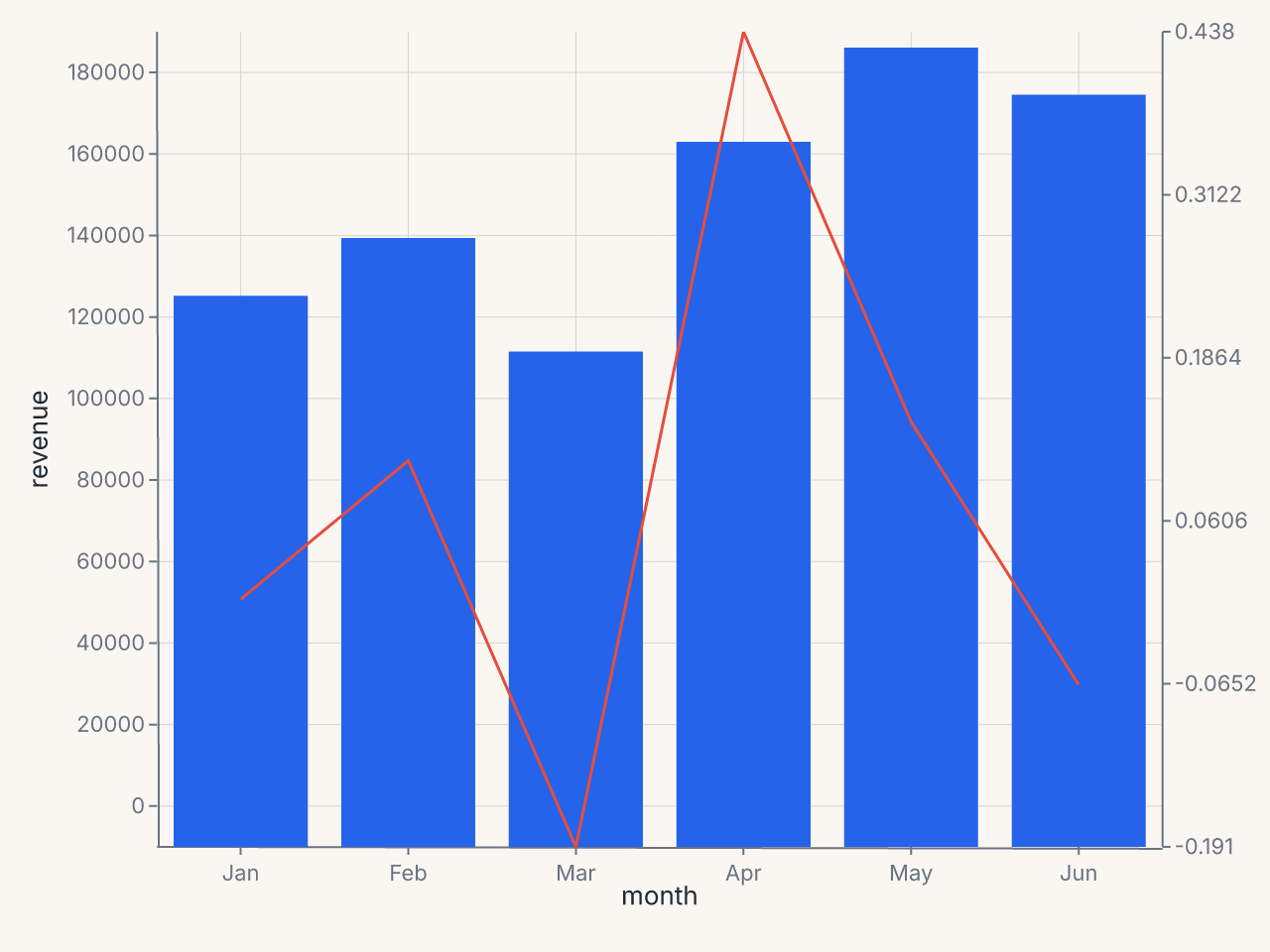
See Secondary Axes.
BreakAxis — Outlier Gaps
BreakAxis skips a region of the scale with a visual break indicator:
chart = (
    fm.Chart(df)
    .mark_bar()
    .encode(x="category:N", y="value:Q")
    + fm.BreakAxis(axis="y", gap=(100, 800))
)
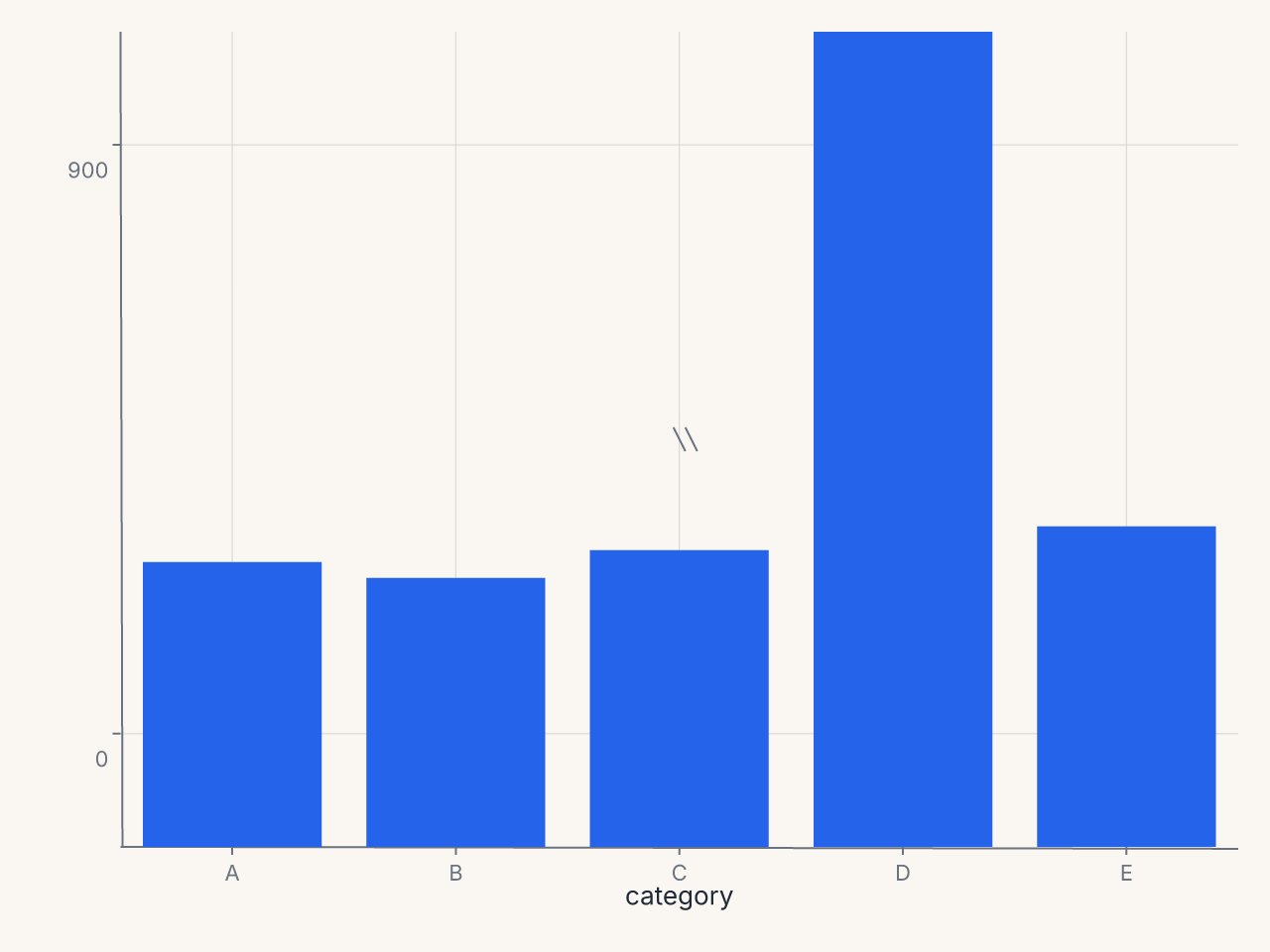
See Break Axes.
Inset — Zoomed Detail Panels
Inset embeds a self-contained sub-chart over the parent plot area:
zoom = (
    fm.Chart(df.filter(pl.col("x").is_between(1.0, 3.0)))
    .mark_point(size=120)
    .encode(x="x:Q", y="y:Q")
)
chart = (
    fm.Chart(df)
    .mark_point(size=50)
    .encode(x="x:Q", y="y:Q")
    + fm.Inset(chart=zoom, bounds=(fm.norm(0.55), fm.norm(0.0), fm.norm(1.0), fm.norm(0.5)))
)
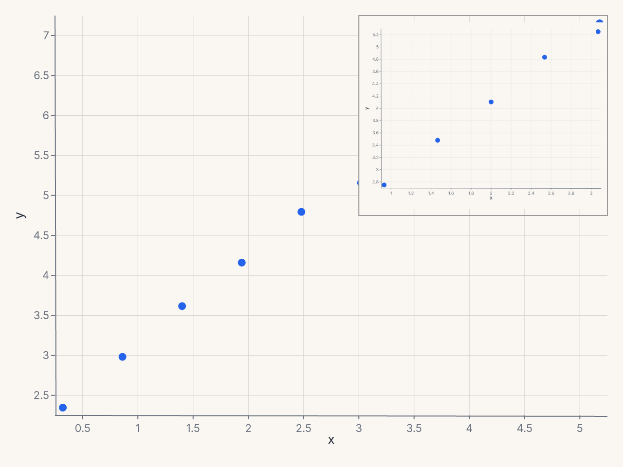
See Inset Panels.
The Override Escape Hatch
For the rare case where ferrum's typed surface hasn't caught up to what you need, .override()
lets you inject spec-path key/value pairs directly:
Use override only as a last resort. Unknown paths raise FerrumOverrideError at render time
with a closest-match suggestion. Paths that have a typed equivalent emit a deprecation warning
pointing to the right method.
See Override for path conventions and validation behavior.
Migration from matplotlib
| matplotlib | ferrum equivalent |
|---|---|
ax.set_xlabel("Revenue") |
.labs(x="Revenue") |
ax.set_title("Monthly Sales") |
.labs(title="Monthly Sales") |
ax.tick_params(axis='x', rotation=45) |
.configure_axis(label_angle=45) |
ax.set_xlim(0, 100) |
.xlim(0, 100) or configure_axis(domain_min=0, domain_max=100) |
ax.set_xticks([0, 25, 50, 75, 100]) |
.configure_axis(tick_values=[0, 25, 50, 75, 100]) |
ax.xaxis.set_major_formatter(...) |
.configure_axis(label_format="currency") |
ax.legend(loc="lower center") |
.configure_legend(orient="bottom") |
ax.legend(ncols=3) |
.configure_legend(columns=3) |
ax.get_legend().set_visible(False) |
.configure_legend(orient="none") |
ax.set_facecolor("#f0f0f0") |
.theme(fm.Theme(background="#f0f0f0")) |
ax.grid(True, color="#ddd") |
.configure_grid(color="#ddd") |
ax.spines[...].set_visible(False) |
.configure_axis(domain=False) |
ax.annotate("text", xy=...) |
+ fm.annotation.callout(x, y, "text") |
ax.axhline(y=0) |
+ fm.annotate_hline(value=0) |
ax.axvspan(x1, x2) |
+ fm.annotation.span("x", x1, x2, fill="#eee") |
ax.twinx() |
+ fm.SecondaryY(field="col2") |
Broken axis with brokenaxes |
+ fm.BreakAxis(axis="y", gap=(lo, hi)) |
Inset with mpl_toolkits.axes_grid1 |
+ fm.Inset(chart=zoom_chart, bounds=...) |
Where to Go Next
- Themes — visual identity, built-in themes, custom themes
- Composition — layering, faceting, and multi-panel layouts
- Marks & Encodings — the per-channel
axis=Axis(...)andlegend=Legend(...)options - Concepts: Configuration — full parameter reference for all 6 config objects
- Concepts: Format Presets — all named presets with examples
- Concepts: Annotations — all 8 annotation primitives
- Concepts: Secondary Axes — dual-axis charts
- Concepts: Break Axes — handling outlier values
- Concepts: Inset Panels — embedded detail views
- Concepts: Override — spec-path escape hatch