Model diagnostics
This is where Ferrum's headline claim — model outputs are data — becomes specific code.
The diagnostic surface consists of three coordinated layers. You can mix and match them freely; they all return regular Chart objects (or compound views) that compose with the rest of the grammar.
| Layer | What it is | When to reach for it |
|---|---|---|
| Figure-level helpers | roc_chart, calibration_chart, confusion_matrix_chart, [shap_chart][ferrum.shap_chart], etc. |
One-line entry points. Takes a fitted model + test data, returns a Chart. |
ModelSource |
The data interface | When you want to compute derived diagnostic data once and reuse it across multiple charts. |
| sklearn-protocol visualizers | ROCVisualizer, CalibrationVisualizer, ConfusionMatrixVisualizer, etc. |
When you want lifecycle control (.fit() / .score() / .show()) or are following a yellowbrick-style pattern. |
The design rationale is on the Model outputs are data Concepts page; this page is the practical reference.
Figure-level helpers
The fast path: pass a fitted model and held-out data, get a Chart back. The helpers cover the standard model-evaluation surface and dispatch the underlying transforms in Rust.
import ferrum as fm
from sklearn.datasets import load_breast_cancer
from sklearn.ensemble import RandomForestClassifier
from sklearn.model_selection import train_test_split
data = load_breast_cancer()
X_train, X_test, y_train, y_test = train_test_split(data.data, data.target, random_state=0)
model = RandomForestClassifier(n_estimators=20, random_state=0).fit(X_train, y_train)
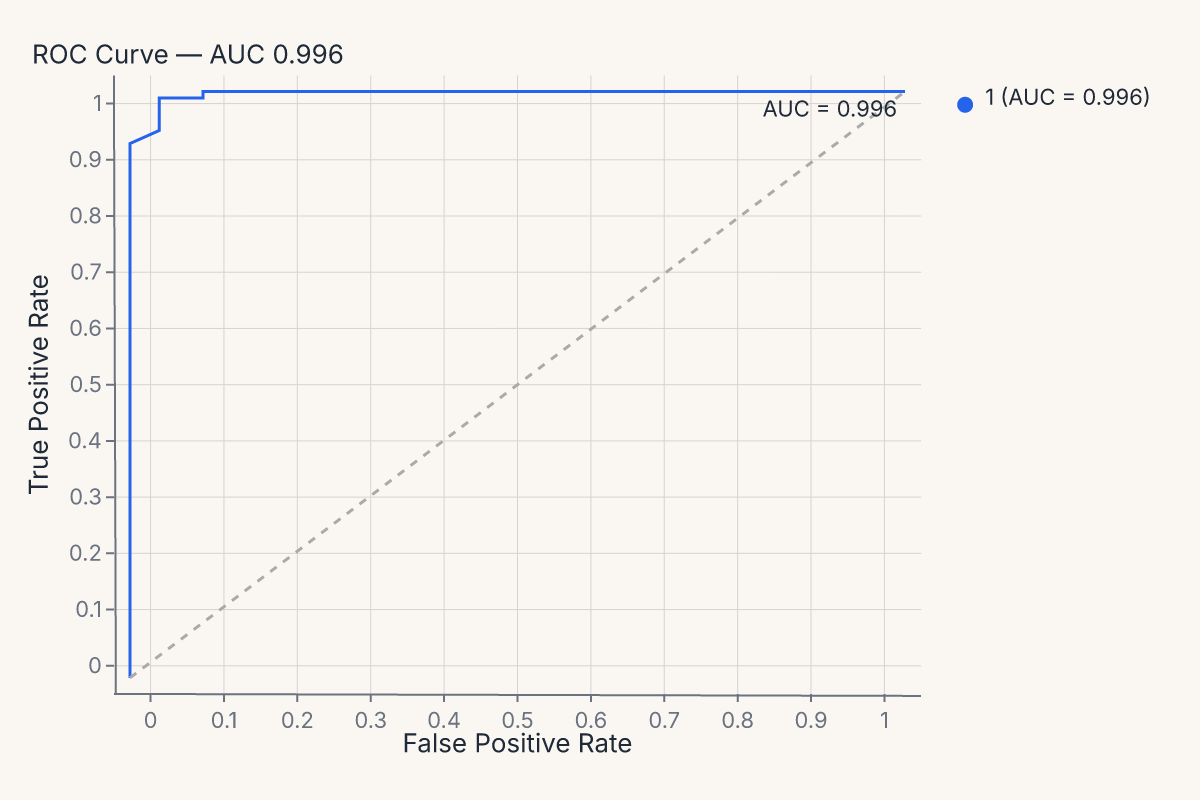
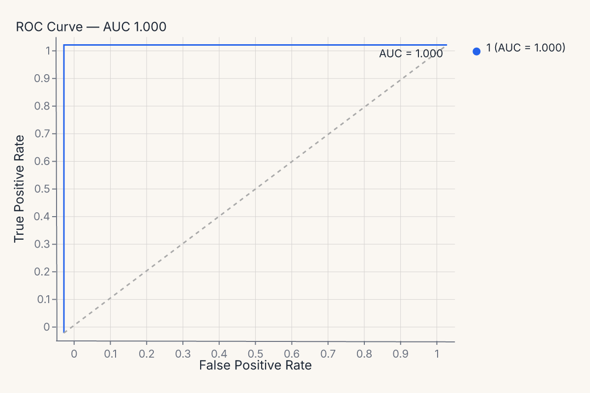
roc = fm.roc_chart(model, X_test, y_test)
roc
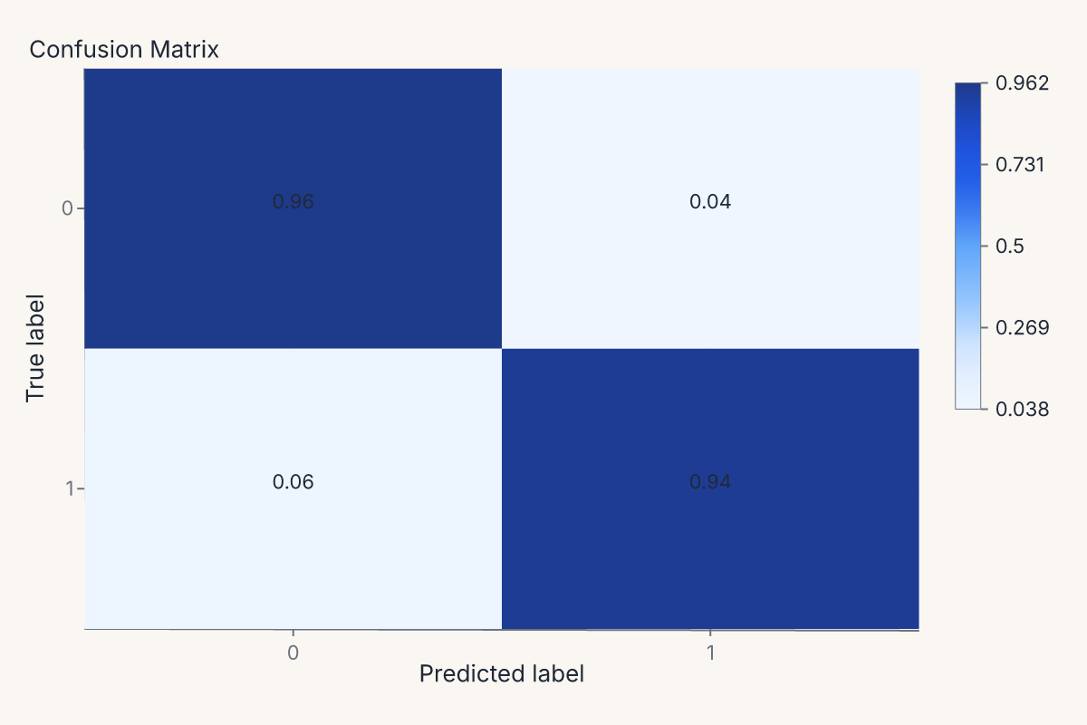
The same pattern produces a confusion matrix:
import ferrum as fm
from sklearn.datasets import load_breast_cancer
from sklearn.ensemble import RandomForestClassifier
from sklearn.model_selection import train_test_split

data = load_breast_cancer()
X_train, X_test, y_train, y_test = train_test_split(data.data, data.target, random_state=0)
model = RandomForestClassifier(n_estimators=20, random_state=0).fit(X_train, y_train)

cm = fm.confusion_matrix_chart(model, X_test, y_test, normalize="true")
cm
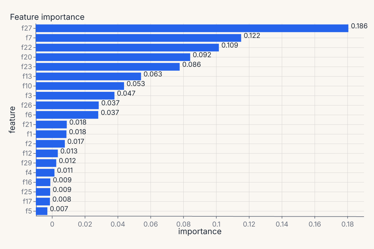
Or feature importances, with the helper handling whichever importance method the estimator exposes (feature_importances_, permutation importance, coefficients):
import ferrum as fm
from sklearn.datasets import load_breast_cancer
from sklearn.ensemble import RandomForestClassifier
from sklearn.model_selection import train_test_split

data = load_breast_cancer()
X_train, X_test, y_train, y_test = train_test_split(data.data, data.target, random_state=0)
model = RandomForestClassifier(n_estimators=20, random_state=0).fit(X_train, y_train)

importances = fm.importance_chart(model, X_test, y_test)
importances
The full helper menu
Every helper follows the same signature shape: helper(model_or_source, X=None, y=None, **kwargs) -> Chart. Pass a fitted model + held-out data, or pass a pre-constructed ModelSource as the first argument (next section). All helpers accept a theme= keyword.
| Family | Helpers |
|---|---|
| Classification | roc_chart, pr_chart, calibration_chart, confusion_matrix_chart, class_prediction_error_chart, classification_report_chart, class_balance_chart, discrimination_threshold_chart, gain_chart, lift_chart |
| Regression | residuals_chart, prediction_error_chart, cooks_distance_chart |
| Feature explanation | importance_chart, [shap_chart][ferrum.shap_chart], shap_beeswarm_chart, shap_bar_chart, shap_waterfall_chart, pdp_chart |
| Model selection | learning_curve_chart, validation_curve_chart, cv_scores_chart, alpha_selection_chart |
| Clustering / manifold | silhouette_chart, elbow_chart, manifold_chart, pca_scree_chart, intercluster_distance_chart, parallel_coordinates_chart, decision_boundary_chart, [rank_chart][ferrum.rank_chart], rank1d_chart, rank2d_chart, cluster_diagnostics |
The full API surface is on the API Reference / ferrum page.
ModelSource: derived diagnostic data
ModelSource wraps a fitted estimator and held-out data, then exposes derived diagnostic tables (predicted probabilities, ROC curve points, calibration bins, confusion counts, residuals, SHAP values, partial dependence grids, ...) as polars DataFrames.
When you call roc_chart(model, X, y), the helper builds a ModelSource internally, asks it for the ROC curve points, and feeds those points to a chart spec. If you're computing multiple diagnostics on the same model + dataset, it's more efficient — and cleaner — to build the ModelSource once and pass it to each helper:
import ferrum as fm
from sklearn.datasets import load_breast_cancer
from sklearn.ensemble import RandomForestClassifier
from sklearn.model_selection import train_test_split

data = load_breast_cancer()
X_train, X_test, y_train, y_test = train_test_split(data.data, data.target, random_state=0)
model = RandomForestClassifier(n_estimators=20, random_state=0).fit(X_train, y_train)

source = fm.ModelSource(model, X_test, y_test)
roc = fm.roc_chart(source)
cm = fm.confusion_matrix_chart(source)
importances = fm.importance_chart(source)
report = (roc | cm) & importances
report
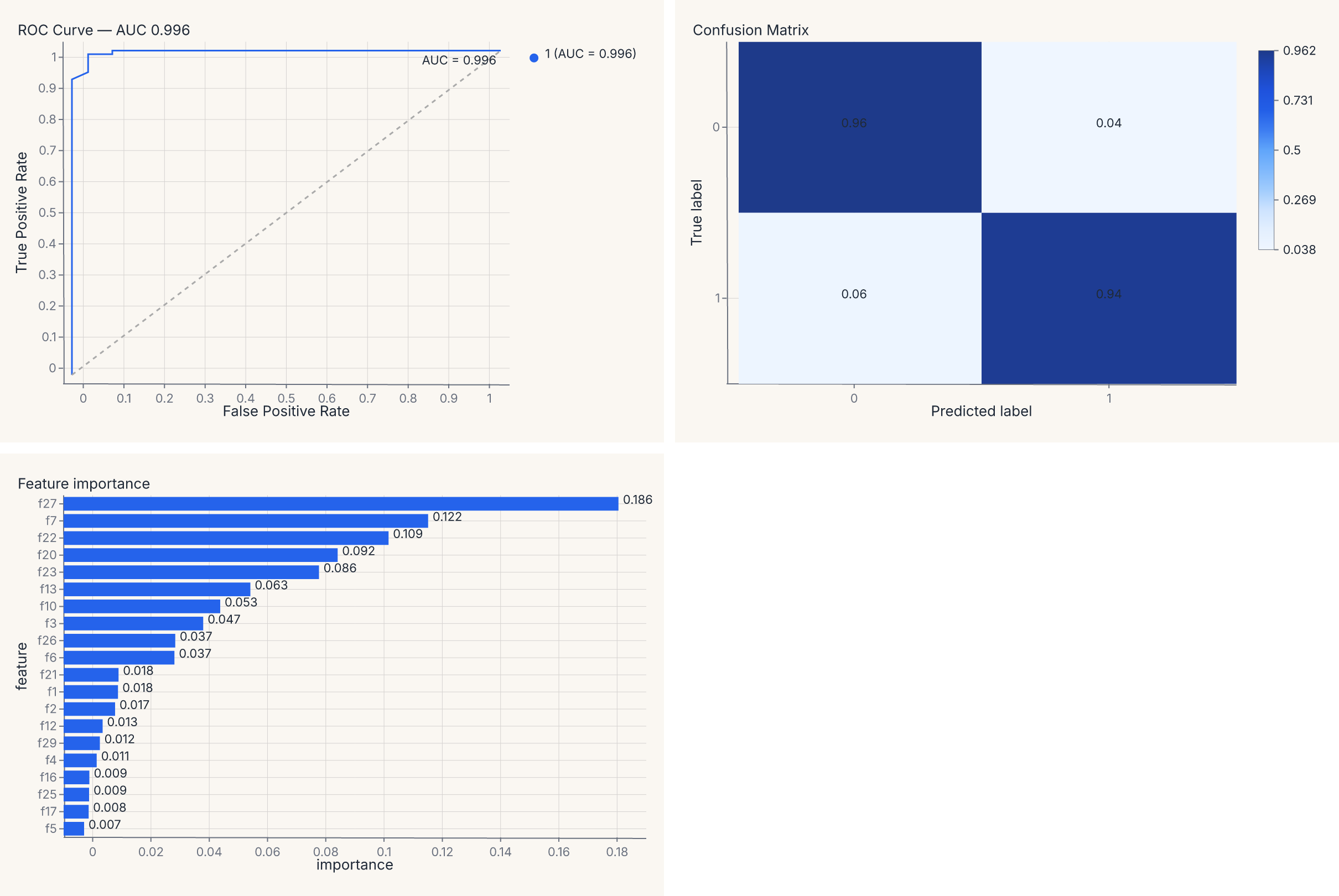
The report value is a regular composed chart — (roc | cm) & importances lays the three diagnostics into a 2 × 2 grid (with the importance chart spanning the bottom row), and you can save it, theme it, or further compose it as one artifact. The composition operators are the same | and & you use for any other charts (see Composition).
Why ModelSource matters
The boundary ModelSource enforces is the load-bearing one: it computes the derived diagnostic tables once, then every chart consumes the result. Without ModelSource, computing a ROC curve and a calibration curve on the same model would re-predict probabilities twice, and you'd have to thread that data plumbing through your own code.
ModelSource also lazy-imports sklearn, shap, and umap as needed: import ferrum does not pull those packages into your process. They load only when you actually compute a diagnostic that requires them — and only on the fitted-model path. The raw-array path (below) computes its metrics on Ferrum's native Rust kernels and imports none of them.
Comparing multiple models
Most classification helpers accept a compare= keyword for side-by-side multi-model comparison on the same test set. Pass a dict mapping display names to fitted estimators:
import ferrum as fm
from sklearn.datasets import load_breast_cancer
from sklearn.ensemble import RandomForestClassifier
from sklearn.linear_model import LogisticRegression
from sklearn.model_selection import train_test_split

data = load_breast_cancer()
X_train, X_test, y_train, y_test = train_test_split(data.data, data.target, random_state=0)
rf = RandomForestClassifier(n_estimators=20, random_state=0).fit(X_train, y_train)
lr = LogisticRegression(max_iter=500, random_state=0).fit(X_train, y_train)

chart = fm.roc_chart(rf, X_test, y_test, compare={"Logistic Regression": lr})
chart

The base model is labeled "base" by default; each entry in compare= adds a named curve. The resulting chart overlays all models on the same axes with a color legend.
For full control, use ModelSource.compare() directly to build a ComparedModelSource and pass it to any helper:
cms = fm.ModelSource.compare(
    {"RF": rf, "LR": lr},
    X_test, y_test,
)
roc = fm.roc_chart(cms)
cal = fm.calibration_chart(cms)
report = roc | cal
report
ComparedModelSource computes derived data once per model and stamps a model column on the concatenated output, so charts can route color="model" automatically.
Precomputed scores (no model required)
Every classification and regression helper also accepts raw y_true= / y_pred= arrays instead of a fitted model. This is useful when you already have predictions — from a saved CSV, a batch inference job, a non-sklearn framework, or an evaluation pipeline that separates prediction from visualization. This path is fully sklearn-free: ROC, precision-recall, calibration, confusion-matrix, and threshold-sweep metrics are computed by Ferrum's native Rust kernels, so no [models] extra is required.
import ferrum as fm
from sklearn.datasets import load_breast_cancer
from sklearn.ensemble import RandomForestClassifier
from sklearn.model_selection import train_test_split

data = load_breast_cancer()
X_train, X_test, y_train, y_test = train_test_split(data.data, data.target, random_state=0)
model = RandomForestClassifier(n_estimators=20, random_state=0).fit(X_train, y_train)

# Predict once, visualize many ways
y_proba = model.predict_proba(X_test)
y_pred = model.predict(X_test)

roc = fm.roc_chart(y_true=y_test, y_pred=y_proba)
cm = fm.confusion_matrix_chart(y_true=y_test, y_pred=y_pred)
report = roc | cm
report
The two paths are mutually exclusive — pass either model, X, y or y_true=, y_pred=, not both.
What y_pred means
The interpretation of y_pred depends on the chart:
| Chart needs | What to pass as y_pred |
Helpers |
|---|---|---|
| Soft scores / probabilities | predict_proba(X) (1-D binary or 2-D multiclass) |
roc_chart, pr_chart, calibration_chart, gain_chart, lift_chart, discrimination_threshold_chart |
| Hard class labels | predict(X) (1-D) |
confusion_matrix_chart, class_prediction_error_chart |
| Fitted values | predict(X) (1-D continuous) |
residuals_chart, prediction_error_chart |
Limitations of the precomputed path
- No
compare=— multi-model comparison requires fitted models so each can be re-predicted on the same data. - No
cv=— cross-validation helpers (learning_curve_chart,validation_curve_chart,cv_scores_chart) need a model to re-fit across folds. - No feature-based helpers —
importance_chart,shap_chart,pdp_chart, and clustering helpers require a model orModelSource.
sklearn-protocol visualizers
For lifecycle control or yellowbrick-style ergonomics, every diagnostic also has a visualizer class. The visualizer takes the model at construction time, runs through .fit() / .score(), and exposes .show() which returns a Chart:
import ferrum as fm
from sklearn.datasets import load_breast_cancer
from sklearn.ensemble import RandomForestClassifier
from sklearn.model_selection import train_test_split

data = load_breast_cancer()
X_train, X_test, y_train, y_test = train_test_split(data.data, data.target, random_state=0)
model = RandomForestClassifier(n_estimators=20, random_state=0).fit(X_train, y_train)

visualizer = fm.ROCVisualizer(model)
visualizer.fit(X_train, y_train).score(X_test, y_test)
chart = visualizer.show()
chart
The full visualizer menu mirrors the helpers:
| Family | Visualizers |
|---|---|
| Classification | ROCVisualizer, PRVisualizer, CalibrationVisualizer, ConfusionMatrixVisualizer, ClassificationReportVisualizer, ClassPredictionErrorVisualizer, ClassBalanceVisualizer, DiscriminationThresholdVisualizer |
| Regression | ResidualsVisualizer, PredictionErrorVisualizer, CooksDistanceVisualizer |
| Explanation | FeatureImportancesVisualizer, SHAPVisualizer, SHAPBeeswarmVisualizer, SHAPBarVisualizer, SHAPWaterfallVisualizer |
| Model selection | LearningCurveVisualizer, ValidationCurveVisualizer, CVScoresVisualizer, AlphaSelectionVisualizer |
| Clustering / manifold | SilhouetteVisualizer, ElbowVisualizer, ManifoldVisualizer, InterclusterDistanceVisualizer, PCAVarianceVisualizer, Rank1DVisualizer, Rank2DVisualizer, ParallelCoordinatesVisualizer |
Pick the helper when you want the diagnostic with minimal ceremony. Pick the visualizer when you want CV-fold lifecycle, custom training/scoring splits, or compatibility with code patterns from yellowbrick.
Customizing diagnostic output
Every diagnostic helper accepts four override keywords for customization without dropping to the grammar API:
| Keyword | What it does |
|---|---|
mark= |
Override or suppress sub-layers by name. |
encode= |
Override encoding channels. |
properties= |
Override chart properties (title, width, height). |
layers= |
Append extra layers on top. |
Diagnostic charts are composites with named sub-layers. Inspect them with .layer_names:
import ferrum as fm
from sklearn.datasets import load_breast_cancer
from sklearn.ensemble import RandomForestClassifier
from sklearn.model_selection import train_test_split

data = load_breast_cancer()
X_train, X_test, y_train, y_test = train_test_split(data.data, data.target, random_state=0)
model = RandomForestClassifier(n_estimators=20, random_state=0).fit(X_train, y_train)

chart = fm.roc_chart(model, X_test, y_test)
names = chart.layer_names
assert "line" in names
assert "reference" in names
Override sub-layers by name — suppress them with False, or merge mark kwargs with a dict:
import ferrum as fm
from sklearn.datasets import load_breast_cancer
from sklearn.ensemble import RandomForestClassifier
from sklearn.model_selection import train_test_split
data = load_breast_cancer()
X_train, X_test, y_train, y_test = train_test_split(data.data, data.target, random_state=0)
model = RandomForestClassifier(n_estimators=20, random_state=0).fit(X_train, y_train)
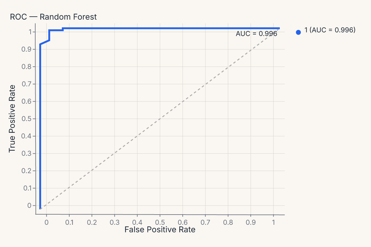
chart = fm.roc_chart(
model, X_test, y_test,
mark={"line": {"stroke_width": 3}},
properties={"title": "ROC — Random Forest"},
)
chart
The same mark=, encode=, properties=, layers= pattern works on every diagnostic helper — confusion_matrix_chart, calibration_chart, importance_chart, and all the rest.
Diagnostics compose with everything else
The most important property of these helpers is structural: their output is a regular Ferrum chart. That means a ROC curve participates in the rest of the grammar identically to a scatter plot:
- Theme it with
.theme(fm.themes.publication)or set a process default withset_default_theme. - Save it with
.save("roc.svg"). - Concatenate it with
|or&(as shown above). - Pass it through anywhere a
Chartis expected.
A four-panel model report is (roc | cm) & (residuals | importances) — same composition operators as any other compound view. There is no separate API for "make these diagnostic charts work together."
Caveats and limitations
A few sharp edges worth knowing:
- SHAP and shap-style helpers: require
shapinstalled. They lazy-import on first call; install the optionalferrum-viz[shap]extra to pull it in. UMAP runs in pure Rust viamanifolds-rs— no Python dependency. - Per-class breakdowns: classifier diagnostics default to a per-class view when the model has more than two classes. Pass
per_class=Falseto collapse to a macro / micro / weighted average. - Compare multiple models: most classification helpers accept a
compare=keyword (or aComparedModelSourcedata source) for side-by-side comparison. See the API reference for the per-helper signatures. - Non-sklearn models: any estimator exposing
predict()andpredict_proba()works (XGBoost, LightGBM, CatBoost, etc.). For frameworks without sklearn-compatible APIs (PyTorch, TensorFlow), use they_true=/y_pred=precomputed path described above.
Where to go next
- Model outputs are data for the design rationale behind treating diagnostics as charts.
- Figure-level helpers for the broader family of one-line chart helpers (most diagnostic helpers follow the same pattern).
- Composition for the operators (
+,|,&) used to compose multiple diagnostics into a single model report. - Themes for applying consistent styling to a multi-chart diagnostic view.
- The API Reference / ferrum for the full signatures of every
*_charthelper and every*Visualizerclass.