Recipes
Worked examples using the grammar API. Each recipe starts from data and builds up to a finished chart. The progression runs from simple single-mark charts to multi-layer compositions with per-group transforms.
For explicit data preprocessing (filtering, reshaping, window functions), see the Data Transforms guide.
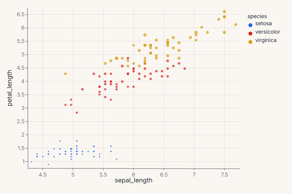
Scatter with color and size
Map two continuous fields to position and two more to appearance:
import ferrum as fm
import polars as pl
from sklearn.datasets import load_iris

raw = load_iris()
iris = pl.DataFrame(raw.data, schema=["sepal_length", "sepal_width", "petal_length", "petal_width"]).with_columns(
    species=pl.Series([raw.target_names[t] for t in raw.target])
)
chart = (
    fm.Chart(iris)
    .mark_point(opacity=0.7)
    .encode(
        x="sepal_length",
        y="petal_length",
        color="species:N",
        size="petal_width",
    )
)
chart
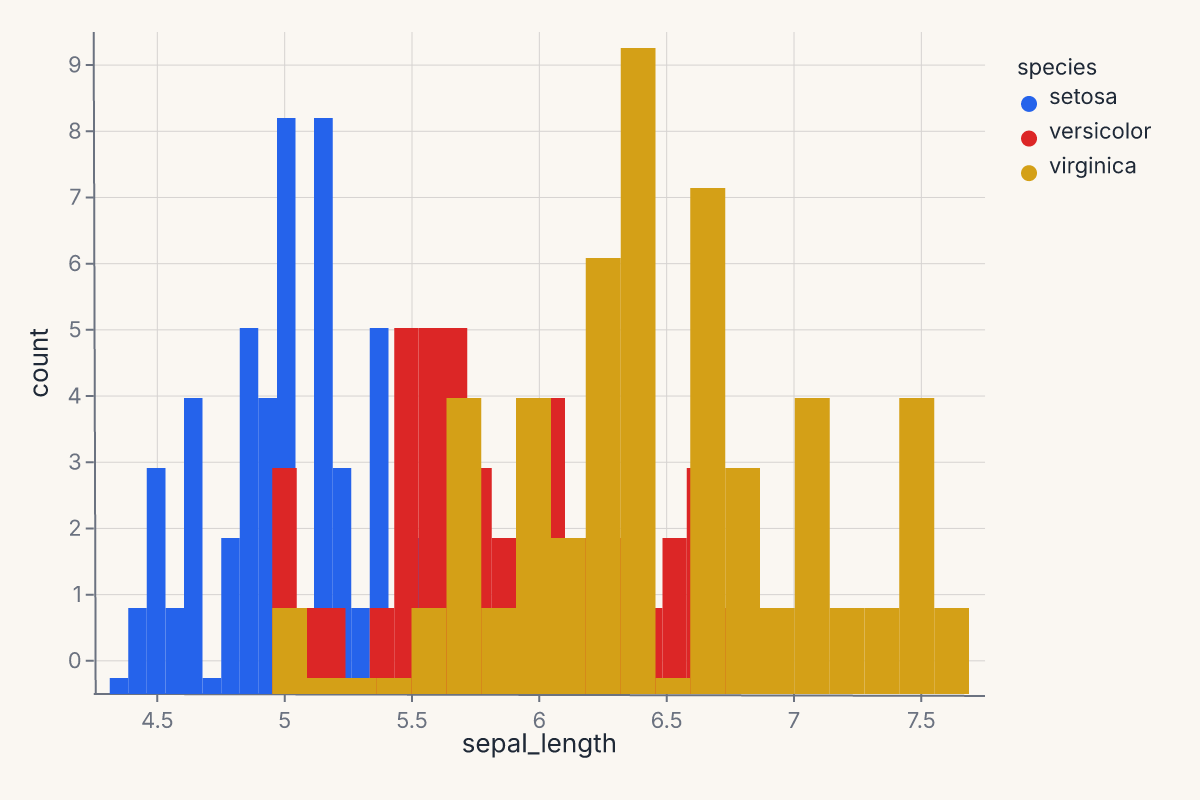
Histogram with hue overlay
Stack or layer distributions by a categorical variable:
import ferrum as fm
import polars as pl
from sklearn.datasets import load_iris

raw = load_iris()
iris = pl.DataFrame(raw.data, schema=["sepal_length", "sepal_width", "petal_length", "petal_width"]).with_columns(
    species=pl.Series([raw.target_names[t] for t in raw.target])
)
chart = (
    fm.Chart(iris)
    .mark_histogram(bin_count=20, groupby="species")
    .encode(x="sepal_length", color="species:N")
)
chart
Per-group KDE
Use groupby to compute a separate density estimate per category:
import ferrum as fm
import polars as pl
from sklearn.datasets import load_iris

raw = load_iris()
iris = pl.DataFrame(raw.data, schema=["sepal_length", "sepal_width", "petal_length", "petal_width"]).with_columns(
    species=pl.Series([raw.target_names[t] for t in raw.target])
)
chart = (
    fm.Chart(iris)
    .mark_density(bandwidth="scott", groupby="species")
    .encode(x="sepal_length", color="species:N")
)
chart
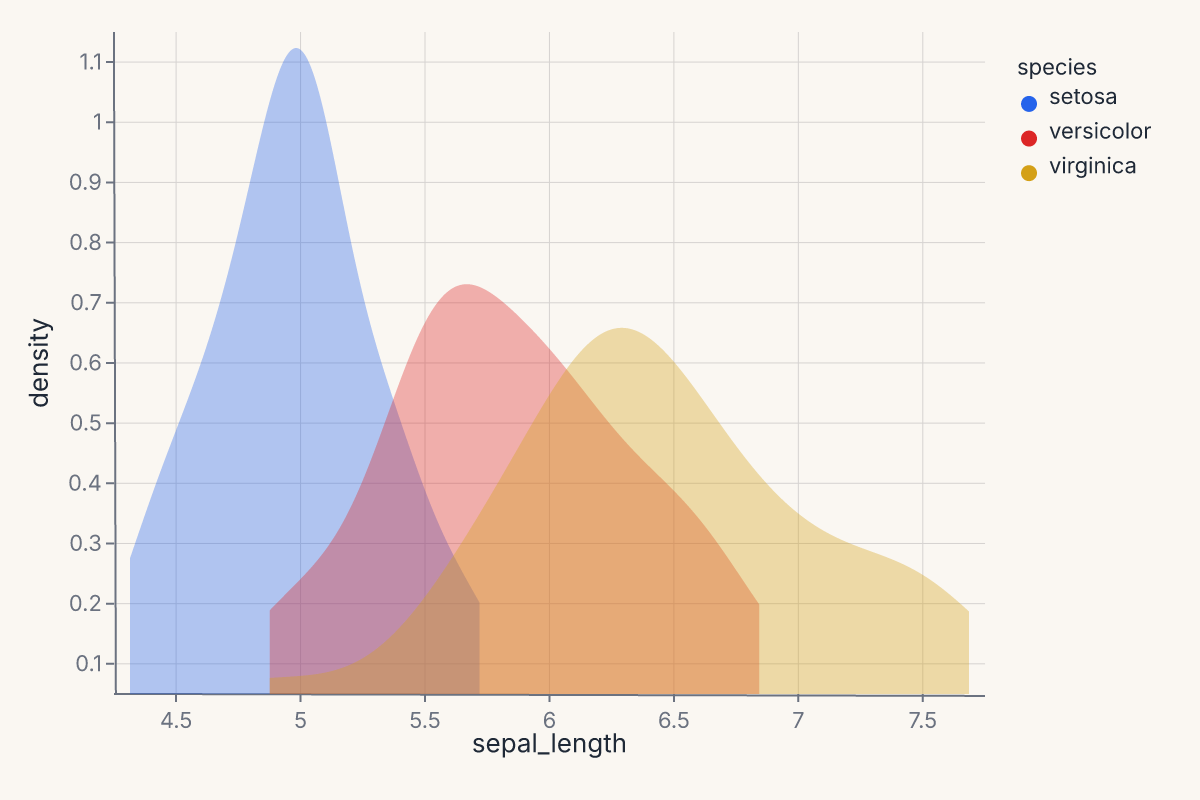
Without groupby, the density is computed over all rows combined. With groupby="species", each species gets its own KDE curve colored by the color encoding.
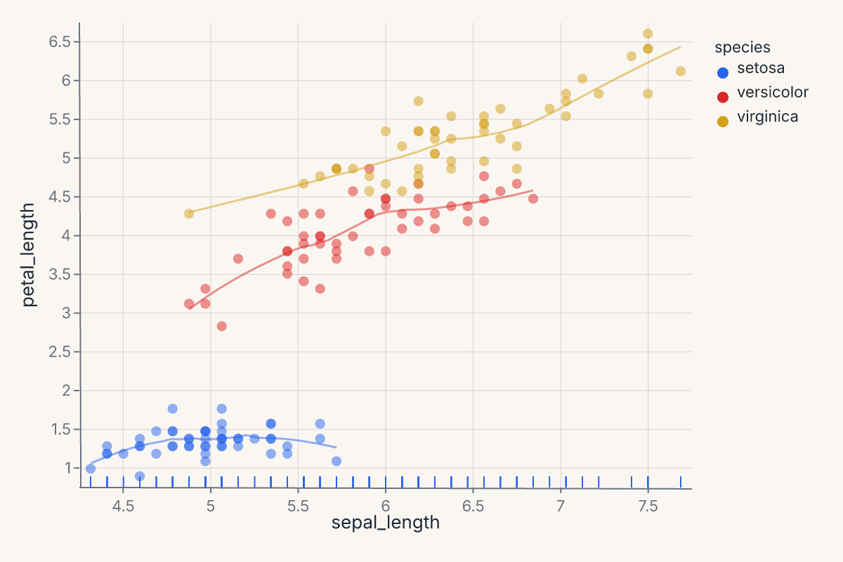
Scatter + per-group smooth
Layer a scatter with per-species LOESS trend lines. The groupby parameter is essential — without it, one combined line is computed:
import ferrum as fm
import polars as pl
from sklearn.datasets import load_iris

raw = load_iris()
iris = pl.DataFrame(raw.data, schema=["sepal_length", "sepal_width", "petal_length", "petal_width"]).with_columns(
    species=pl.Series([raw.target_names[t] for t in raw.target])
)
points = (
    fm.Chart(iris)
    .mark_point(opacity=0.6)
    .encode(x="sepal_length", y="petal_length", color="species:N")
)
trend = (
    fm.Chart(iris)
    .mark_smooth(method="loess", groupby="species")
    .encode(x="sepal_length", y="petal_length", color="species:N")
)
chart = points + trend
chart
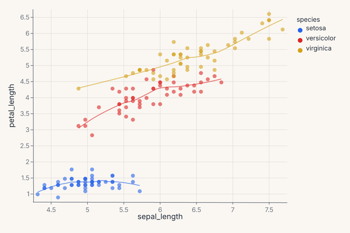
The + operator layers both marks on shared axes. The scatter renders the raw points; the smooth renders the fitted curves. Both share the same color scale.
Scatter + smooth with confidence interval
Add a confidence band around the regression line with ci=:
import ferrum as fm
import polars as pl
from sklearn.datasets import load_iris

raw = load_iris()
iris = pl.DataFrame(raw.data, schema=["sepal_length", "sepal_width", "petal_length", "petal_width"]).with_columns(
    species=pl.Series([raw.target_names[t] for t in raw.target])
)
points = (
    fm.Chart(iris)
    .mark_point(opacity=0.5)
    .encode(x="sepal_length", y="petal_length")
)
fit = (
    fm.Chart(iris)
    .mark_smooth(method="lm", ci=0.95)
    .encode(x="sepal_length", y="petal_length")
)
chart = points + fit
chart
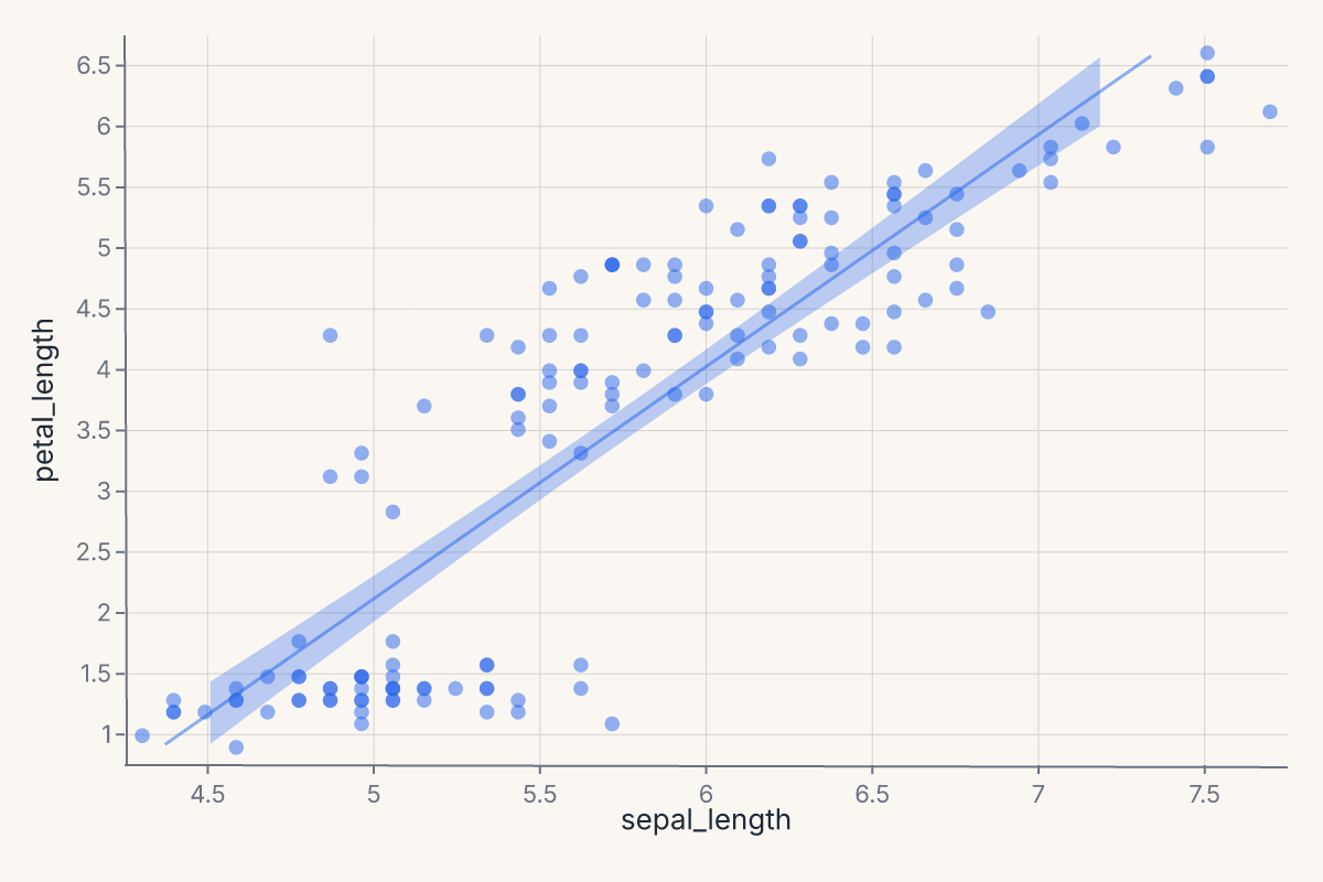
ci=0.95 produces a layered ribbon (band) + line chart. The ribbon shows the 95% confidence interval around the OLS fit. Use method="lm" for linear regression or method="loess" for a local smoother.
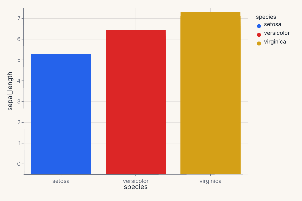
Bar chart with color
A simple grouped bar chart using a categorical x-axis:
import ferrum as fm
import polars as pl
from sklearn.datasets import load_iris

raw = load_iris()
iris = pl.DataFrame(raw.data, schema=["sepal_length", "sepal_width", "petal_length", "petal_width"]).with_columns(
    species=pl.Series([raw.target_names[t] for t in raw.target])
)
chart = (
    fm.Chart(iris)
    .mark_bar()
    .encode(x="species:N", y="sepal_length", color="species:N")
)
chart
Pairwise scatter grid
Use RepeatChart to show multiple field combinations in a grid:
import ferrum as fm
import polars as pl
from sklearn.datasets import load_iris

raw = load_iris()
iris = pl.DataFrame(raw.data, schema=["sepal_length", "sepal_width", "petal_length", "petal_width"]).with_columns(
    species=pl.Series([raw.target_names[t] for t in raw.target])
)
template = (
    fm.Chart(iris)
    .mark_point(opacity=0.6)
    .encode(x=fm.Repeat.column, y=fm.Repeat.row, color="species:N")
)
chart = fm.RepeatChart(
    template,
    row=["sepal_length", "petal_length"],
    column=["sepal_width", "petal_width"],
)
chart
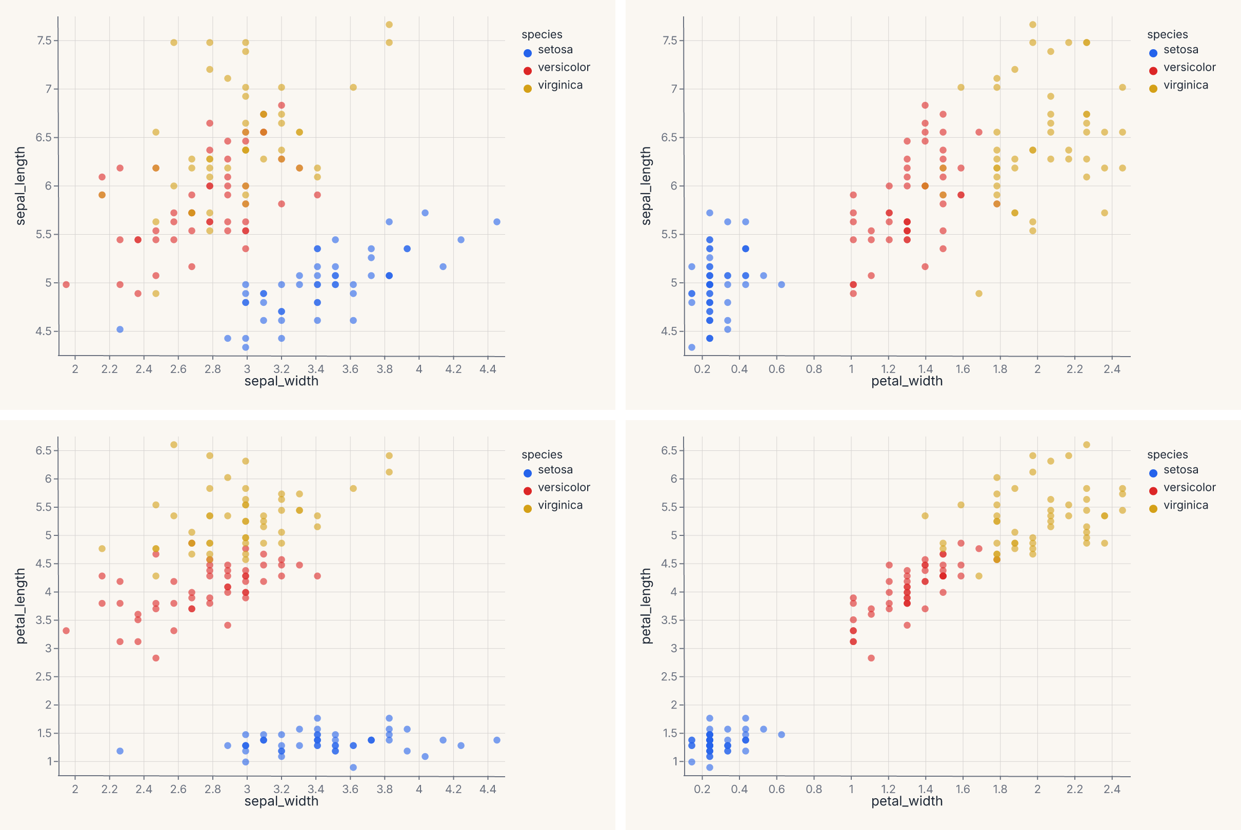
Each cell in the grid swaps one field into the x or y encoding. This is the grammar-level equivalent of fm.pairplot() — use RepeatChart when you want full control over the template chart.
Three-layer scatter with smooth and rug
Stack three grammar layers into one chart — scatter, per-group LOESS trend, and a rug plot showing the marginal distribution:
import ferrum as fm
import polars as pl
from sklearn.datasets import load_iris

raw = load_iris()
iris = pl.DataFrame(raw.data, schema=["sepal_length", "sepal_width", "petal_length", "petal_width"]).with_columns(
    species=pl.Series([raw.target_names[t] for t in raw.target])
)
points = (
    fm.Chart(iris)
    .mark_point(opacity=0.5, size=40)
    .encode(x="sepal_length", y="petal_length", color="species:N")
)
smooth = (
    fm.Chart(iris)
    .mark_smooth(method="loess", groupby="species")
    .encode(x="sepal_length", y="petal_length", color="species:N")
)
rug = (
    fm.Chart(iris)
    .mark_tick(opacity=0.3)
    .encode(x="sepal_length", color="species:N")
)
chart = points + smooth + rug
chart
Each + adds another layer on the same axes. All three layers share the x/y scales and the color palette. The rug ticks along the bottom show the marginal distribution of sepal length per species.
Multi-panel model report
Compose multiple diagnostic charts into a single view. Train a model, then build a four-panel report with one line of composition:
import ferrum as fm
import polars as pl
import numpy as np
from sklearn.datasets import load_iris
from sklearn.ensemble import RandomForestClassifier
from sklearn.model_selection import train_test_split

raw = load_iris()
rng = np.random.default_rng(42)
X_noisy = raw.data + rng.normal(0, 1.5, raw.data.shape)
X_train, X_test, y_train, y_test = train_test_split(
    X_noisy, raw.target, test_size=0.3, random_state=42
)
model = RandomForestClassifier(n_estimators=50, random_state=42).fit(X_train, y_train)

roc = fm.roc_chart(model, X_test, y_test)
cm = fm.confusion_matrix_chart(model, X_test, y_test)
importances = fm.importance_chart(model, X_test, y_test)
report = (roc | cm) & importances
report
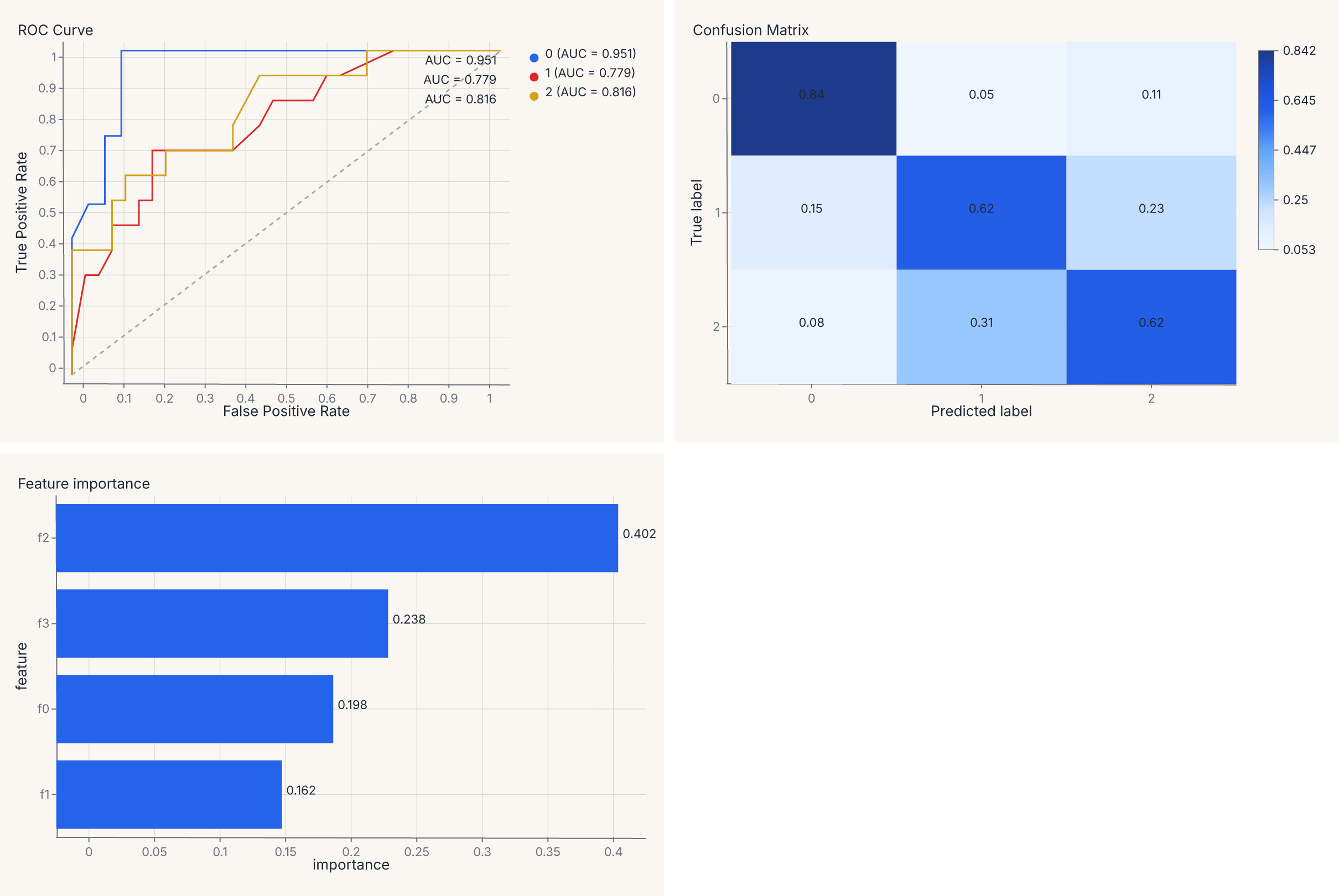
The | operator places charts side by side; & stacks vertically. The result is a single SVG with three panels — same grammar, same theme, one .save() call.
Comparing two models side by side
Diagnostic chart output is a regular Chart — add titles, apply themes, and compose with |:
import ferrum as fm
import numpy as np
from sklearn.datasets import load_iris
from sklearn.ensemble import RandomForestClassifier
from sklearn.linear_model import LogisticRegression
from sklearn.model_selection import train_test_split

raw = load_iris()
rng = np.random.default_rng(42)
X_noisy = raw.data + rng.normal(0, 1.5, raw.data.shape)
X_train, X_test, y_train, y_test = train_test_split(
    X_noisy, raw.target, test_size=0.3, random_state=42
)
rf = RandomForestClassifier(n_estimators=50, random_state=42).fit(X_train, y_train)
lr = LogisticRegression(max_iter=500, random_state=42).fit(X_train, y_train)

roc_rf = fm.roc_chart(rf, X_test, y_test).properties(title="Random Forest")
roc_lr = fm.roc_chart(lr, X_test, y_test).properties(title="Logistic Regression")
chart = (roc_rf | roc_lr).theme(fm.themes.publication)
chart
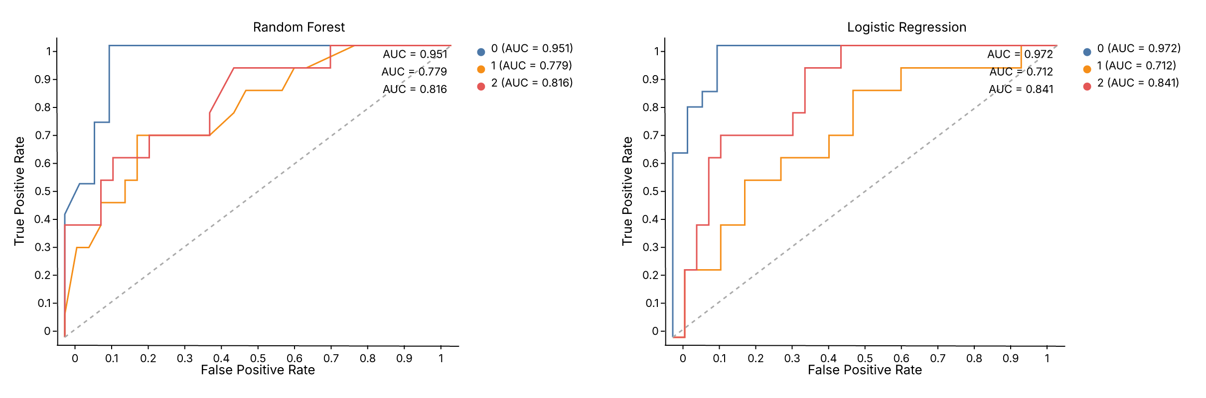
.properties(title=...) adds a title to each panel. .theme() applies to the entire composed view. The same pattern works for any diagnostic helper — swap roc_chart for calibration_chart, pr_chart, or confusion_matrix_chart.
Horizontal bars with CoordFlip
Ferrum draws bars vertically by default (x = category, y = value). To flip to horizontal bars, apply CoordFlip:
import ferrum as fm
import polars as pl

df = pl.DataFrame({"category": ["A", "B", "C", "D"], "value": [4.2, 2.8, 3.6, 5.1]})
chart = (
    fm.Chart(df)
    .mark_bar()
    .encode(x="category:N", y="value")
    .coord(fm.CoordFlip())
)
chart
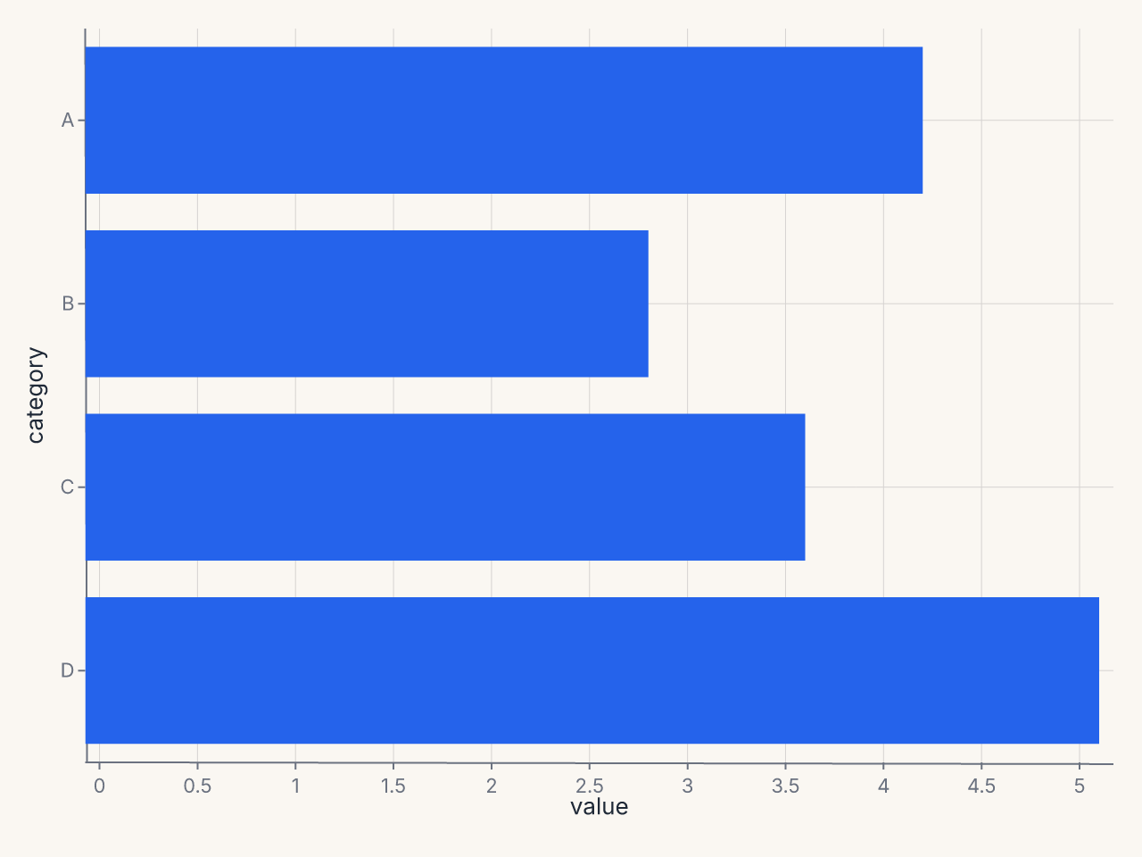
CoordFlip swaps the x and y axes at render time — the encoding stays as written, but the visual orientation flips. This is the idiomatic way to produce horizontal bar charts, lollipop charts, or any chart where the categorical axis should run vertically.
Other coordinate systems exist as classes — CoordPolar (for pie/donut/radial charts) and CoordGeo (for map projections) — but their renderer support is limited compared to CoordFlip and the default CoordCartesian.
Annotations: reference lines and text callouts
Layer mark_rule and mark_text on top of a data chart to add reference lines and text annotations:
import ferrum as fm
import polars as pl
import numpy as np

rng = np.random.default_rng(42)
df = pl.DataFrame({"x": rng.standard_normal(100), "y": rng.standard_normal(100)})

scatter = fm.Chart(df).mark_point(opacity=0.6).encode(x="x", y="y")

# Horizontal reference line at y=0
hline = fm.Chart(pl.DataFrame({"y": [0.0]})).mark_rule(stroke="red", stroke_dash=[4, 2]).encode(y="y")

# Vertical reference line at x=0
vline = fm.Chart(pl.DataFrame({"x": [0.0]})).mark_rule(stroke="red", stroke_dash=[4, 2]).encode(x="x")

# Text callout
label = (
    fm.Chart(pl.DataFrame({"x": [1.5], "y": [2.0], "label": ["outlier region"]}))
    .mark_text(fill="gray", font_size=10)
    .encode(x="x", y="y", text="label")
)

chart = scatter + hline + vline + label
chart
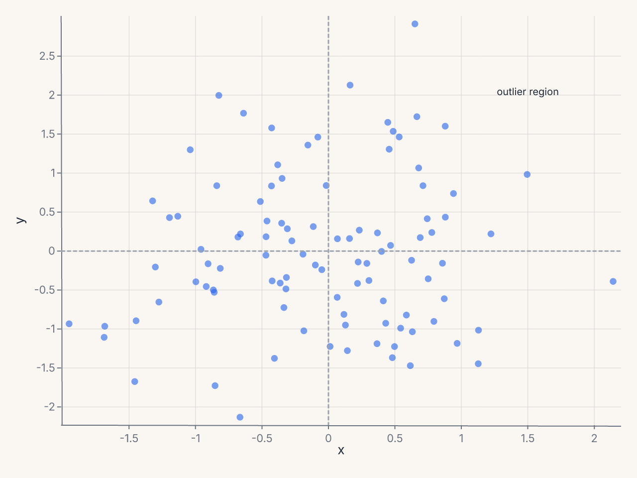
The + operator layers all marks on the same axes. mark_rule with only y encoded draws a horizontal line spanning the full plot width; with only x encoded it draws a vertical line spanning the full height. mark_text places text at the (x, y) position with the string from the text encoding channel.
Chart sizing
Control chart dimensions with .properties(width=..., height=...):
import ferrum as fm
import polars as pl

df = pl.DataFrame({"x": [1, 2, 3, 4, 5], "y": [2, 4, 3, 5, 4]})
chart = (
    fm.Chart(df)
    .mark_point()
    .encode(x="x", y="y")
    .properties(width=600, height=400)
)
chart
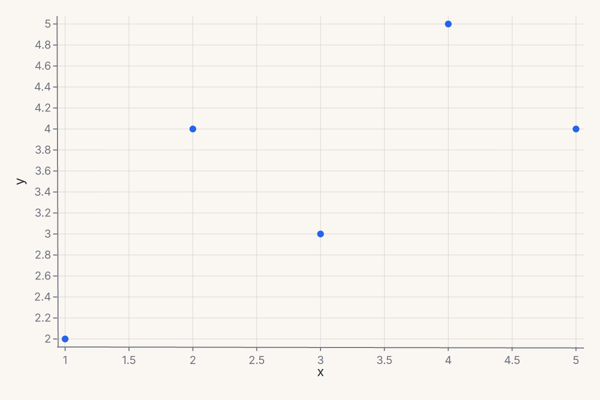
The default size is 600 x 400. Use .properties() when you need a wider plot for time series, a square plot for scatter matrices, or a compact sparkline.
Custom category order
Force a specific category order on a nominal axis with sort=:
import ferrum as fm
import polars as pl

df = pl.DataFrame({"size": ["L", "S", "M", "L", "S", "M"], "count": [30, 10, 20, 25, 15, 22]})
chart = (
    fm.Chart(df)
    .mark_bar()
    .encode(
        x=fm.X("size", type="N", sort=["S", "M", "L"]),
        y="count",
    )
)
chart
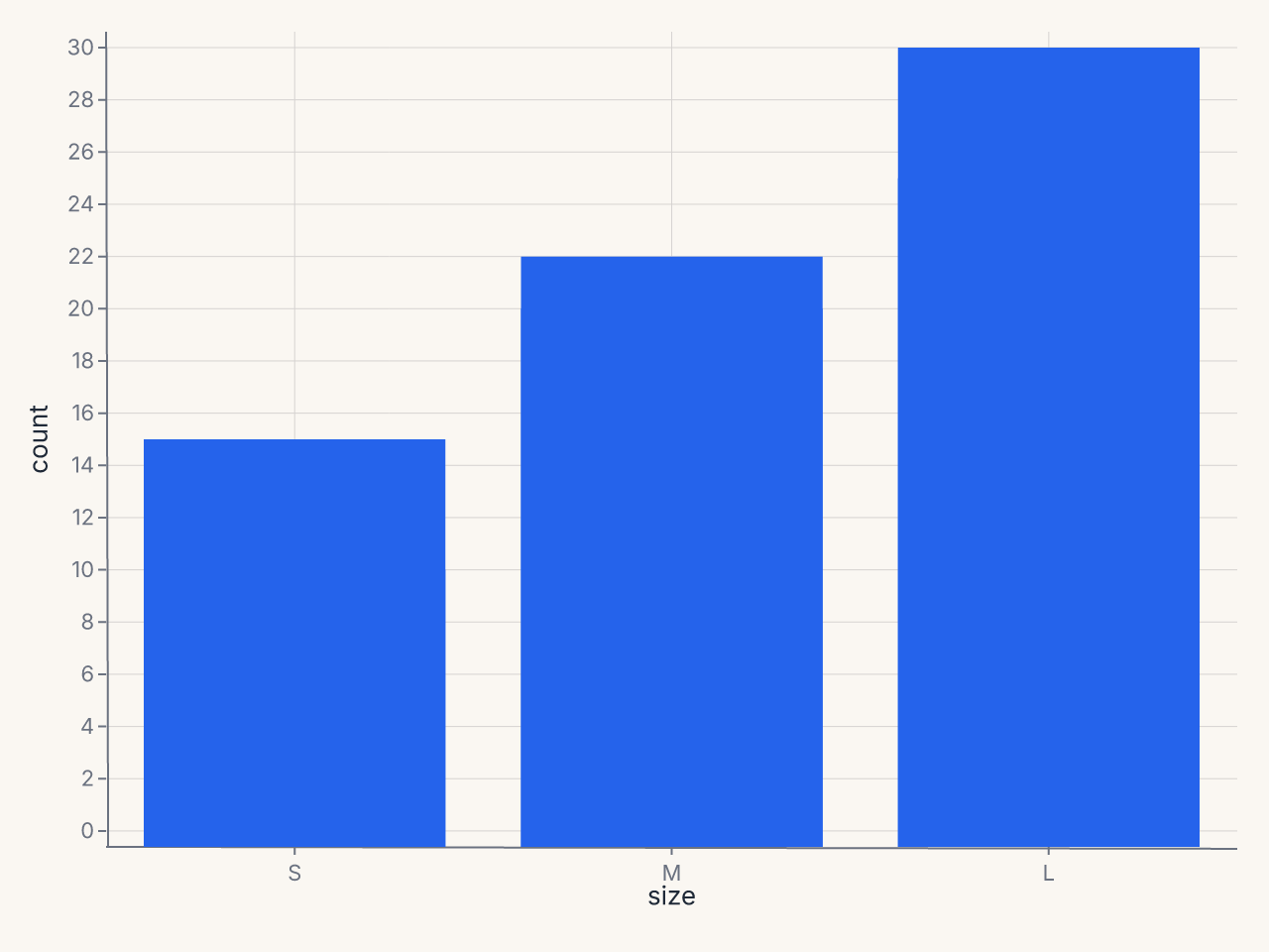
The sort= parameter on positional channels accepts a list of category values in the desired display order. Without it, categories appear in their natural (alphabetical) order.
Time-series line chart
Plot temporal data by tagging the date column with :T:
import ferrum as fm
import polars as pl
from datetime import date

df = pl.DataFrame({
    "date": [date(2024, 1, 1), date(2024, 2, 1), date(2024, 3, 1),
             date(2024, 4, 1), date(2024, 5, 1), date(2024, 6, 1)],
    "revenue": [100, 120, 115, 140, 155, 170],
})
chart = (
    fm.Chart(df)
    .mark_line()
    .encode(x="date:T", y="revenue")
)
chart
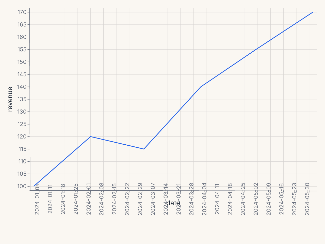
The :T suffix tells ferrum the x-axis is temporal, enabling date-aware tick formatting and axis scaling.
Filtered scatter with derived column
Apply data transforms before rendering — transform_filter removes rows and transform_calculate adds a computed column:
import ferrum as fm
import polars as pl

df = pl.DataFrame({
    "x": [1, 2, 3, 4, 5, 6, 7, 8, 9, 10],
    "y": [2.1, 4.3, 5.8, 8.2, 9.5, 12.1, 14.0, 15.8, 18.2, 20.1],
    "group": ["A", "A", "B", "B", "A", "B", "A", "B", "A", "B"],
})
chart = (
    fm.Chart(df)
    .transform(
        fm.transform_filter("datum.x > 2"),
        fm.transform_calculate("ratio", "datum.y / datum.x"),
    )
    .mark_point()
    .encode(x="x", y="ratio", color="group:N")
)
chart
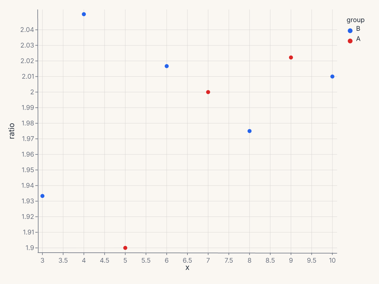
transform_filter removes rows where x <= 2, transform_calculate adds a derived ratio column. Both run in Rust before rendering.
ConcatChart wrapping grid
Arrange multiple charts in a wrapping grid layout using ConcatChart:
import ferrum as fm
import polars as pl

df = pl.DataFrame({
    "x": list(range(50)),
    "y": [v ** 0.5 for v in range(50)],
    "cat": ["A"] * 25 + ["B"] * 25,
})
charts = []
for mark_fn in [fm.Chart.mark_point, fm.Chart.mark_line, fm.Chart.mark_area, fm.Chart.mark_density]:
    c = mark_fn(fm.Chart(df)).encode(x="x", y="y", color="cat:N")
    charts.append(c)

grid = fm.ConcatChart(*charts, columns=2, spacing=15.0)
grid
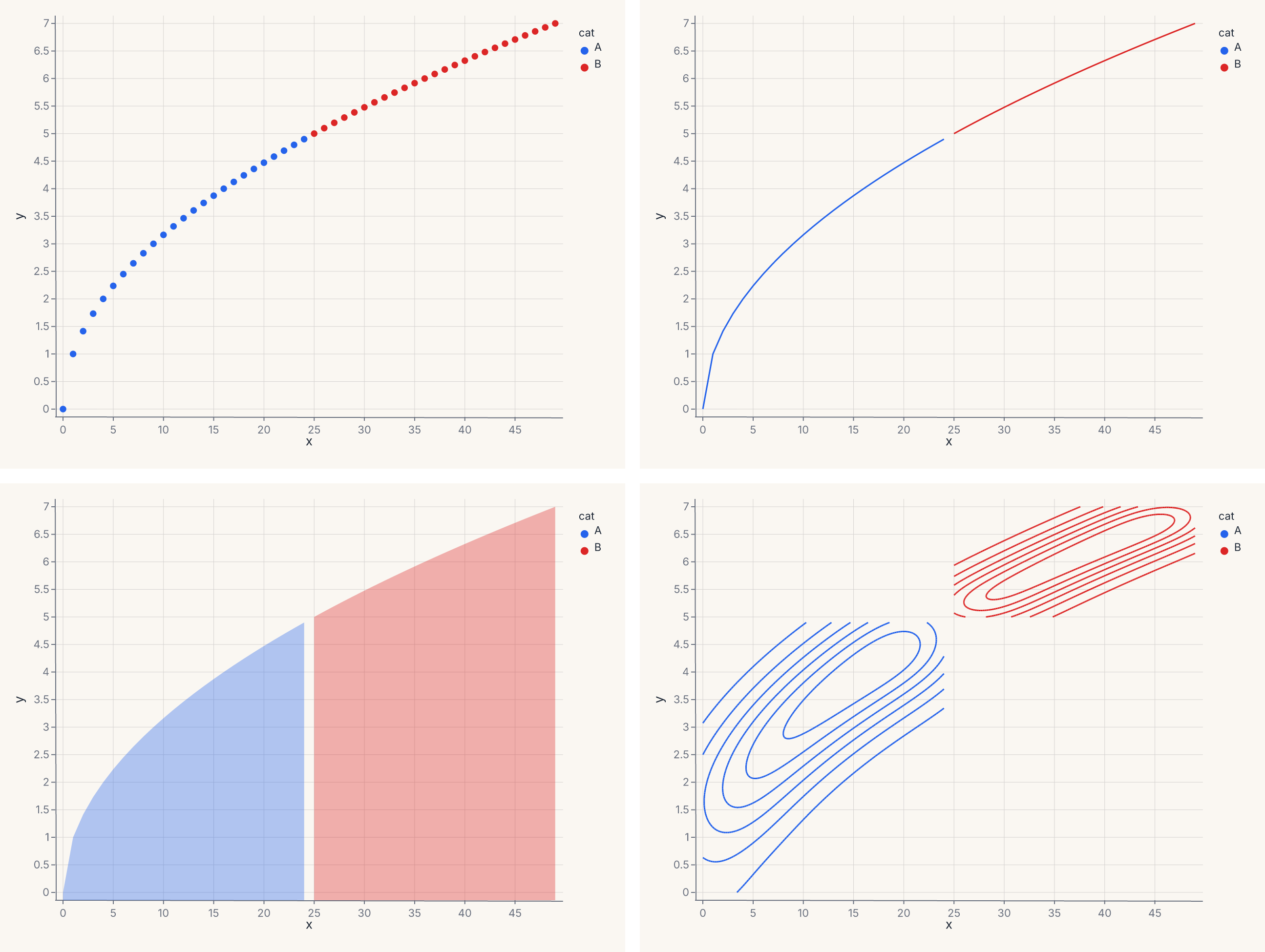
ConcatChart arranges 4 charts in a 2-column wrapping grid. Use it when charts share data but show different mark types or encodings.
Custom axis and legend
Use Axis(...) and Legend(...) value classes for per-channel control over axis presentation and legend layout:
import ferrum as fm
import polars as pl
from sklearn.datasets import load_iris

raw = load_iris()
iris = pl.DataFrame(raw.data, schema=["sepal_length", "sepal_width", "petal_length", "petal_width"]).with_columns(
    species=pl.Series([raw.target_names[t] for t in raw.target])
)
chart = (
    fm.Chart(iris)
    .mark_point(opacity=0.7)
    .encode(
        x=fm.X("sepal_length", axis=fm.Axis(title="Sepal Length (cm)", grid=False, label_angle=-45)),
        y=fm.Y("petal_length", axis=fm.Axis(title="Petal Length (cm)", tick_count=5)),
        color=fm.Color("species:N", legend=fm.Legend(orient="bottom", columns=3, title="Species")),
    )
)
chart
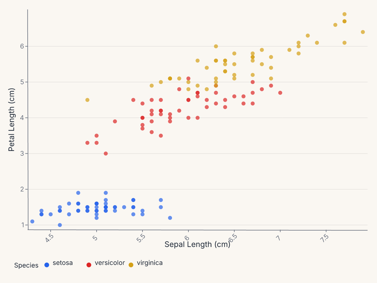
Axis(...) and Legend(...) give per-channel control over axis presentation and legend layout without affecting the theme.
Power-scaled bubble chart
Use SqrtScale on the size encoding so bubble area is proportional to the data value:
import ferrum as fm
import polars as pl

df = pl.DataFrame({
    "country": ["US", "China", "India", "Brazil", "UK", "France", "Japan", "Germany"],
    "gdp": [21.4, 14.7, 2.9, 1.8, 2.8, 2.7, 5.1, 3.8],
    "population": [331, 1412, 1380, 213, 67, 67, 126, 83],
    "continent": ["NA", "Asia", "Asia", "SA", "EU", "EU", "Asia", "EU"],
})
chart = (
    fm.Chart(df)
    .mark_point(opacity=0.7)
    .encode(
        x="gdp",
        y="population",
        size=fm.Size("population", scale=fm.SqrtScale(domain=[0, 1500])),
        color="continent:N",
    )
)
chart
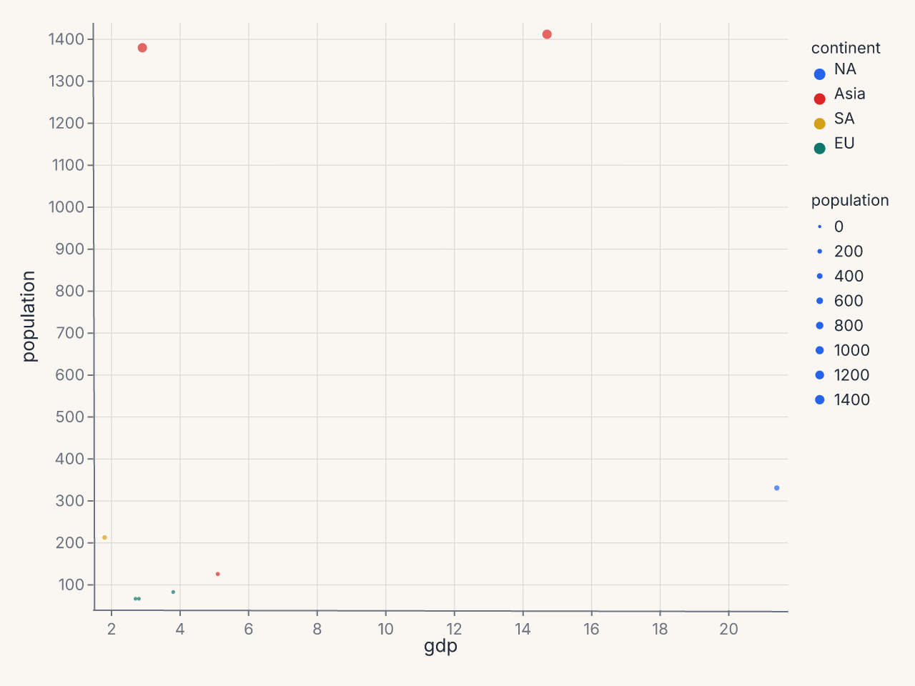
SqrtScale(domain=[0, 1500]) is equivalent to PowScale(domain=[0, 1500], exponent=0.5). It makes bubble area proportional to the data value — without it, large values visually dominate.
Where to go next
- Marks & encodings for the full mark and encoding reference.
- Composition for layering, concatenation, and compound views.
- Figure-level helpers for one-line entry points to common patterns.
- Saving & export for output formats and rendering options.