Marks & encodings
Two primitives carry every Ferrum chart: marks (the geometric shapes that visualize your data) and encodings (the typed mappings from data fields to visual variables). Picking the right mark + encoding combination is most of what authoring a chart looks like.
This page is the reference for both. It covers the encoding channels, the mark families, the shorthand syntax that compresses common cases, and when to reach for what.
How a chart is assembled
A Ferrum chart is built by attaching a mark to a data source and declaring which columns drive which visual variables. Every chart follows the same shape:
import ferrum as fm
import polars as pl
from sklearn.datasets import load_iris
raw = load_iris()
iris = pl.DataFrame(raw.data, schema=["sepal_length", "sepal_width", "petal_length", "petal_width"]).with_columns(
species=pl.Series([raw.target_names[t] for t in raw.target])
)
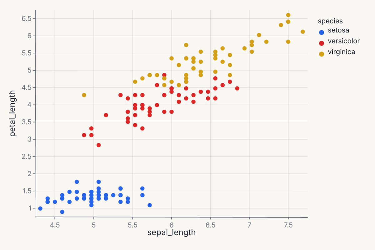
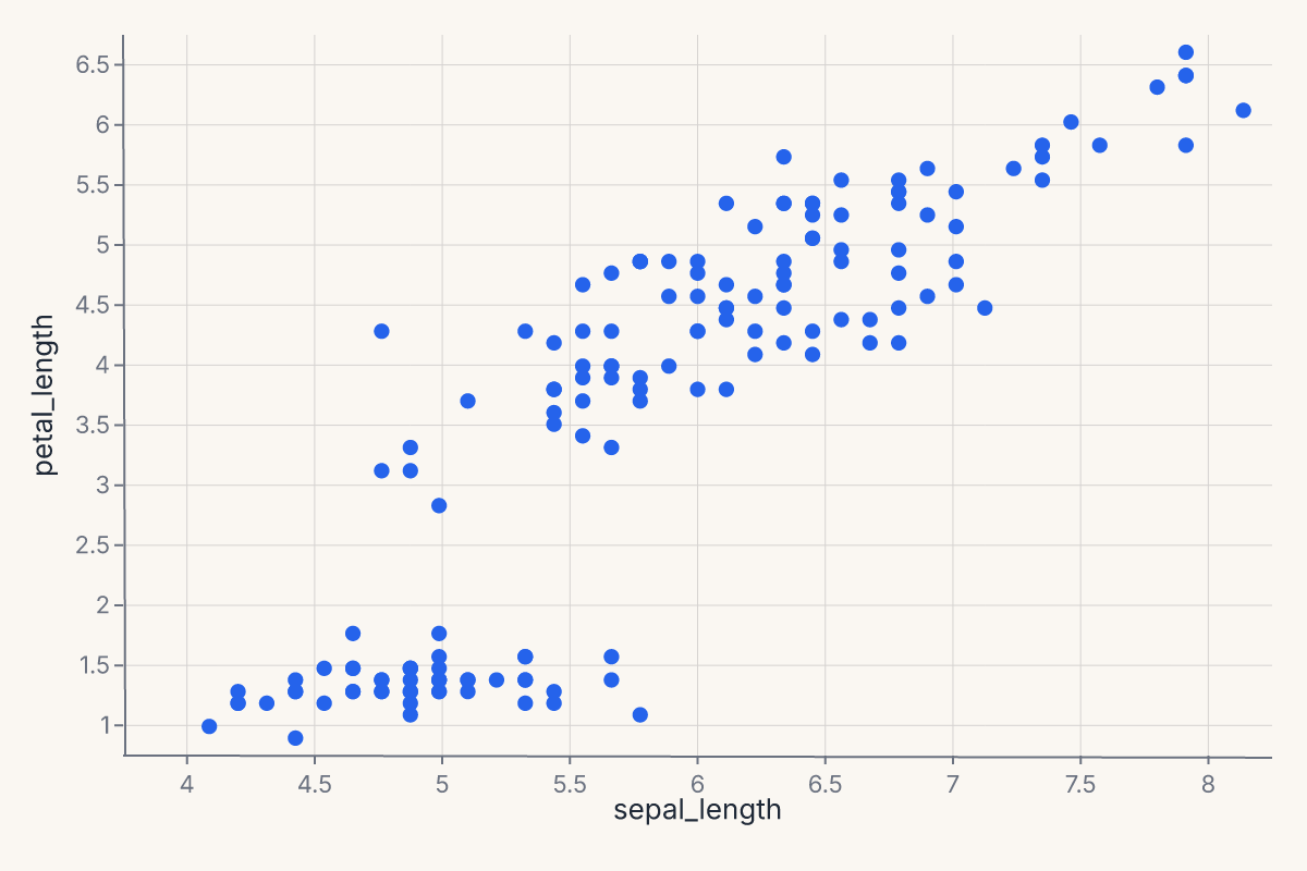
chart = (
fm.Chart(iris)
.mark_point()
.encode(x="sepal_length", y="petal_length", color="species:N")
)
chart
The three pieces — data, mark, encoding — compose freely. You can change the mark without touching the encoding (mark_line() instead of mark_point()), change the encoding without touching the mark, or compose multiple marks against the same encoding (see Composition).
Encoding channels
An encoding channel declares: this field drives this visual variable. Channels are typed by the engine: a quantitative field gets a continuous scale, a nominal field gets a categorical color palette, a temporal field gets a time scale. You can be explicit by passing an encoding object (fm.X("col", type="Q")) or use the shorthand syntax (described below).
Positional channels
These channels place marks in space:
| Channel | Purpose |
|---|---|
x, y |
Primary horizontal / vertical position. |
x2, y2 |
Secondary position. Used for bands, segments, intervals, error extents. |
xerror, yerror, xerror2, yerror2 |
Error extents around the primary position. |
theta, radius |
Polar coordinates. Used with CoordPolar. |
Most charts only declare x and y. The rest unlock band marks (mark_area, mark_errorband), intervals (mark_rect, mark_rule), and polar plots.
Appearance channels
These channels modulate how marks look:
| Channel | Purpose |
|---|---|
color |
Mark color. Continuous fields get a perceptually uniform palette; categorical fields get a discrete palette. |
fill, stroke |
Override color separately for the fill and stroke. color sets both. |
opacity, fill_opacity, stroke_opacity |
Mark opacity. |
stroke_width, stroke_dash |
Stroke styling. |
size |
Mark size. |
shape |
Mark glyph (for mark_point). |
angle |
Rotation. |
Appearance channels can take either a field name (data-driven) or a literal value (constant for all marks). Setting color="red" colors every mark red; setting color="species:N" colors marks by the species column.
Text and metadata channels
These channels carry information that does not directly map to position or appearance:
| Channel | Purpose |
|---|---|
text |
Text content for mark_text. |
detail |
Additional grouping that does not affect appearance — useful for keeping series separate without coloring them differently. |
tooltip, tooltip_field |
Field shown on hover. In interactive mode, renders as a tooltip overlay; in static output, becomes accessibility metadata. |
href |
URL the mark links to. |
description |
Accessibility description. |
key |
Stable identity for interactive selections. |
Faceting channels
These channels split the chart into small multiples:
| Channel | Purpose |
|---|---|
facet |
Single faceting variable, wrapped into a grid. |
facet_row, facet_col |
Row / column facets for a 2-D small-multiples grid. |
Faceting is structural: it produces multiple panels rather than overlaying marks. To layer marks against the same axes, use Composition.
The shorthand string syntax
Encodings accept a compact string syntax that handles the most common cases without explicit channel objects:
| Shorthand | Meaning |
|---|---|
"field" |
Field with inferred type (engine picks Q / N / O / T based on dtype). |
"field:Q" |
Explicitly quantitative. |
"field:N" |
Nominal (unordered categorical). |
"field:O" |
Ordinal (ordered categorical). |
"field:T" |
Temporal. |
"agg(field):Q" |
Aggregation. Examples: "mean(price):Q", "count():Q", "sum(qty):Q", "median(value):Q". |
The shorthand is purely syntactic sugar over the explicit form. fm.X("price", type="Q") and "price:Q" produce identical specs. The shorthand keeps simple cases compact; the explicit form unlocks advanced channel options.
When in doubt, use the explicit form:
import ferrum as fm
import polars as pl
from sklearn.datasets import load_iris

raw = load_iris()
iris = pl.DataFrame(raw.data, schema=["sepal_length", "sepal_width", "petal_length", "petal_width"]).with_columns(
    species=pl.Series([raw.target_names[t] for t in raw.target])
)
chart = (
    fm.Chart(iris)
    .mark_point()
    .encode(
        x=fm.X("sepal_length", type="Q", title="Sepal length"),
        y=fm.Y("petal_length", type="Q", title="Petal length"),
        color=fm.Color("species", type="N", title="Species"),
    )
)
chart

Position adjustments
Position adjustments control how marks that share the same x-position are arranged. Pass a position object to any mark's position= parameter.
Dodge — side-by-side (grouped bars)
Spreads marks into non-overlapping groups. The by parameter selects the grouping channel (defaults to color/fill).
import ferrum as fm
import polars as pl

df = pl.DataFrame({
    "category": ["A", "A", "B", "B"],
    "group": ["x", "y", "x", "y"],
    "value": [10.0, 15.0, 8.0, 12.0],
})
chart = (
    fm.Chart(df)
    .mark_bar(position=fm.Dodge(padding=0.05))
    .encode(x="category:N", y="value:Q", color="group:N")
)
Stack — stacked bars/areas
Accumulates marks vertically. The offset parameter controls the stacking strategy:
"zero"(default) — standard cumulative stack from y = 0."normalize"— 100% stack; each x-bin scales to a total of 1."center"— streamgraph; symmetric around y = 0.
chart = (
    fm.Chart(df)
    .mark_bar(position=fm.Stack(offset="normalize"))
    .encode(x="category:N", y="value:Q", color="group:N")
)
Jitter — random displacement for overplotting
Adds controlled noise to one or both axes. Output is deterministic for a given dataset and seed.
chart = (
    fm.Chart(df)
    .mark_point(position=fm.Jitter(axis="x", width=0.3, seed=42))
    .encode(x="category:N", y="value:Q")
)
Axis customization
Scale types
Positional channels accept an explicit scale via the scale= parameter. Ferrum exposes five scale classes:
| Scale | Usage |
|---|---|
LinearScale |
Default continuous scale. |
LogScale |
Logarithmic (base-10 by default; configurable via base=). |
SymlogScale |
Symmetric log — handles zero and negatives. |
TimeScale |
Temporal axis. |
OrdinalScale |
Discrete/categorical. |
See Scale Types for the full scale reference including PowScale, BandScale, PointScale, and color scales.
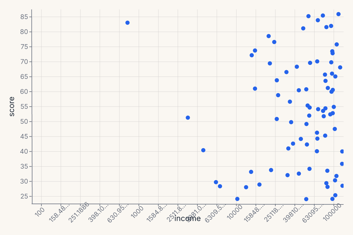
import ferrum as fm
import polars as pl
import numpy as np

rng = np.random.default_rng(42)
df_log = pl.DataFrame({"income": rng.uniform(100, 100000, 80), "score": rng.uniform(20, 90, 80)})
chart = (
    fm.Chart(df_log)
    .mark_point(size=40)
    .encode(
        x=fm.X("income", scale=fm.LogScale(domain=[100, 100000], base=10)),
        y="score:Q",
    )
)
chart
Axis limits (domain)
Set explicit axis limits by passing a domain= list to the scale constructor:
import ferrum as fm
import polars as pl
from sklearn.datasets import load_iris

raw = load_iris()
iris = pl.DataFrame(raw.data, schema=["sepal_length", "sepal_width", "petal_length", "petal_width"])
chart = (
    fm.Chart(iris)
    .mark_point(size=40)
    .encode(
        x=fm.X("sepal_length", scale=fm.LinearScale(domain=[4, 8])),
        y="petal_length:Q",
    )
)
chart
Reversed axis
Swap the domain endpoints to reverse an axis:
# Reversed y-axis (high values at bottom)
chart = (
    fm.Chart(df)
    .mark_point()
    .encode(
        x="x:Q",
        y=fm.Y("depth", scale=fm.LinearScale(domain=[100, 0])),
    )
)
Legend control
The legend parameter on appearance channels controls legend rendering.
Suppressing the legend
Pass legend=False or legend=None to hide the legend for a channel:
chart = (
    fm.Chart(df)
    .mark_point()
    .encode(
        x="x:Q", y="y:Q",
        color=fm.Color("species", legend=False),
    )
)
Legend title
The legend title defaults to the field name. Override it with the title= parameter on the encoding channel:
chart = (
    fm.Chart(df)
    .mark_point()
    .encode(
        x="x:Q", y="y:Q",
        color=fm.Color("species", title="Iris species"),
    )
)
Legend suppression is currently supported on Color. Other appearance channels (size, shape) accept the legend kwarg but it is reserved for future use.
See Legend for per-channel legend customization via the Legend(...) value class.
Palette cycling
When the number of distinct categories exceeds the palette length, colors cycle — category i receives palette[i % len(palette)]. The same modular-index strategy applies to the shape palette. This means that with many categories, some groups will share a color or glyph. If your data has more groups than palette entries, consider switching to a larger palette via scheme= or reducing cardinality before plotting.
See Color for programmatic palette access.
Mark families
Ferrum ships 54 mark methods on Chart. They group into families by what they're for.
Primitive marks
The geometric building blocks. Use these when you want direct control over what gets drawn.
| Method | Geometry |
|---|---|
mark_point() |
Discrete points. The default scatter mark. |
mark_line() |
Polyline connecting points in order. |
mark_area() |
Filled area, optionally banded with y2. |
mark_bar() |
Vertical or horizontal bars. |
mark_rect() |
Rectangular cells. Used for heatmaps and intervals. |
mark_rule() |
Reference lines (often horizontal or vertical). |
mark_text() |
Text labels (paired with the text encoding). |
mark_label() |
Positioned text labels with automatic collision avoidance. |
mark_image() |
Image tiles from URL fields. |
mark_tick() |
Short ticks, often used for rug plots. |
mark_segment() |
Arbitrary line segments from (x, y) to (x2, y2). |
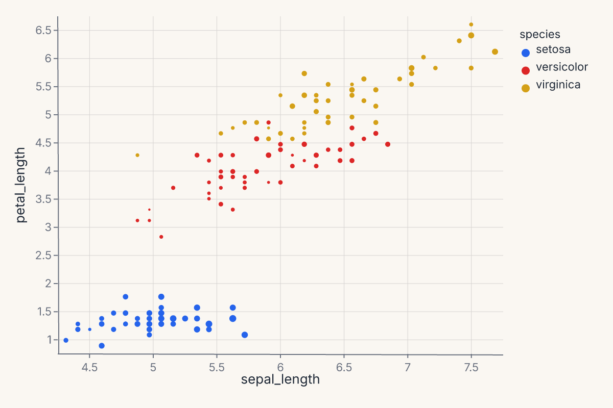
Example — basic scatter:
import ferrum as fm
import polars as pl
from sklearn.datasets import load_iris

raw = load_iris()
iris = pl.DataFrame(raw.data, schema=["sepal_length", "sepal_width", "petal_length", "petal_width"]).with_columns(
    species=pl.Series([raw.target_names[t] for t in raw.target])
)
chart = (
    fm.Chart(iris)
    .mark_point()
    .encode(
        x="sepal_length",
        y="petal_length",
        color="species:N",
        size="sepal_width",
    )
)
chart
Statistical marks
These marks compute a transform on your data before rendering — KDE, binning, smoothing, contours, quantile-quantile reference, or arbitrary functions. The transform happens in Rust, declared in the chart spec.
| Method | Transform |
|---|---|
mark_smooth() |
LOESS or OLS regression overlay (with optional CI band). |
mark_errorbar() |
Error bars with optional terminal ticks. |
mark_errorband() |
Filled band between y and y2. |
mark_histogram() |
Binned counts or densities. |
mark_density() |
1-D kernel density estimate. |
mark_contour() |
2-D density contours. |
mark_hex() |
Hexagonal binning for large datasets. stroke/stroke_width draw cell borders. |
mark_raster() |
Pre-aggregated rectangular grid. |
mark_qq() |
Quantile-quantile plot against a reference distribution. |
mark_function() |
Plot an arbitrary f(x) over a domain. |
Transform kwargs (bandwidth, bin_count, ci, …) control the computation; they are independent of the constant mark-style kwargs above. Statistical marks accept both, and the style applies to every layer the mark emits — for mark_smooth(ci=...) that means the regression line and the CI ribbon together:
# Overlapping translucent KDEs: opacity is a mark-style kwarg, bandwidth is a transform kwarg
fm.Chart(df).mark_density(bandwidth="scott", opacity=0.4).encode(x="value:Q", color="group:N")
A few marks reserve a name for the transform: mark_density(fill=False) selects a line instead of a filled area, and mark_hex reads cmap/stroke/stroke_width as its own parameters — use color= for a constant hex fill.
mark_smooth methods
The smoothing method is selected with the method= kwarg. The computation runs in Rust.
| Method | Description |
|---|---|
"loess" (default) |
Locally-weighted polynomial regression. |
"lm" |
Ordinary least-squares linear fit. |
Key parameters:
ci— confidence interval level (e.g.0.95). When set, emits a ribbon + line layered chart. DefaultNone(no band).bandwidth— LOESS span fraction in(0, 1]. Default0.75. Ignored whenmethod="lm".degree— LOESS polynomial degree (1or2). Default2. Ignored whenmethod="lm".n— number of evaluation grid points. Default200.
Note
"logistic" regression is available via the separate Logistic transform (used by lmplot), not through mark_smooth.
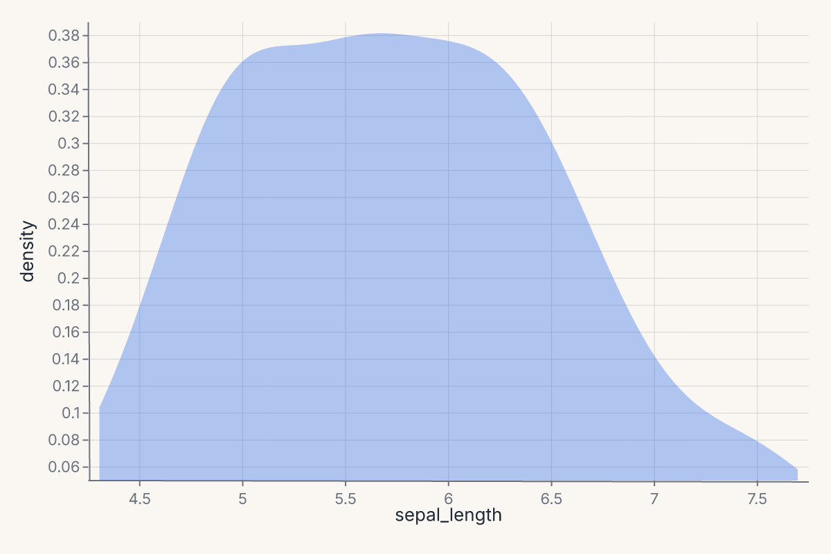
Example — 1-D kernel density estimate:
import ferrum as fm
import polars as pl
from sklearn.datasets import load_iris

raw = load_iris()
iris = pl.DataFrame(raw.data, schema=["sepal_length", "sepal_width", "petal_length", "petal_width"]).with_columns(
    species=pl.Series([raw.target_names[t] for t in raw.target])
)
chart = (
    fm.Chart(iris)
    .mark_density(bandwidth="scott")
    .encode(x="sepal_length")
)
chart
Stat marks are described in detail in Stats in the rendering pipeline.
Grouped transforms with groupby
Statistical marks compute their transform over the entire dataset by default. To compute independently per group — one LOESS line per species, one KDE per category — pass groupby=:
import ferrum as fm
import polars as pl
from sklearn.datasets import load_iris

raw = load_iris()
iris = pl.DataFrame(raw.data, schema=["sepal_length", "sepal_width", "petal_length", "petal_width"]).with_columns(
    species=pl.Series([raw.target_names[t] for t in raw.target])
)
chart = (
    fm.Chart(iris)
    .mark_smooth(method="loess", groupby="species")
    .encode(x="sepal_length", y="petal_length", color="species:N")
)
chart
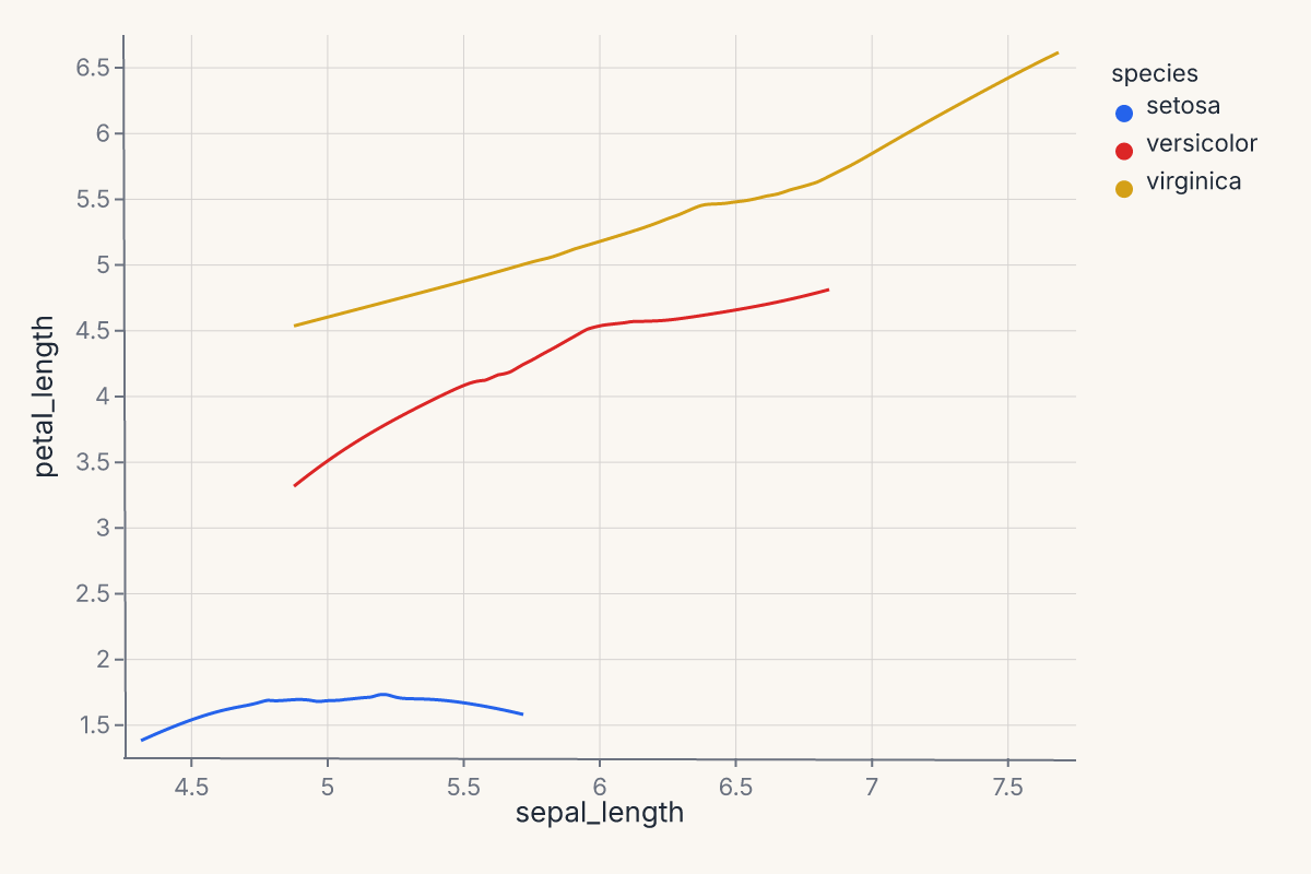
The groupby parameter is available on mark_smooth, mark_density, and mark_histogram. The group column is preserved in the transform output so downstream color= encoding maps each group to a distinct visual.
This is especially important when layering a statistical mark with a scatter via + — without groupby, the transform runs over all data combined and produces a single aggregate line.
Distribution-summary marks
For comparing categorical distributions at a glance:
| Method | Geometry |
|---|---|
mark_boxplot() |
Tukey boxplot — quartiles, whiskers, outliers. |
mark_violin() |
Symmetric KDE per group. |
mark_boxen() |
Letter-value boxplot — more quantiles for larger samples. |
mark_swarm() |
Beeswarm jitter (categorical scatter without overlap). |
Example — boxplot by species:
import ferrum as fm
import polars as pl
from sklearn.datasets import load_iris
raw = load_iris()
iris = pl.DataFrame(raw.data, schema=["sepal_length", "sepal_width", "petal_length", "petal_width"]).with_columns(
species=pl.Series([raw.target_names[t] for t in raw.target])
)
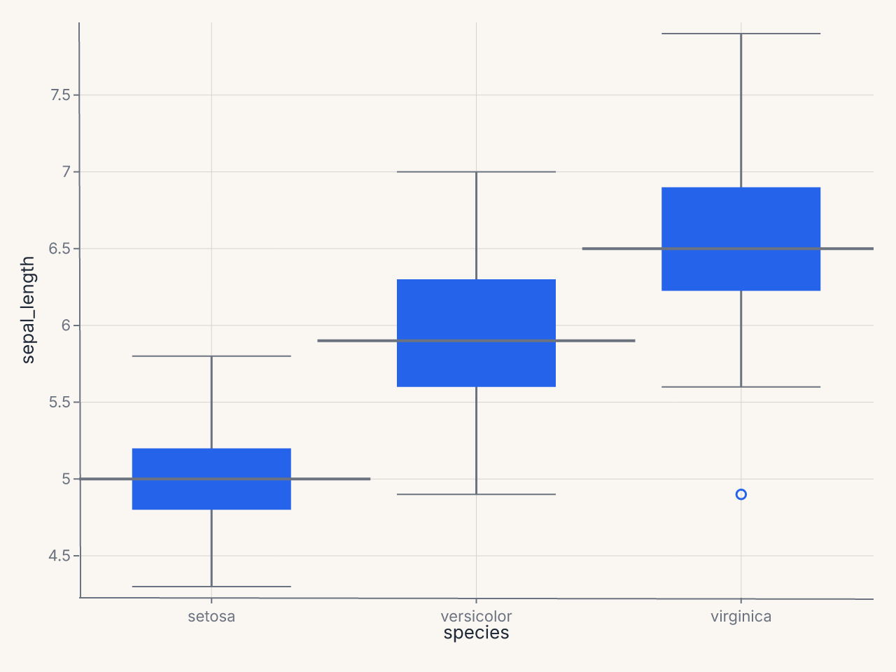
chart = (
fm.Chart(iris)
.mark_boxplot()
.encode(x="species:N", y="sepal_length")
)
chart

Composition marks
| Method | Geometry |
|---|---|
mark_ribbon() |
Continuous band, typically paired with a line overlay. |
Other marks
| Method | Geometry |
|---|---|
mark_geoshape() |
Geographic polygons (GeoJSON-backed). |
mark_arc() |
Arc/wedge segments for pie and donut charts (polar coordinates). |
Model-diagnostic marks
These marks work with ModelSource to produce evaluation plots. For most use cases, prefer the figure-level helpers (roc_chart, calibration_chart, etc.) covered in Figure-level helpers. The marks exist for when you want grammar-level composition of custom diagnostic views.
Classification:
| Method | Purpose |
|---|---|
mark_roc() |
ROC curve with AUC annotation. |
mark_pr() |
Precision-recall curve. |
mark_calibration() |
Calibration (reliability) curve. |
mark_confusion() |
Confusion matrix heatmap. |
mark_class_prediction_error() |
Stacked prediction-error bars by class. |
mark_discrimination_threshold() |
Metrics vs. decision threshold. |
mark_gain() |
Cumulative gains chart. |
mark_lift() |
Lift curve. |
Regression:
| Method | Purpose |
|---|---|
mark_residuals() |
Residuals vs. fitted values. |
mark_prediction_error() |
Predicted vs. actual scatter with identity line. |
Explanation:
| Method | Purpose |
|---|---|
mark_importance() |
Feature importance bar chart. |
mark_shap_beeswarm() |
SHAP beeswarm summary plot. |
mark_shap_bar() |
SHAP mean-absolute bar plot. |
mark_shap_waterfall() |
SHAP waterfall for a single prediction. |
mark_pdp() |
Partial dependence plot. |
Model selection:
| Method | Purpose |
|---|---|
mark_learning_curve() |
Train/test score vs. sample size. |
mark_validation_curve() |
Score vs. hyperparameter value. |
mark_cv_scores() |
Cross-validation score distribution. |
mark_alpha_selection() |
Regularization path (alpha vs. metric). |
Clustering and manifold:
| Method | Purpose |
|---|---|
mark_silhouette() |
Silhouette coefficient per sample. |
mark_pca_scree() |
PCA explained variance scree plot. |
mark_intercluster_distance() |
Inter-cluster distance map. |
mark_decision_boundary() |
2-D decision boundary contour. |
mark_rank1d() |
Univariate feature ranking. |
mark_rank2d() |
Pairwise feature ranking matrix. |
mark_parallel_coordinates() |
Parallel coordinates plot by class. |
Mark shortcuts
Several common mark configurations have dedicated aliases to keep code concise.
mark_circle() and mark_square() are convenience aliases for mark_point(shape="circle") and mark_point(shape="square") respectively. They accept the same keyword arguments as mark_point().
chart = fm.Chart(df).mark_circle(size=60).encode(x="x", y="y", color="group:N")
chart = fm.Chart(df).mark_square(size=60).encode(x="x", y="y", color="group:N")
mark_line(point=True) overlays point markers at each data coordinate on top of the line — a common pattern for time-series where individual observations should be visible:
"|" and "-" point shapes render vertical and horizontal line markers respectively. These are useful as per-point glyphs in strip plots or rug-like overlays:
Friendly kwarg aliases
Every mark — primitive (mark_point, mark_line), statistical (mark_density, mark_histogram, mark_smooth), and composite (mark_boxplot, mark_violin) — accepts the same constant mark-style kwargs (opacity, fill, stroke, stroke_width, stroke_dash, size), plus short, familiar aliases for them. Aliases are resolved before the spec is compiled — they have no runtime cost and produce identical output.
| Alias | Canonical | Notes |
|---|---|---|
color="red" |
fill="red" |
Sets the mark fill color directly. |
alpha=0.5 |
opacity=0.5 |
Mark opacity in [0, 1]. |
linetype="dashed" |
stroke_dash=[4, 2] |
Named line patterns; see table below. |
Named linetype values and their dash arrays:
linetype= |
Dash pattern |
|---|---|
"solid" |
[] (solid line) |
"dashed" |
[4, 2] |
"dotted" |
[1, 3] |
"dashdot" |
[4, 2, 1, 2] |
"longdash" |
[8, 4] |
# These three produce identical output:
fm.Chart(df).mark_line(alpha=0.7, color="steelblue", linetype="dashed").encode(x="x", y="y")
fm.Chart(df).mark_line(opacity=0.7, fill="steelblue", stroke_dash=[4, 2]).encode(x="x", y="y")
Picking a mark
A quick decision guide for the common cases:
- One variable, looking at distribution shape?
mark_density()ormark_histogram(). - One variable across groups?
mark_boxplot()(ormark_violin()for symmetric KDEs,mark_swarm()for full points). - Two variables, looking at relationship?
mark_point()(low cardinality),mark_hex()(high cardinality),mark_smooth()overlaid on points (with a regression line). - Two variables over time?
mark_line(), optionally withmark_ribbon()ormark_errorband()for uncertainty. - Counts by category?
mark_bar(). Addencode(color="...")and a stacking position adjustment for stacked bars. - A discrete grid of values?
mark_rect(). The same primitive serves heatmaps and binned 2-D histograms. - Model diagnostic? Use the figure-level helpers in Figure-level helpers and Model diagnostics rather than calling diagnostic marks directly.
A complete example
Combining multiple marks against one data source with shared encodings (full composition is covered on the Composition page):
import ferrum as fm
import polars as pl
from sklearn.datasets import load_iris
raw = load_iris()
iris = pl.DataFrame(raw.data, schema=["sepal_length", "sepal_width", "petal_length", "petal_width"]).with_columns(
species=pl.Series([raw.target_names[t] for t in raw.target])
)
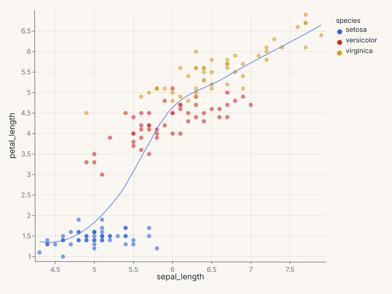
points = (
fm.Chart(iris)
.mark_point(opacity=0.6)
.encode(x="sepal_length", y="petal_length", color="species:N")
)
trend = (
fm.Chart(iris)
.mark_smooth(method="loess")
.encode(x="sepal_length", y="petal_length", color="species:N")
)
combined = points + trend
combined
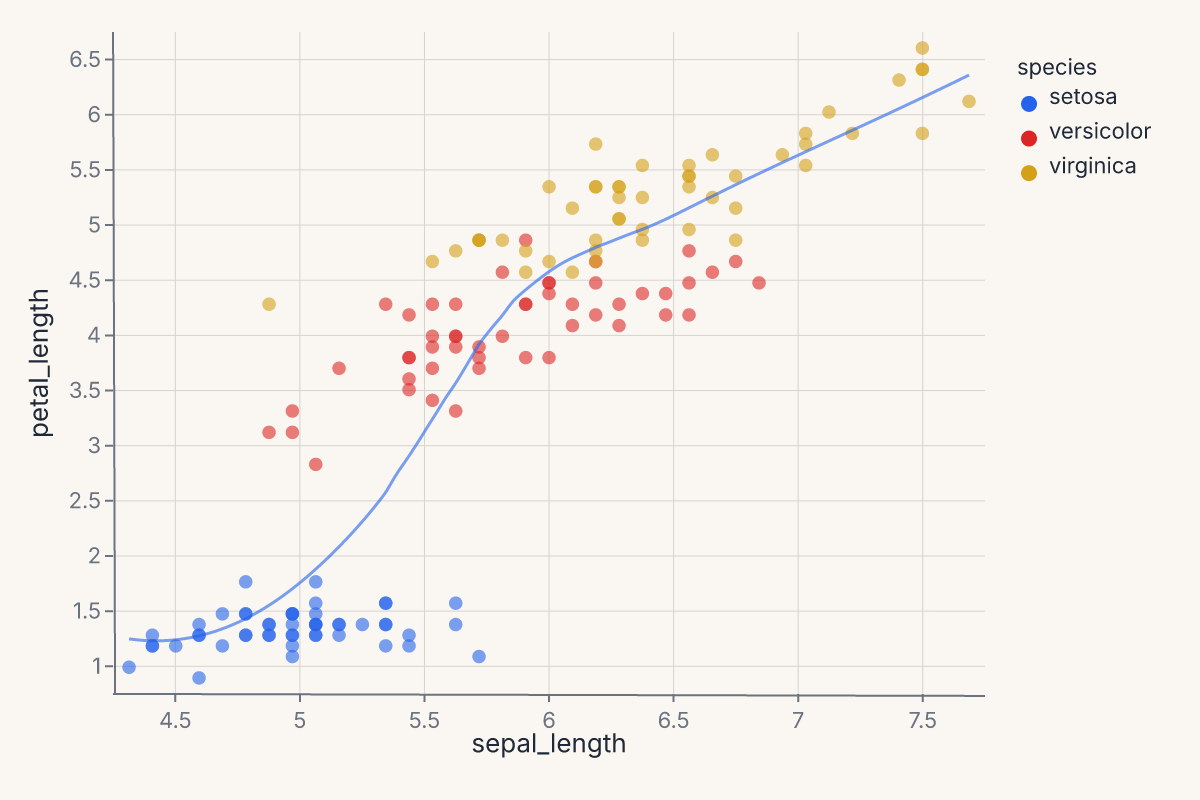
This puts a per-species LOESS overlay on top of a scatter. Same encoding, two marks, one layered chart — the + operator on Chart produces a layered view that renders both marks against the same axes.
Where to go next
- Composition for how to combine multiple marks and charts into compound views (
Layer,HConcat,VConcat,JointChart, etc.). - Themes for changing how marks look without changing the chart spec.
- Figure-level helpers for one-line entry points to common chart patterns.
- Stats in the rendering pipeline for the design rationale behind statistical marks.
- The API Reference for the full method signatures of every mark and encoding channel.