First plot
This page gets you from zero to a rendered chart in under a minute. By the end you'll have a scatter plot, a layered chart, and a saved SVG — and you'll know the three-piece pattern that every Ferrum chart follows.
Prerequisites
This tutorial uses scikit-learn for sample datasets. If you followed the
recommended install (pip install ferrum-viz[all]), you
already have it. If you chose the lean install, run
pip install ferrum-viz[models] first.
The pattern
Every Ferrum chart is data + mark + encoding:
import ferrum as fm
import polars as pl
from sklearn.datasets import load_iris

raw = load_iris()
iris = pl.DataFrame(raw.data, schema=["sepal_length", "sepal_width", "petal_length", "petal_width"]).with_columns(
    species=pl.Series([raw.target_names[t] for t in raw.target])
)
chart = (
    fm.Chart(iris)
    .mark_point()
    .encode(x="sepal_length", y="petal_length", color="species:N")
)
chart
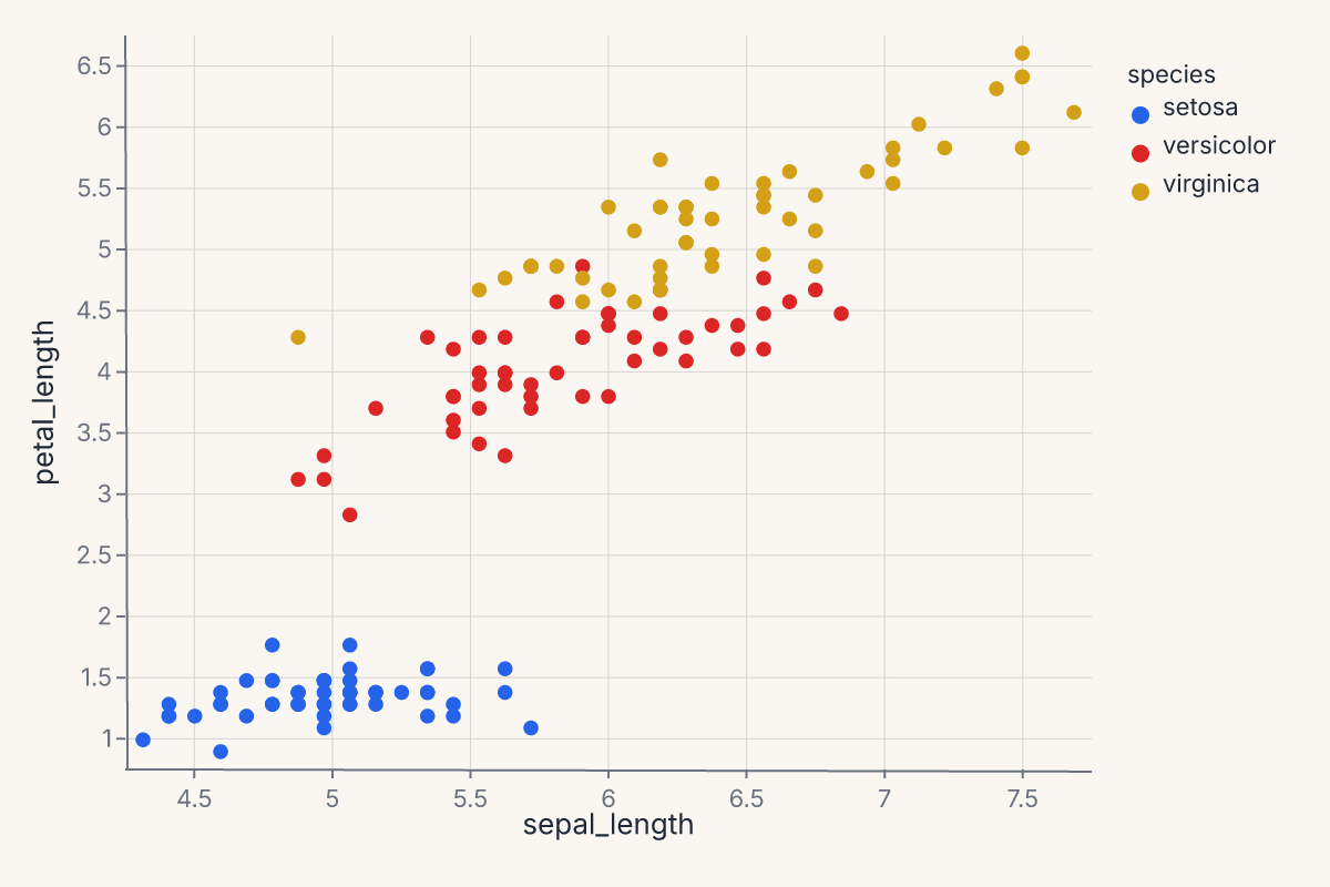
That's the whole thing: Chart(data) binds your DataFrame, .mark_point() picks the geometry, .encode(...) maps columns to visual channels. The result is a Chart object — call .to_svg() to render it, .save() to write it to disk, or just display it in a Jupyter notebook (where it renders automatically).
Add a trend line
Want a regression overlay? Layer it with +:
import ferrum as fm
import polars as pl
from sklearn.datasets import load_iris

raw = load_iris()
iris = pl.DataFrame(raw.data, schema=["sepal_length", "sepal_width", "petal_length", "petal_width"]).with_columns(
    species=pl.Series([raw.target_names[t] for t in raw.target])
)
points = (
    fm.Chart(iris)
    .mark_point(opacity=0.6)
    .encode(x="sepal_length", y="petal_length", color="species:N")
)
trend = (
    fm.Chart(iris)
    .mark_smooth(method="loess", groupby="species")
    .encode(x="sepal_length", y="petal_length", color="species:N")
)
chart = points + trend
chart
groupby="species" tells the smoother to fit a separate curve per group rather than one curve through all points. See the Marks reference for the full parameter list on each mark.
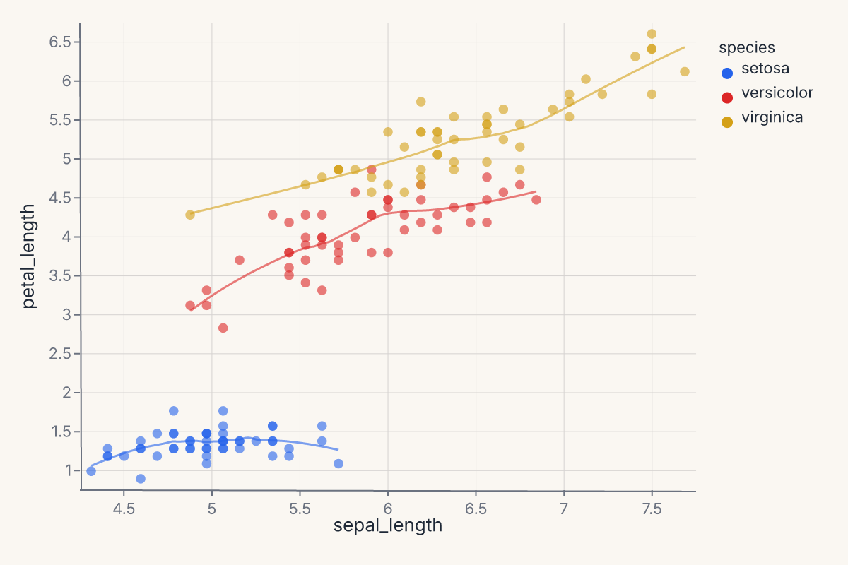
The + operator always layers — both marks share the same axes. The LOESS smooth is computed in Rust; you declared what you wanted, not how to compute it.
Try a different mark
Different questions call for different marks. The pattern is always the same — data, mark, encoding:
import ferrum as fm
import polars as pl
from sklearn.datasets import load_iris
raw = load_iris()
iris = pl.DataFrame(raw.data, schema=["sepal_length", "sepal_width", "petal_length", "petal_width"]).with_columns(
species=pl.Series([raw.target_names[t] for t in raw.target])
)
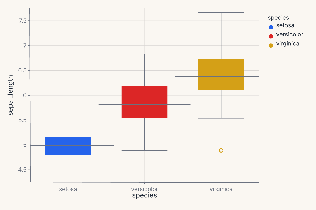
chart = (
fm.Chart(iris)
.mark_boxplot()
.encode(x="species:N", y="sepal_length", color="species:N")
)
chart
Apply a theme
Themes are one method call:
import ferrum as fm
import polars as pl
from sklearn.datasets import load_iris

raw = load_iris()
iris = pl.DataFrame(raw.data, schema=["sepal_length", "sepal_width", "petal_length", "petal_width"]).with_columns(
    species=pl.Series([raw.target_names[t] for t in raw.target])
)
chart = (
    fm.Chart(iris)
    .mark_point()
    .encode(x="sepal_length", y="petal_length", color="species:N")
    .theme(fm.themes.publication)
)
chart
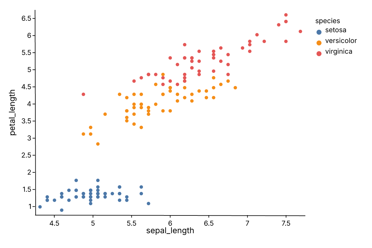
Ferrum ships twelve built-in themes in the themes module — from Paper Ink (the warm default) to dark, publication, and editorial styles.
See Configuration and ferrum.config for more on customization.
Axis labels and limits
You don't have to reach into encoding declarations to set human-readable axis labels. .labs() sets them post-hoc:
import ferrum as fm
import polars as pl
from sklearn.datasets import load_iris

raw = load_iris()
iris = pl.DataFrame(raw.data, schema=["sepal_length", "sepal_width", "petal_length", "petal_width"]).with_columns(
    species=pl.Series([raw.target_names[t] for t in raw.target])
)
chart = (
    fm.Chart(iris)
    .mark_point()
    .encode(x="sepal_length", y="petal_length", color="species:N")
    .labs(x="Sepal length (cm)", y="Petal length (cm)", title="Iris — sepal vs. petal")
)
chart
To clip the axis range without modifying the encoding, use .xlim() and .ylim():
Both are shortcuts: .labs() is equivalent to setting title= on each channel object; .xlim() / .ylim() are equivalent to scale=fm.LinearScale(domain=[lo, hi]) on the positional channel. They are there for when you want the result quickly without remembering the full API path.
What just happened
In four snippets you used:
- Data binding —
fm.Chart(iris)accepts polars, pandas, modin, cuDF, dask, ibis, pyarrow, or dict-of-arrays. One constructor. - Marks —
mark_point(),mark_smooth(),mark_boxplot(). Ferrum has 54 marks covering primitives, statistical transforms, distributions, and model diagnostics. - Encodings —
x,y,color. Shorthand strings like"species:N"set the type (Nominal). The:Nsuffix declares the field as Nominal (categorical); Ferrum supports four type codes::Q(quantitative/continuous),:N(nominal/categorical),:O(ordinal/ranked), and:T(temporal/datetime). See Marks & encodings for details. The full formfm.X("field", type="Q", title="...")gives finer control. - Composition —
+layers marks on shared axes.|and&concatenate charts side-by-side or stacked. - Themes —
.theme(fm.themes.publication)swaps the entire visual style without touching the data or encoding.
Where to go next
- Marks & encodings — the full mark and encoding reference.
- Composition — layering, concatenation, joint charts, repeat grids.
- Themes — the twelve built-in themes, custom themes, and scoped defaults.
- Figure-level helpers — one-line entry points for common chart patterns.
- Model diagnostics — ROC curves, confusion matrices, SHAP — all as charts.