Figure-level helpers
Figure-level helpers are one-line entry points for common chart patterns. They are convenience over the grammar, not parallel objects: each helper builds a Chart (or a compound view like JointChart / RepeatChart / ClusterMapChart) and returns it. The result is themeable, composable, savable, and renderable in exactly the same way as a chart you wrote from primitives.
This page covers the grammar-level helpers in [ferrum.plots][]. Each is also available at the top level (fm.displot ≡ fm.plots.displot). For diagnostic helpers (roc_chart, confusion_matrix_chart, etc.), see Model diagnostics.
When to use a helper
Reach for a helper when:
- You want the canonical version of a common chart with one call.
- You're prototyping and the chart shape is more important than fine-grained control.
- You're following a seaborn-style mental model (
displot,catplot,lmplotfollow seaborn's signatures intentionally).
Drop down into the grammar when:
- You need a mark or transform that the helper doesn't expose.
- You want to layer the helper output with something else (you can — see the end of this page).
- You're authoring a chart that doesn't fit any of the standard patterns.
The two paths converge: a helper's output and a grammar-authored chart are the same kind of object. Switching between them mid-pipeline is a non-event.
Grammar-level helpers
| Helper | What it produces | Family |
|---|---|---|
displot |
Univariate distribution | Distribution |
catplot |
Categorical comparison | Categorical |
relplot |
Relational scatter or line | Relational |
lmplot |
Regression scatter with fit overlay | Regression |
regplot |
Single-axes regression plot | Regression |
residplot |
Residuals from a regression fit | Regression |
pairplot |
Pairwise scatter grid | Matrix |
heatmap |
2-D heatmap of a wide table | Matrix |
clustermap |
Clustered heatmap with dendrograms | Matrix |
jointplot |
Bivariate plot with marginal distributions | Joint |
Distribution: displot
A univariate distribution plot. Supports kind="hist" (default), "kde", "ecdf", and "rug". Returns a Chart.
import ferrum as fm
import polars as pl
from sklearn.datasets import load_iris
raw = load_iris()
iris = pl.DataFrame(raw.data, schema=["sepal_length", "sepal_width", "petal_length", "petal_width"]).with_columns(
species=pl.Series([raw.target_names[t] for t in raw.target])
)
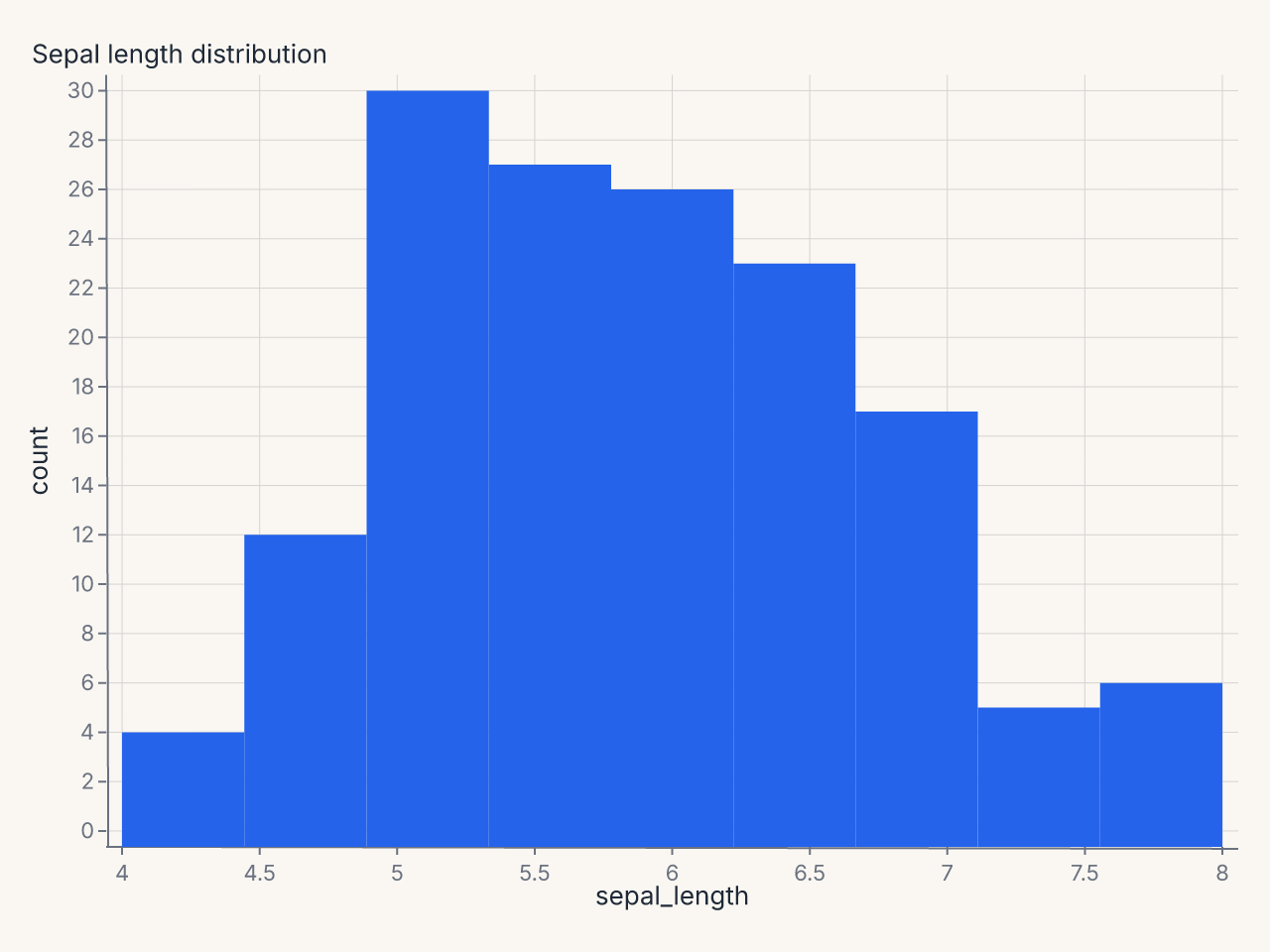
chart = fm.displot(iris, x="sepal_length", kind="hist")
chart
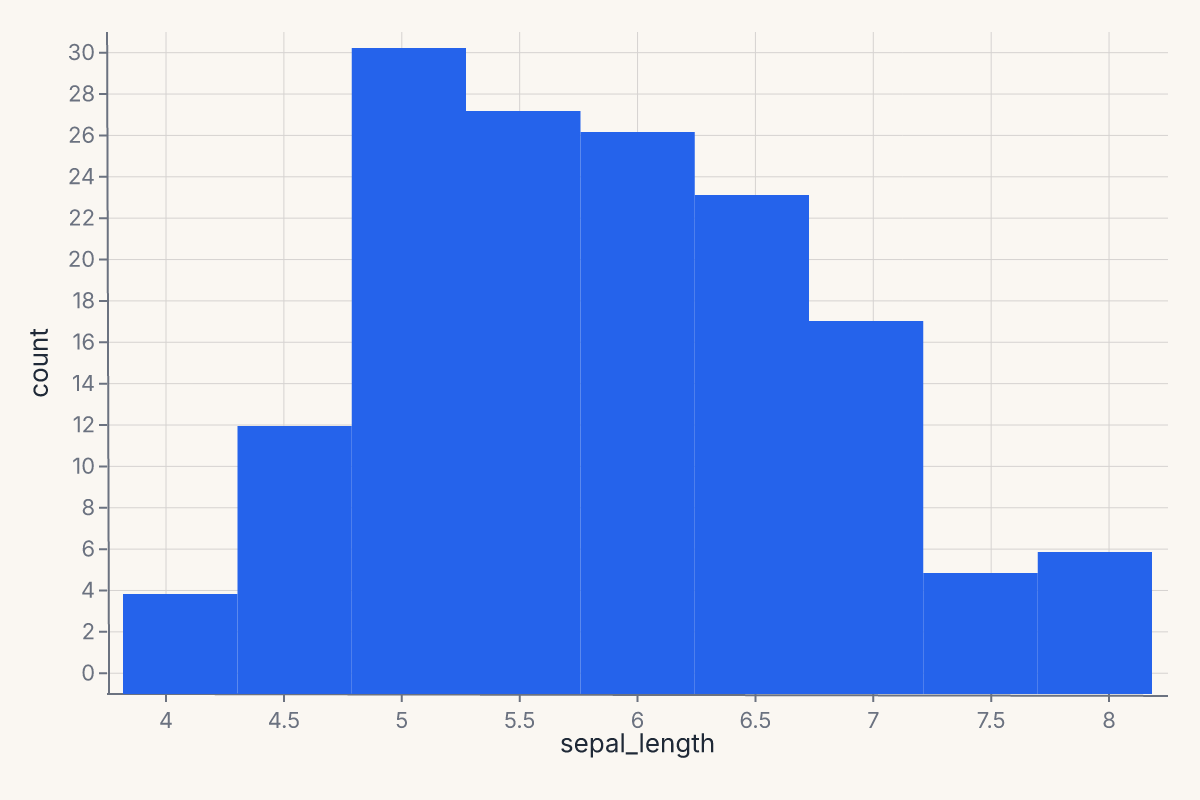
displot follows seaborn's signature: x, y, hue, col, row for encoding; kind for the geometry; bins, bandwidth, bw_adjust, multiple, kde, rug for the statistical details.
Categorical: catplot
Categorical comparisons across groups. Supports kind="strip" (default), "swarm", "box", "violin", "boxen", "point", "bar", "count". Returns a Chart.
import ferrum as fm
import polars as pl
from sklearn.datasets import load_iris

raw = load_iris()
iris = pl.DataFrame(raw.data, schema=["sepal_length", "sepal_width", "petal_length", "petal_width"]).with_columns(
    species=pl.Series([raw.target_names[t] for t in raw.target])
)
chart = fm.catplot(iris, x="species", y="sepal_length", kind="box")
chart
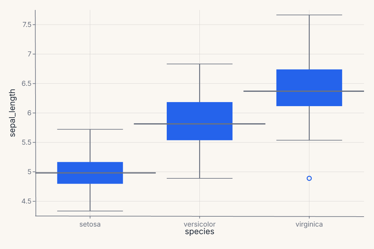
catplot is the one-call entry point for the boxplot / violin / strip / swarm family. It selects the right composite mark based on kind= and applies sensible defaults (jitter for strip plots, dodge for grouped bars, bootstrap CIs for point and bar estimates).
Relational: relplot
relplot produces a relational plot — scatter or line — with optional faceting. Supports kind="scatter" (default) and "line". Returns a Chart.
import ferrum as fm
import polars as pl
from sklearn.datasets import load_iris

raw = load_iris()
iris = pl.DataFrame(raw.data, schema=["sepal_length", "sepal_width", "petal_length", "petal_width"]).with_columns(
    species=pl.Series([raw.target_names[t] for t in raw.target])
)
chart = fm.relplot(iris, x="sepal_length", y="petal_length", hue="species", kind="scatter")
chart
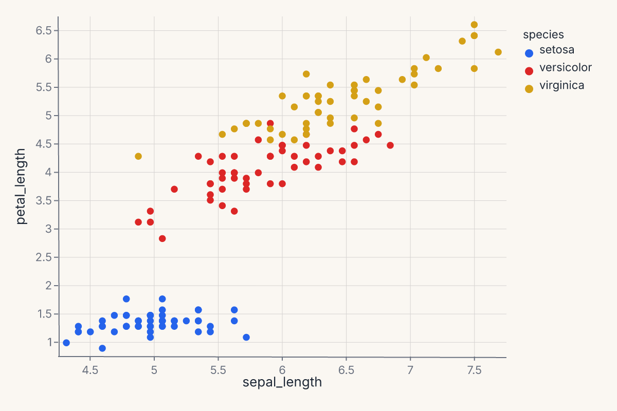
relplot follows seaborn's signature: x, y, hue, size, style, col, row for encoding; kind for the geometry. Use it when you want a quick faceted scatter or line chart without dropping into the grammar.
Regression: lmplot, regplot, and residplot
lmplot produces a faceted regression scatter with a fit overlay. The fit is configurable through method= ("lm", "loess", "logistic", polynomial order) and ci= for the confidence band. It supports col= and row= for faceting. Returns a Chart with the scatter and the fit as layers.
import ferrum as fm
import polars as pl
from sklearn.datasets import load_iris

raw = load_iris()
iris = pl.DataFrame(raw.data, schema=["sepal_length", "sepal_width", "petal_length", "petal_width"]).with_columns(
    species=pl.Series([raw.target_names[t] for t in raw.target])
)
chart = fm.lmplot(iris, x="sepal_length", y="petal_length")
chart
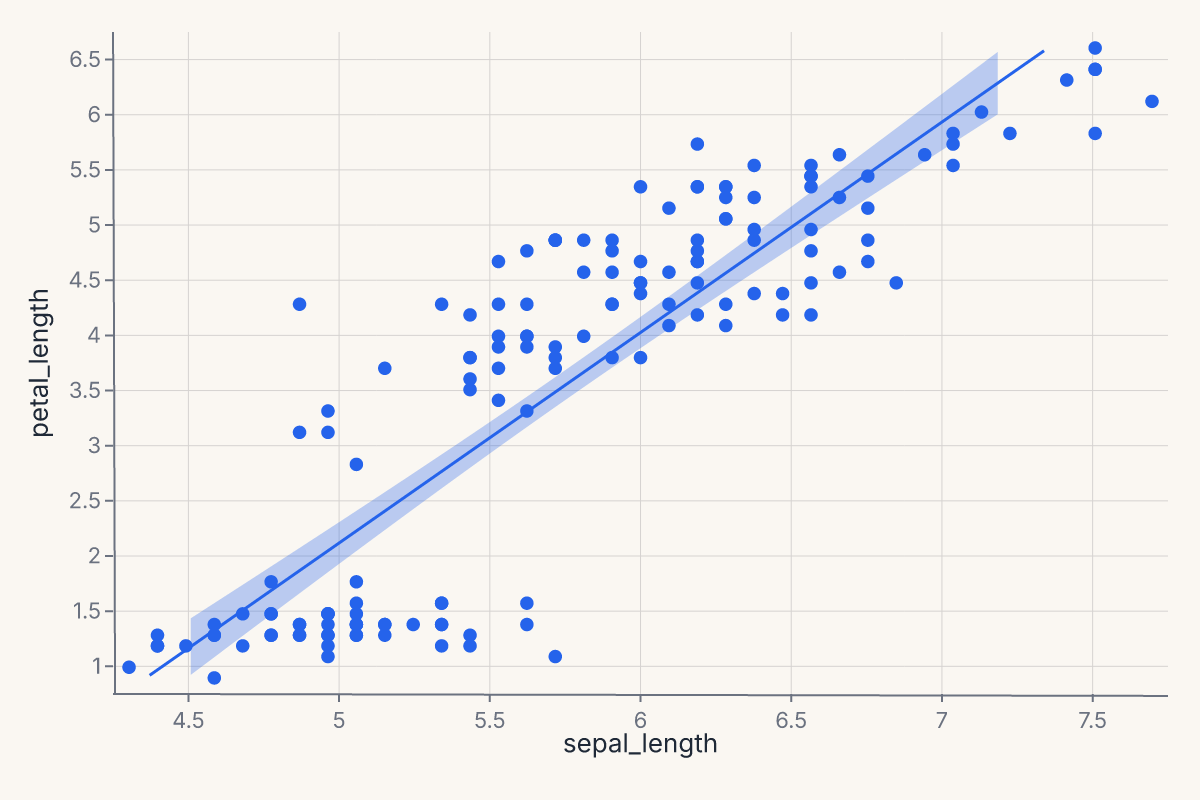
regplot is the single-axes equivalent of lmplot — same API for the regression fit (method=, ci=, order=, scatter=, scatter_kws=, line_kws=) but without faceting (col= and row= are excluded). Use regplot when you want one regression plot on one set of axes; use lmplot when you want the same plot faceted across a categorical variable.
import ferrum as fm
import polars as pl
from sklearn.datasets import load_iris

raw = load_iris()
iris = pl.DataFrame(raw.data, schema=["sepal_length", "sepal_width", "petal_length", "petal_width"]).with_columns(
    species=pl.Series([raw.target_names[t] for t in raw.target])
)
chart = fm.regplot(iris, x="sepal_length", y="petal_length", method="lm", ci=95)
chart
residplot plots the residuals from a regression fit. Useful for diagnosing whether a linear fit is appropriate and whether residuals are heteroscedastic. Returns a Chart.
import ferrum as fm
import polars as pl
from sklearn.datasets import load_iris

raw = load_iris()
iris = pl.DataFrame(raw.data, schema=["sepal_length", "sepal_width", "petal_length", "petal_width"]).with_columns(
    species=pl.Series([raw.target_names[t] for t in raw.target])
)
chart = fm.residplot(iris, x="sepal_length", y="petal_length")
chart
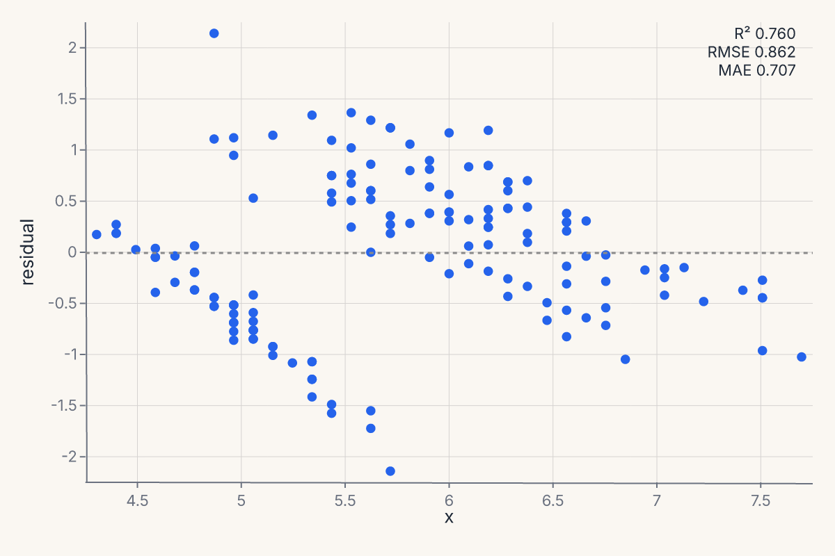
Pass lowess=True to overlay a lowess smoother on the residuals; robust=True switches the fit to a robust regression so outliers don't pull the line.
Matrix: pairplot, heatmap, clustermap
pairplot produces a pairwise-scatter grid (also known as a scatterplot matrix). Returns a RepeatChart.
import ferrum as fm
import polars as pl
from sklearn.datasets import load_iris

raw = load_iris()
iris = pl.DataFrame(raw.data, schema=["sepal_length", "sepal_width", "petal_length", "petal_width"]).with_columns(
    species=pl.Series([raw.target_names[t] for t in raw.target])
)
chart = fm.pairplot(iris, vars=["sepal_length", "petal_length"], hue="species")
chart
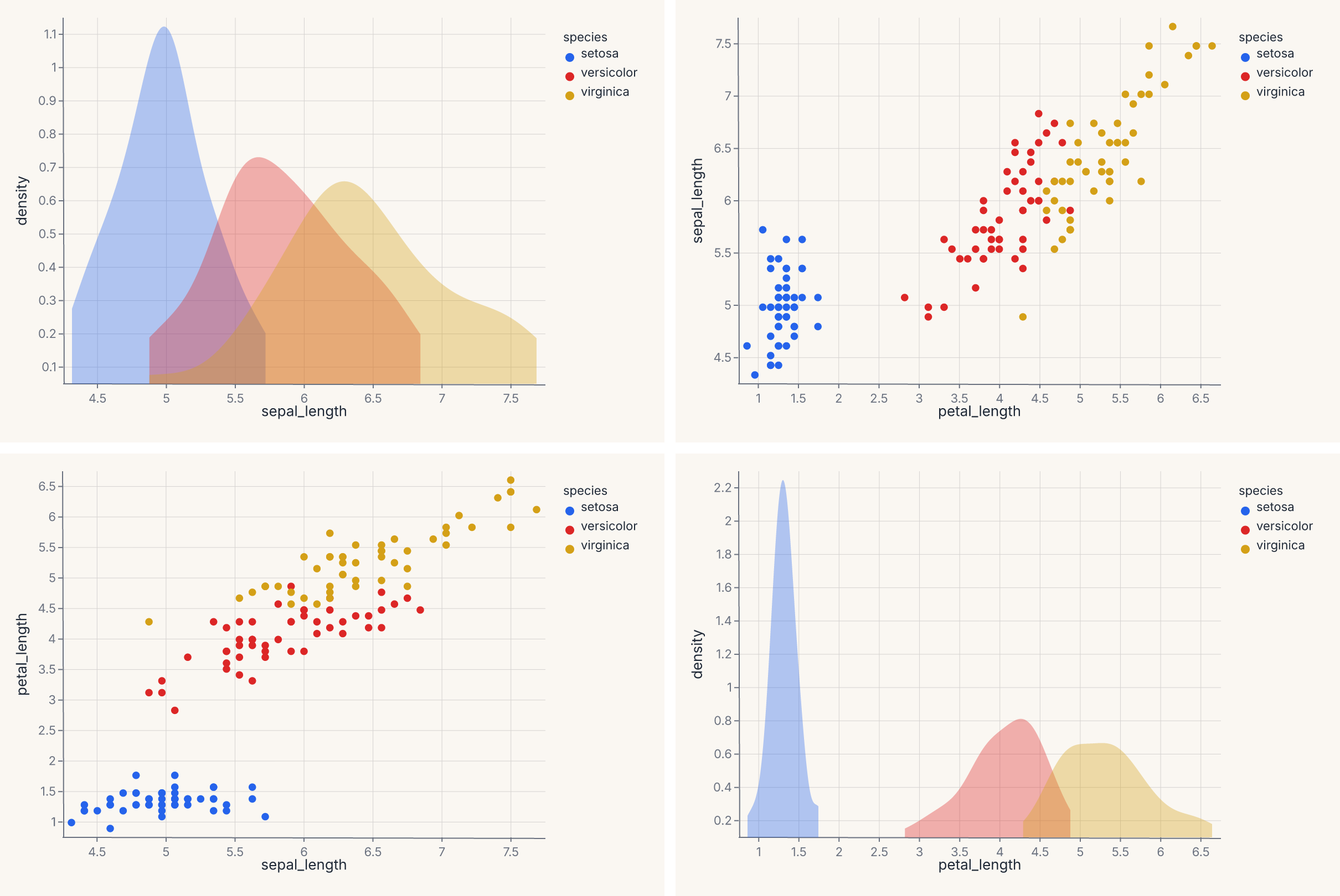
For a triangular instead of square layout, pass corner=True. To set diagonal cells separately (typically univariate distributions), use diag_kind="hist" or "kde".
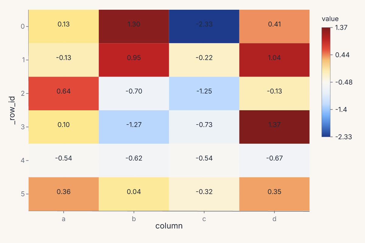
heatmap renders a 2-D heatmap from a wide-format DataFrame. Each row of the input becomes a row of the heatmap; each numeric column becomes a column. Returns a Chart.
import ferrum as fm
import polars as pl
import numpy as np

rng = np.random.default_rng(0)
table = pl.DataFrame({
    "a": rng.standard_normal(6),
    "b": rng.standard_normal(6),
    "c": rng.standard_normal(6),
    "d": rng.standard_normal(6),
})
chart = fm.heatmap(table, annot=True, cmap="blues")
chart
clustermap returns a ClusterMapChart — a heatmap with row and column dendrograms computed from a hierarchical clustering of the data. The signature mirrors seaborn's: method= selects the linkage ("ward", "single", "complete", "average"), metric= selects the distance ("euclidean", "correlation", etc.), and z_score= / standard_scale= normalize the data before clustering.
Joint: jointplot
jointplot produces a central bivariate plot flanked by univariate marginals — a scatter with marginal histograms is the canonical version. Returns a JointChart.
import ferrum as fm
import polars as pl
from sklearn.datasets import load_iris

raw = load_iris()
iris = pl.DataFrame(raw.data, schema=["sepal_length", "sepal_width", "petal_length", "petal_width"]).with_columns(
    species=pl.Series([raw.target_names[t] for t in raw.target])
)
chart = fm.jointplot(iris, x="sepal_length", y="petal_length", kind="scatter", marginal_kind="hist")
chart
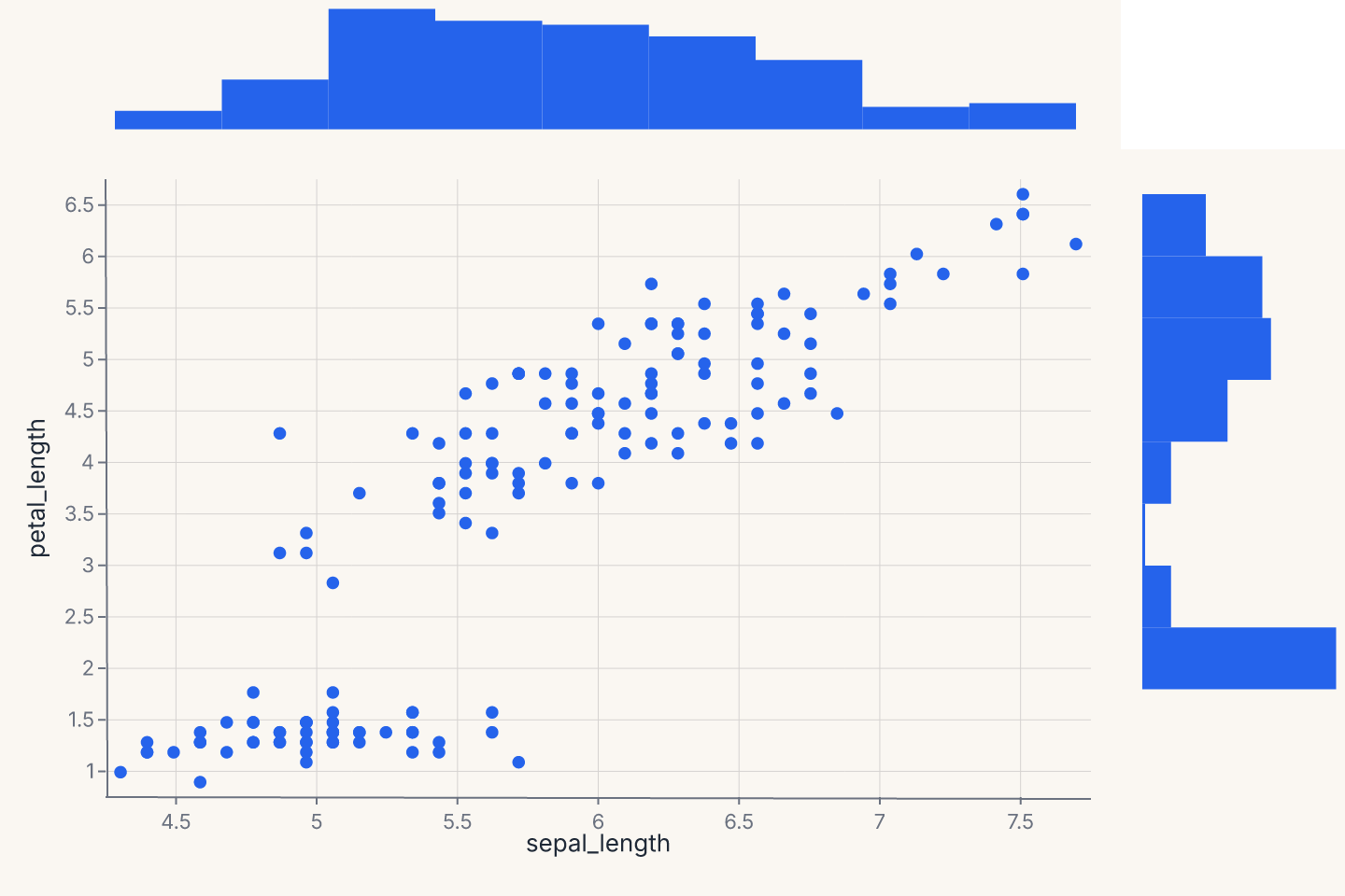
kind= controls the center plot ("scatter", "kde", "hist", "hex", "reg"); marginal_kind= controls both marginals ("hist", "kde", "rug", "box"). The marginals share their data axis with the center.
Annotation: annotate_abline
fm.annotate_abline(slope, intercept) returns a Chart that draws a straight reference line with the given slope and intercept. Because it returns a regular chart, you layer it onto any chart with +:
import ferrum as fm
import polars as pl
import numpy as np

rng = np.random.default_rng(42)
df = pl.DataFrame({"actual": rng.uniform(0, 10, 60).tolist(), "predicted": rng.uniform(0, 10, 60).tolist()})
scatter = fm.Chart(df).mark_point(opacity=0.7).encode(x="actual:Q", y="predicted:Q")
perfect_fit = fm.annotate_abline(slope=1, intercept=0, stroke="red", stroke_dash=[4, 2])
chart = scatter + perfect_fit
chart
The reference line is a useful overlay on predicted-vs-actual plots (identity line at slope=1, intercept=0), residual diagnostics (zero reference line at slope=0), or any chart that needs a visual reference. Optional keyword arguments stroke=, stroke_width=, and stroke_dash= control the line appearance.
Customizing helper output
Since helper output is a regular chart, you can chain grammar methods to customize it:
import ferrum as fm
import polars as pl
from sklearn.datasets import load_iris
raw = load_iris()
iris = pl.DataFrame(raw.data, schema=["sepal_length", "sepal_width", "petal_length", "petal_width"]).with_columns(
species=pl.Series([raw.target_names[t] for t in raw.target])
)
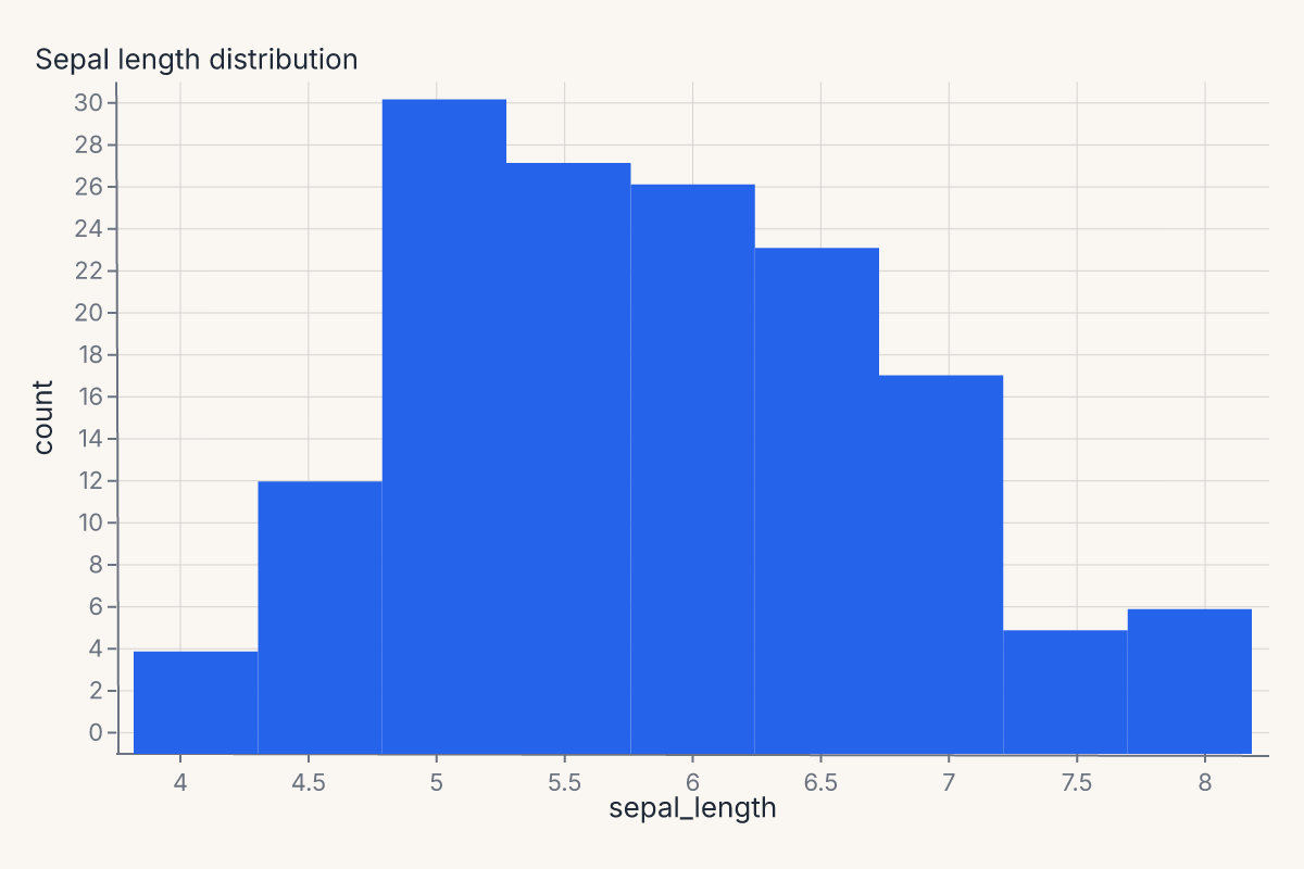
chart = fm.displot(iris, x="sepal_length", kind="hist").properties(title="Sepal length distribution")
chart
Composite marks (boxplot, errorbar, smooth with CI, etc.) have named sub-layers you can inspect:
import ferrum as fm
import polars as pl

df = pl.DataFrame({"x": [1, 2, 3, 4, 5], "y": [2, 4, 3, 5, 4]})
chart = fm.Chart(df).mark_boxplot().encode(x="x", y="y")
names = chart.layer_names
assert "box" in names
assert "median" in names
The model diagnostics helpers go further with a built-in mark=, encode=, properties=, layers= override surface — see that page for details.
Helpers and the rest of the grammar
The output of every helper is a regular Ferrum chart object. That means:
- A helper result accepts
.theme(),.facet(), and.save()exactly like a primitive chart. - A helper result can be
hconcat'd with another helper result or with a grammar-authored chart. - A helper result can be layered with a grammar-authored chart using
+when the axes are compatible.
The boundary between helpers and grammar is one-way porous: anything you can do with the grammar, you can do to a helper's output. Anything you can do with a helper, you can also do by hand if you outgrow the helper's options.
Composition in practice:
import ferrum as fm
import polars as pl
from sklearn.datasets import load_iris

raw = load_iris()
iris = pl.DataFrame(raw.data, schema=["sepal_length", "sepal_width", "petal_length", "petal_width"]).with_columns(
    species=pl.Series([raw.target_names[t] for t in raw.target])
)
fit = fm.lmplot(iris, x="sepal_length", y="petal_length")
distribution = fm.displot(iris, x="sepal_length", kind="hist")
report = fit | distribution
report
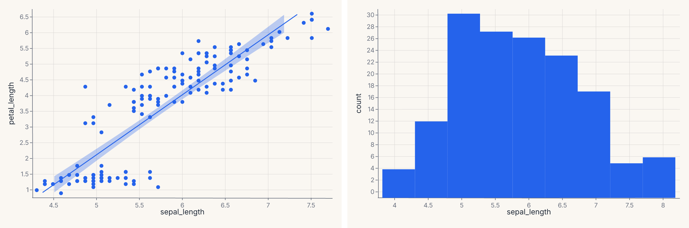
The regression fit and the distribution plot are concatenated horizontally with the same | operator that works for any two charts.
Where to go next
- Marks & encodings for the primitives the helpers compile into.
- Composition for the operators (
+,|,&,JointChart,RepeatChart) the helpers use internally. - Themes — every helper accepts a
theme=keyword to apply a theme at the call site. - Model diagnostics for the Phase 10 family of helpers (ROC, calibration, confusion, SHAP, etc.) that follow the same pattern.
- The API Reference for the full keyword signatures of each helper.