Inset Panels
Inset embeds a self-contained sub-chart overlaid on a parent chart's plot area. The inset
has its own independent scales, axes, marks, and configuration. It overlays without
reflowing the parent — the parent's layout is computed first, and the inset is painted
on top at its specified bounds.
Typical uses: zoom panels for a region of interest, detail views of a dense area, supplementary distributions alongside a main scatter.
Basic usage
Compose an Inset onto a chart with +:
import ferrum as fm
import polars as pl

df = pl.DataFrame({
    "x": [0.5, 1.0, 1.5, 2.0, 2.5, 3.0, 3.5, 4.0, 4.5, 5.0],
    "y": [2.1, 2.8, 3.5, 4.1, 4.8, 5.2, 5.8, 6.3, 6.9, 7.4],
})

# Build a zoom view of the [1.0, 3.0] x range
zoom_df = df.filter(pl.col("x").is_between(1.0, 3.0))
zoom = (
    fm.Chart(zoom_df)
    .mark_point(size=120)
    .encode(x="x:Q", y="y:Q")
)

# Embed the zoom in the top-right of the parent
chart = (
    fm.Chart(df)
    .mark_point(size=50)
    .encode(x="x:Q", y="y:Q")
    + fm.Inset(
        chart=zoom,
        bounds=(fm.norm(0.55), fm.norm(0.0), fm.norm(1.0), fm.norm(0.5)),
    )
)
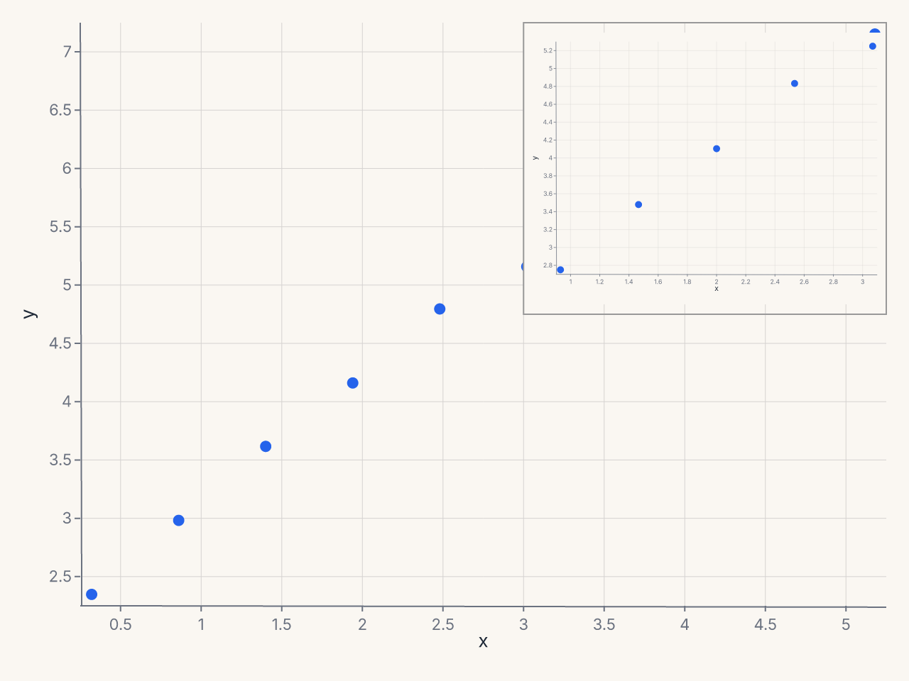
The inset occupies the top-right 40% x 45% of the plot area. Scales, ticks, and marks inside the inset are computed independently from the parent.
Constructor reference
fm.Inset(
    chart,                     # Chart: the chart to embed (required)
    bounds,                    # tuple: (left, top, right, bottom) (required)
    border=True,               # bool: draw a border around the inset
    border_color="#999",       # str
    border_dash=None,          # list[float] | None: dash pattern for border
    background="#fff",         # str | None: background color; None = transparent
    shadow=False,              # bool: drop shadow
    connect_to=None,           # tuple | None: (x, y) source region in parent
    connect_style="lines",     # str: connector style
)
Parameters
| Parameter | Type | Default | Description |
|---|---|---|---|
chart |
Chart |
required | The sub-chart to embed |
bounds |
tuple |
required | (left, top, right, bottom) in norm, px, or data coords |
border |
bool |
True |
Draw a border around the inset |
border_color |
str |
"#999" |
Border color |
border_dash |
list[float] | None |
None |
Border dash pattern |
background |
str | None |
"#fff" |
Inset background; None for transparent |
shadow |
bool |
False |
Apply a drop shadow |
connect_to |
tuple | None |
None |
Data coords (x, y) of the source region |
connect_style |
str |
"lines" |
Connector style: "bracket", "lines", or "none" |
Validation
connect_stylemust be one of"bracket","lines", or"none". Invalid values raiseValueErrorat construction time.
Specifying bounds
The bounds tuple (left, top, right, bottom) defines the inset position and size
within the parent's plot area. Each element can be:
- A plain
float(data-space coordinate) — useful when you want the inset at a specific data location. fm.norm(f)— fraction of the plot-area width or height (0.0 to 1.0).fm.px(n)— absolute pixels from the plot-area origin.
Most use cases call for fm.norm(...):
# Top-right corner, 35% wide × 40% tall
bounds=(fm.norm(0.65), fm.norm(0.0), fm.norm(1.0), fm.norm(0.40))

# Bottom-left corner, 40% wide × 35% tall
bounds=(fm.norm(0.0), fm.norm(0.65), fm.norm(0.40), fm.norm(1.0))

# Fixed pixel size at top-left
bounds=(fm.px(10), fm.px(10), fm.px(220), fm.px(160))
Connecting the inset to a source region
When the inset zooms into a specific region of the parent chart, connect_to draws a
connector from the source region to the inset boundary:
fm.Inset(
    chart=zoom,
    bounds=(fm.norm(0.6), fm.norm(0.0), fm.norm(1.0), fm.norm(0.45)),
    connect_to=(1.5, 3.2),       # data coords of the source region center
    connect_style="lines",       # draw lines from corners of source to inset
)
| Style | Description |
|---|---|
"lines" |
Lines from the source region corners to the inset border |
"bracket" |
Bracket around the source region |
"none" |
No connector |
Inset is independent
An inset's configuration does not inherit from the parent chart:
- The inset's scales are computed independently.
- The parent's theme applies to the inset unless you set a different theme on the inset chart explicitly.
- The parent's
configure_*()settings do not cascade into the inset. - The inset does not affect the parent's layout.
To style the inset differently from the parent:
zoom = (
    fm.Chart(zoom_df)
    .mark_point(size=80)
    .encode(x="x:Q", y="y:Q")
    .configure_axis(domain=False, grid=False)
    .configure_padding(top=4, right=4, bottom=4, left=4, auto=False)
)
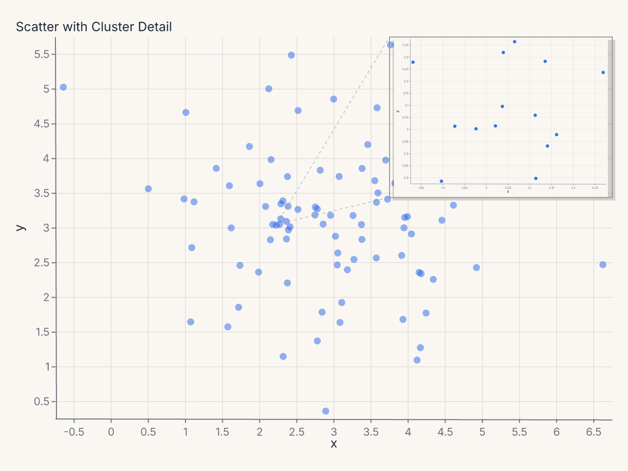
Common patterns
Detail zoom panel
# Scatter with a zoomed inset on the dense cluster
cluster_df = df.filter(
    pl.col("x").is_between(1.6, 2.4) & pl.col("y").is_between(2.6, 3.4)
)
zoom = (
    fm.Chart(cluster_df)
    .mark_point(size=80, opacity=0.9)
    .encode(x="x:Q", y="y:Q")
    .configure_axis(label_font_size=9, tick_count=4)
    .configure_padding(top=6, right=6, bottom=6, left=6, auto=False)
)

chart = (
    fm.Chart(df)
    .mark_point(size=40, opacity=0.5)
    .encode(x="x:Q", y="y:Q")
    .labs(title="Scatter with Cluster Detail")
    + fm.Inset(
        chart=zoom,
        bounds=(fm.norm(0.6), fm.norm(0.0), fm.norm(1.0), fm.norm(0.42)),
        connect_to=(2.0, 3.0),
        connect_style="lines",
        shadow=True,
    )
)
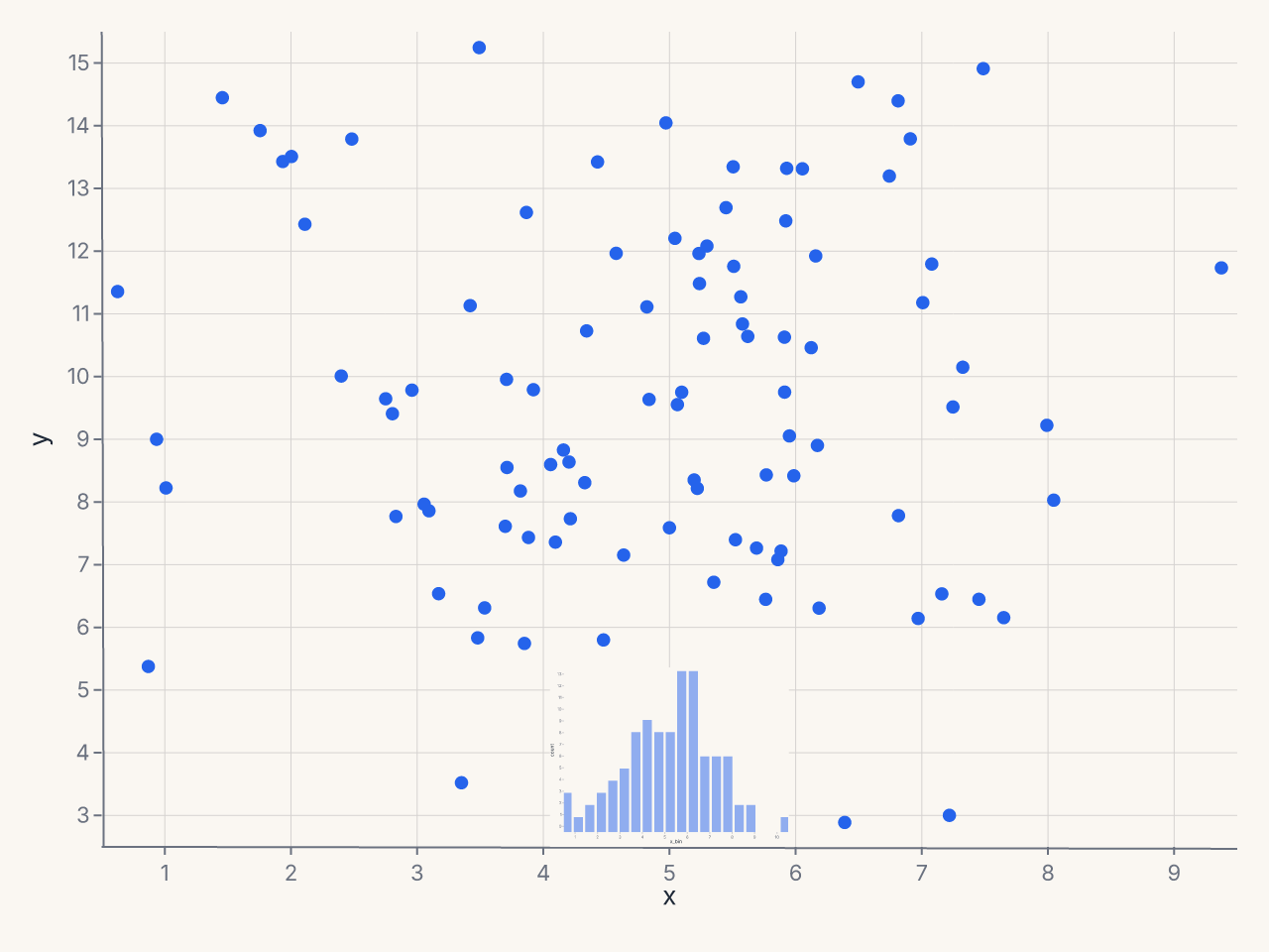
Marginal histogram inset
# Pre-compute histogram bins for the inset
hist_df = (
    df.with_columns((pl.col("x") * 2).round(0).truediv(2).alias("x_bin"))
    .group_by("x_bin")
    .agg(pl.len().alias("count"))
    .sort("x_bin")
)

hist = (
    fm.Chart(hist_df)
    .mark_bar(opacity=0.5)
    .encode(x="x_bin:Q", y="count:Q")
    .configure_axis(domain=False, grid=False, tick_count=0)
    .configure_padding(top=2, right=2, bottom=2, left=2, auto=False)
)

chart = (
    fm.Chart(df)
    .mark_point()
    .encode(x="x:Q", y="y:Q")
    + fm.Inset(
        chart=hist,
        bounds=(fm.norm(0.0), fm.norm(0.78), fm.norm(1.0), fm.norm(1.0)),
        border=False,
        background=None,
    )
)
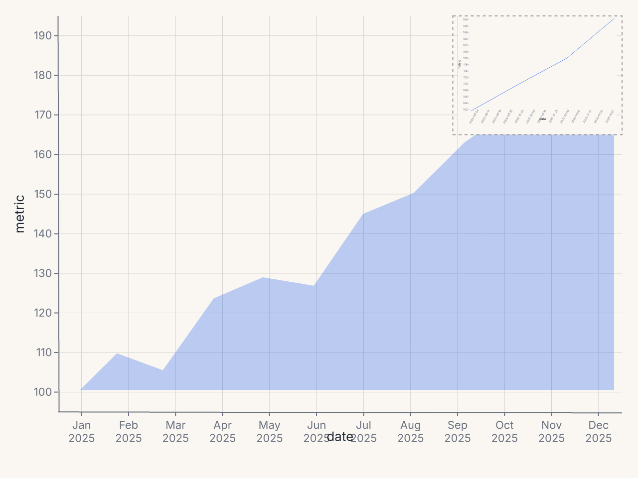
Dashboard card with summary inset
import datetime

dates = pl.date_range(datetime.date(2025, 1, 1), datetime.date(2025, 12, 1), "1mo", eager=True)
metrics = [100, 112, 108, 125, 130, 128, 145, 150, 162, 170, 178, 190]
df = pl.DataFrame({"date": dates, "metric": metrics})
recent_df = df.tail(4)

sparkline = (
    fm.Chart(recent_df)
    .mark_line(stroke_width=1.5, color="#16a34a")
    .encode(x="date:T", y="metric:Q")
    .configure_axis(domain=False, grid=False, tick_count=0)
    .configure_padding(top=2, right=2, bottom=2, left=2, auto=False)
)

chart = (
    fm.Chart(df)
    .mark_area(opacity=0.3)
    .encode(x="date:T", y="metric:Q")
    + fm.Inset(
        chart=sparkline,
        bounds=(fm.norm(0.7), fm.norm(0.0), fm.norm(1.0), fm.norm(0.3)),
        border_dash=[3, 3],
        shadow=False,
    )
)