Configuration Objects
Ferrum's declarative configuration surface exposes six typed config objects, one per
domain. Each is an immutable frozen dataclass. Pass them via .configure() or compose
them with the chart via +.
AxisConfig
Controls tick labels, tick marks, the axis domain line, gridlines, and the scale domain for one or more axes.
from ferrum import AxisConfig

AxisConfig(
    x=True,                      # apply to x axis
    y=True,                      # apply to y axis
    label_angle=-45,             # degrees; negative = counter-clockwise
    label_font_size=11.0,
    label_color="#555",
    label_format="currency",     # named preset
    label_format_raw=None,       # raw d3-format string (mutually exclusive with label_format)
    label_overlap="greedy",      # collision strategy
    tick_count=6,
    tick_size=5.0,
    tick_values=[0, 25, 50, 75, 100],
    title_font_size=12.0,
    title_color="#333",
    title_padding=8.0,
    domain=True,                 # show axis line
    domain_color="#ccc",
    domain_width=1.0,
    grid=True,
    grid_color="#e8e8e8",
    grid_dash=[4.0, 4.0],
    grid_width=1.0,
    domain_min=0.0,
    domain_max=100.0,
    nice=True,
    zero=True,
)
Parameters
| Parameter | Type | Default | Description |
|---|---|---|---|
x |
bool |
True |
Apply this config to the x axis |
y |
bool |
True |
Apply this config to the y axis |
label_angle |
float | None |
None |
Tick label rotation in degrees |
label_font_size |
float | None |
None |
Tick label font size |
label_color |
str | None |
None |
Tick label color |
label_format |
str | None |
None |
Named format preset; see Format Presets |
label_format_raw |
str | None |
None |
Raw d3-format or strftime string |
label_overlap |
str | None |
None |
Overlap strategy: "parity", "greedy", "rotate", or "hide" |
tick_count |
int | None |
None |
Suggested number of ticks |
tick_size |
float | None |
None |
Tick mark length in pixels |
tick_values |
list | None |
None |
Explicit tick positions |
title_font_size |
float | None |
None |
Axis title font size |
title_color |
str | None |
None |
Axis title color |
title_padding |
float | None |
None |
Gap between title and tick labels |
domain |
bool | None |
None |
Show axis line |
domain_color |
str | None |
None |
Axis line color |
domain_width |
float | None |
None |
Axis line width |
grid |
bool | None |
None |
Show grid lines |
grid_color |
str | None |
None |
Grid line color |
grid_dash |
list[float] | None |
None |
Grid dash pattern, e.g. [4, 4] |
grid_width |
float | None |
None |
Grid line width |
domain_min |
float | None |
None |
Minimum of the scale domain |
domain_max |
float | None |
None |
Maximum of the scale domain |
nice |
bool | None |
None |
Round domain to nice values |
zero |
bool | None |
None |
Include zero in the domain |
label_padding |
float | None |
None |
Pixel gap between tick mark and label text (defaults to 2.0) |
grid_opacity |
float | None |
None |
Grid line opacity (0–1) |
orient |
str | None |
None |
Axis side: "top"/"bottom" (x) or "left"/"right" (y); set via axis_x/axis_y, not the shared axis |
translate |
float | None |
None |
Pixel translation of the axis group perpendicular to its line |
min_band |
float | None |
None |
Lower bound for the reserved axis margin band, in pixels |
max_band |
float | None |
None |
Upper bound for the reserved axis margin band, in pixels |
tick_extra |
bool | None |
None |
Append an extra tick at each domain boundary |
tick_min_step |
float | None |
None |
Minimum step between ticks in data space |
title_orient |
str | None |
None |
Side/orientation of the axis title |
zindex |
int | None |
None |
Coarse draw order of the axis relative to marks |
Notes
label_formatandlabel_format_raware mutually exclusive; providing both raisesValueErrorat construction time.label_formatis validated against the known preset list at construction time.- The
xandybooleans control which axes this instance targets. To give x and y different settings, useconfigure(axis_x=..., axis_y=...)on the chart.
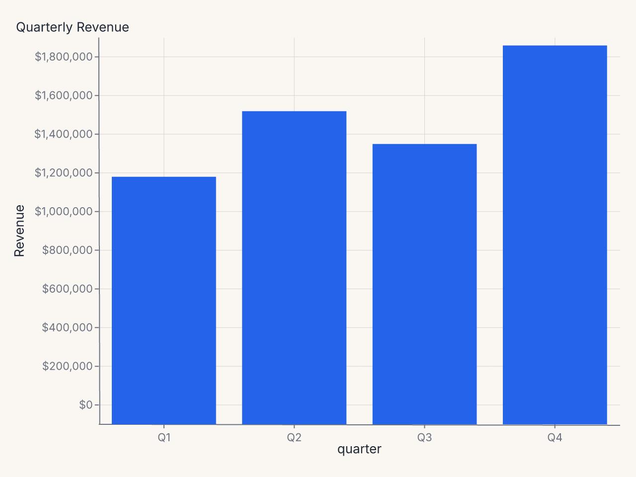
Example: currency-formatted y axis
import polars as pl
import ferrum as fm

df = pl.DataFrame({
    "quarter": ["Q1", "Q2", "Q3", "Q4"],
    "revenue": [1_240_000, 1_580_000, 1_410_000, 1_920_000],
})

chart = (
    fm.Chart(df)
    .mark_bar()
    .encode(
        x=fm.X("quarter:N", sort=None),
        y="revenue:Q",
    )
    .configure_axis(y=True, x=False, label_format="currency")
    .labs(title="Quarterly Revenue", y="Revenue")
)
Example: rotated x labels for long category names
import polars as pl
import ferrum as fm

df = pl.DataFrame({
    "department": [
        "Engineering", "Product Management", "Sales & Marketing",
        "Customer Success", "Research & Development",
    ],
    "headcount": [42, 18, 31, 24, 15],
})

chart = (
    fm.Chart(df)
    .mark_bar()
    .encode(
        x=fm.X("department:N", sort="-y"),
        y="headcount:Q",
    )
    .configure_axis(x=True, y=False, label_angle=-40)
    .labs(title="Department Headcount", x=None, y="Headcount")
)
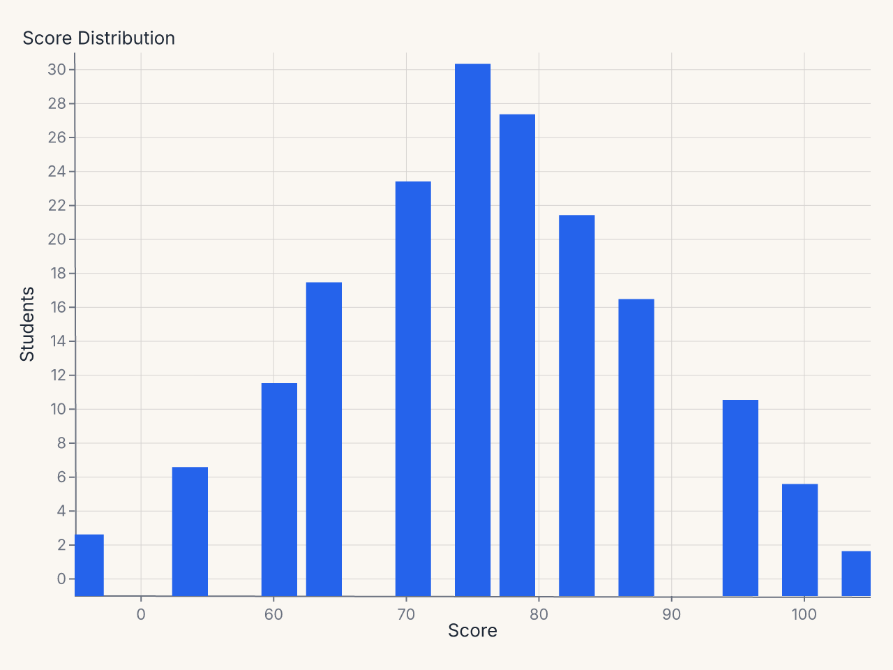
Example: custom tick positions
import polars as pl
import ferrum as fm

df = pl.DataFrame({
    "score": [45, 52, 58, 61, 67, 71, 74, 78, 82, 89, 93, 97],
    "count": [3, 7, 12, 18, 24, 31, 28, 22, 17, 11, 6, 2],
})

chart = (
    fm.Chart(df)
    .mark_bar()
    .encode(x="score:Q", y="count:Q")
    .configure(
        axis_x=fm.AxisConfig(tick_values=[0, 60, 70, 80, 90, 100], label_font_size=11),
        axis_y=fm.AxisConfig(tick_count=5, label_format="integer"),
    )
    .labs(title="Score Distribution", x="Score", y="Students")
)
LegendConfig
Controls legend placement, layout, and typography.
from ferrum import LegendConfig

LegendConfig(
    orient="bottom",          # right | left | top | bottom | none
    direction="horizontal",   # vertical | horizontal
    columns=4,
    title_font_size=12.0,
    label_font_size=11.0,
    symbol_size=100.0,
    symbol_type="circle",
    gradient_length=120.0,
    offset=10.0,
    padding=4.0,
)
Parameters
| Parameter | Type | Default | Description |
|---|---|---|---|
orient |
str | None |
None |
Legend position: "right", "left", "top", "bottom", or "none" |
direction |
str | None |
None |
Item layout: "vertical" or "horizontal" |
columns |
int | None |
None |
Columns in multi-column layout |
title_font_size |
float | None |
None |
Legend title font size |
label_font_size |
float | None |
None |
Legend label font size |
symbol_size |
float | None |
None |
Symbol area (in square pixels) |
symbol_type |
str | None |
None |
Symbol shape |
gradient_length |
float | None |
None |
Continuous gradient legend length |
offset |
float | None |
None |
Offset from the plot area edge |
padding |
float | None |
None |
Internal padding between items |
label_color |
str | None |
None |
Legend label color |
label_limit |
float | None |
None |
Max label width in pixels; wider labels truncate with an ellipsis |
symbol_stroke_width |
float | None |
None |
Stroke width of legend symbol swatches |
gradient_thickness |
float | None |
None |
Gradient (colorbar) legend thickness in pixels |
title_padding |
float | None |
None |
Padding between the legend title and its entries |
row_padding |
float | None |
None |
Vertical entry spacing (vertical-direction legends) |
column_padding |
float | None |
None |
Horizontal entry spacing (horizontal-direction legends) |
clip_height |
float | None |
None |
Cap on legend group height in pixels; overflow is clipped |
tick_min_step |
float | None |
None |
Minimum step between colorbar ticks in data units |
zindex |
int | None |
None |
Coarse draw order of the legend relative to marks |
Notes
orient="none"hides the legend entirely.orientis validated at construction time.
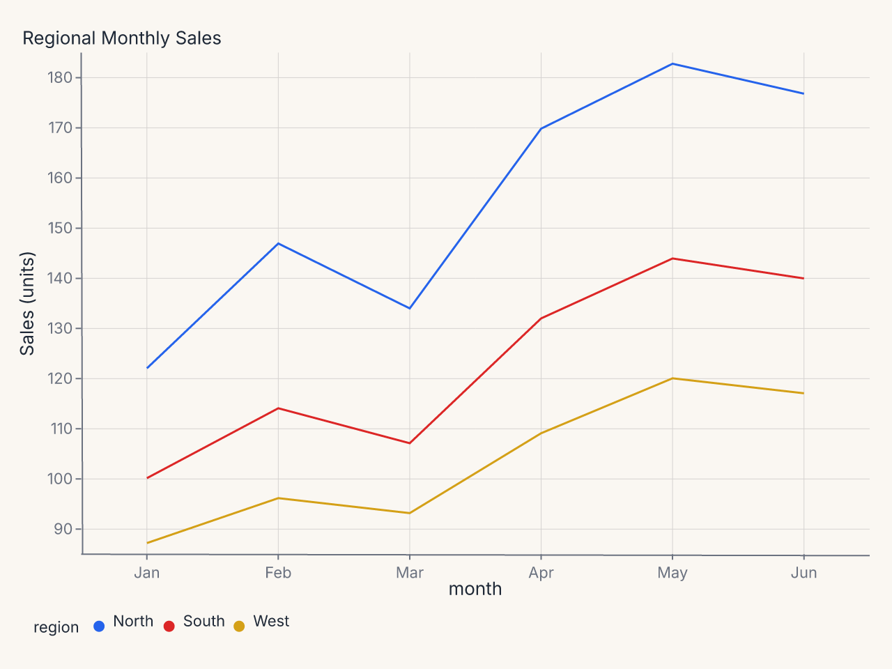
Example: horizontal legend at bottom
import polars as pl
import ferrum as fm

df = pl.DataFrame({
    "month": ["Jan", "Feb", "Mar", "Apr", "May", "Jun"] * 3,
    "region": ["North"] * 6 + ["South"] * 6 + ["West"] * 6,
    "sales": [
        120, 145, 132, 168, 181, 175,
        98, 112, 105, 130, 142, 138,
        85, 94, 91, 107, 118, 115,
    ],
})

chart = (
    fm.Chart(df)
    .mark_line()
    .encode(x="month:N", y="sales:Q", color="region:N")
    .configure_legend(orient="bottom", direction="horizontal")
    .labs(title="Regional Monthly Sales", x=None, y="Sales (units)")
)
TitleConfig
Controls chart title and subtitle styling.
from ferrum import TitleConfig

TitleConfig(
    font_size=18.0,
    font_weight="bold",
    anchor="start",          # start | middle | end
    color="#222",
    offset=8.0,
    subtitle_font_size=13.0,
    subtitle_color="#666",
)
Parameters
| Parameter | Type | Default | Description |
|---|---|---|---|
font_size |
float | None |
None |
Title font size |
font_weight |
str | None |
None |
Title weight, e.g. "bold" or "600" |
anchor |
str | None |
None |
Horizontal alignment: "start", "middle", or "end" |
color |
str | None |
None |
Title color |
offset |
float | None |
None |
Pixel offset from the plot area |
subtitle_font_size |
float | None |
None |
Subtitle font size |
subtitle_color |
str | None |
None |
Subtitle color |
Notes
anchoris validated at construction time. Valid values are"start","middle", and"end".
Example: left-aligned title
GridConfig
Controls gridlines independently from axis configuration. GridConfig lives at the chart
level; for per-axis grid control, use the grid, grid_color, grid_dash, and
grid_width parameters on AxisConfig.
GridConfig styles a single gridline level (the major lines). For two-level gridlines
with separate major/minor styling, use the theme-level Grid value class
(Theme(grid=Grid(major=..., minor=...))) — see the
Themes guide.
from ferrum import GridConfig

GridConfig(
    x=False,               # no vertical grid lines
    y=True,                # horizontal grid lines
    color="#e8e8e8",
    width=1.0,
    dash=[4.0, 4.0],
    opacity=0.8,
    band_colors=["#f9f9f9", "#ffffff"],  # alternating bands
)
Parameters
| Parameter | Type | Default | Description |
|---|---|---|---|
x |
bool | None |
None |
Show vertical grid lines (along x axis) |
y |
bool | None |
None |
Show horizontal grid lines (along y axis) |
color |
str | None |
None |
Grid line color |
width |
float | None |
None |
Grid line width |
dash |
list[float] | None |
None |
Dash pattern, e.g. [4, 4] |
opacity |
float | None |
None |
Grid line opacity |
band_colors |
list[str] | None |
None |
Alternating fill colors between grid lines |
Notes
band_colorstakes a list of two color strings for even/odd bands. Set toNone(the default) to disable band fills.
Example: dashed horizontal gridlines only
PaddingConfig
Controls plot-area margins. Ferrum's auto-padding (enabled by default) expands margins
when axis labels or annotations would otherwise be clipped. Use PaddingConfig to set
minimum padding or to supply exact margins.
from ferrum import PaddingConfig

PaddingConfig(
    top=20.0,
    right=40.0,
    bottom=60.0,
    left=80.0,
    auto=True,    # still expand beyond these minimums if labels require it
)
Parameters
| Parameter | Type | Default | Description |
|---|---|---|---|
top |
float | None |
None |
Top margin in pixels |
right |
float | None |
None |
Right margin in pixels |
bottom |
float | None |
None |
Bottom margin in pixels |
left |
float | None |
None |
Left margin in pixels |
auto |
bool |
True |
Auto-expand margins to fit labels and annotations |
Notes
- When
auto=Trueand individual sides are set, the provided values act as minimums. - When
auto=False, the provided values are used exactly; labels may clip.
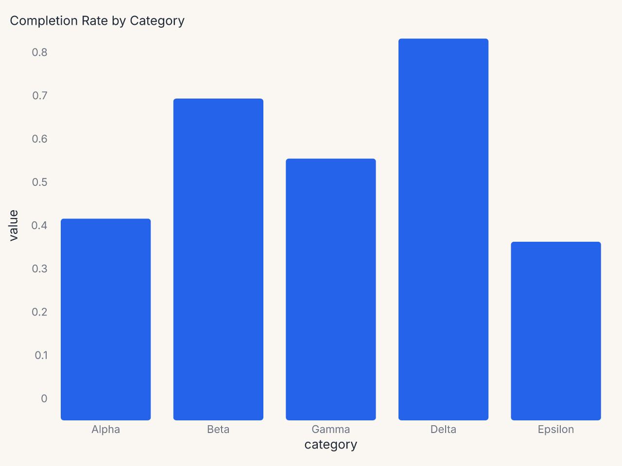
Example: minimal axes with tight padding
import polars as pl
import ferrum as fm

df = pl.DataFrame({
    "category": ["Alpha", "Beta", "Gamma", "Delta", "Epsilon"],
    "value": [0.42, 0.68, 0.55, 0.81, 0.37],
})

chart = (
    fm.Chart(df)
    .mark_bar(corner_radius=3)
    .encode(
        x=fm.X("category:N", sort="-y"),
        y=fm.Y("value:Q", axis=fm.Axis(label_format=".0%")),
    )
    .configure_axis(domain=False, tick_size=0, grid=False, label_font_size=11)
    .configure_padding(top=10, right=10, bottom=10, left=10)
    .labs(title="Completion Rate by Category", x=None, y=None)
)
ColorConfig
Controls default color scale selections at the chart level. When set, these override the theme's palette defaults for this chart only.
from ferrum import ColorConfig

ColorConfig(
    scheme="okabe_ito",               # categorical
    sequential_scheme="viridis",
    diverging_scheme="rdbu",
    domain=["low", "medium", "high"], # explicit domain
    range=["#4292c6", "#08519c"],     # explicit color range
)
Parameters
| Parameter | Type | Default | Description |
|---|---|---|---|
scheme |
str | None |
None |
Named categorical color scheme |
sequential_scheme |
str | None |
None |
Named sequential ramp |
diverging_scheme |
str | None |
None |
Named diverging ramp |
domain |
list | None |
None |
Explicit scale domain values |
range |
list[str] | None |
None |
Explicit list of color strings |
Notes
- Available named schemes are the same as
Theme(color_scheme=...). See Themes for the full palette list. domainandrangeaccept the same types as Vega-Lite's color scale definitions.
Example: brand palette for one chart
The Configure Container
Configure holds all six config objects together. Use it when you want to reuse a
configuration bundle across multiple charts.
from ferrum import Configure, AxisConfig, LegendConfig, TitleConfig, GridConfig

dashboard_config = Configure(
    axis=AxisConfig(label_font_size=10, grid_color="#f0f0f0"),
    legend=LegendConfig(orient="bottom", direction="horizontal"),
    title=TitleConfig(anchor="start", font_size=14),
    grid=GridConfig(x=False, y=True),
)

chart1 = fm.Chart(df1).mark_bar().encode(...) + dashboard_config
chart2 = fm.Chart(df2).mark_line().encode(...) + dashboard_config
When you compose two Configure objects via + on a chart, fields are merged: later
Configure entries win on key conflicts within the same domain. The merge is additive —
you can build up configuration incrementally without losing earlier settings.
Per-axis targeting
The .configure() method accepts axis, axis_x, axis_y, and axis_y2 separately,
letting x and y carry independent settings. The specificity order within a chart is:
axis_ybeatsaxisfor the y axisaxis_xbeatsaxisfor the x axisaxis_y2applies only to the secondary y axis