Showcase: What You Can Build
Well-known chart designs from the matplotlib, seaborn, Altair, and D3 traditions — built in Ferrum's Rust engine. Every image below was produced entirely in Python using Ferrum's grammar-of-graphics API; no matplotlib, no browser, no external renderer. These designs lean on Ferrum features like categorical color ranges, temporal axis auto-inference, size and shape legends, stroke routing on line marks, sort specs, annotation date coordinates, X2/Y2 floating geometry, polar coordinates, continuous-color schemes, hue-split density, per-group error extents, and two-way row-by-column faceting.
Where the Gallery catalogs each individual mark and helper, the Showcase assembles those primitives into complete, recognizable chart designs. Each card shows the concise API call alongside the rendered output.
Four-encoding charts
Encode x, y, size, and color simultaneously for maximum information density.
-
Gapminder Bubble
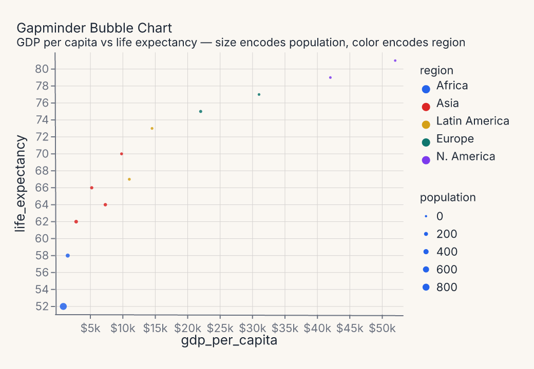
fm.Chart(df).mark_point().encode(x="gdp_per_capita", y="life_expectancy", size=fm.Size("population"), color="region")Four simultaneous encodings — position, size, and color — in one readable chart. The size legend uses Ferrum's new multi-legend stacking; both legends render side by side.
Comparison and annotation
Charts built for the "story in the data" — where one series, one event, or one gap is the point.
-
Highlight Line
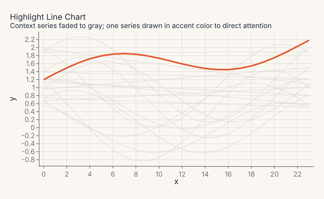
ctx = fm.Chart(ctx_df).mark_line(stroke="#cccccc", opacity=0.55).encode(x="x", y="y", detail="series")+fm.Chart(hi_df).mark_line(stroke="#e4572e")Nine gray context series recede; one accent series commands attention.
detail=groups the context lines without adding a color legend. -
Dumbbell Chart
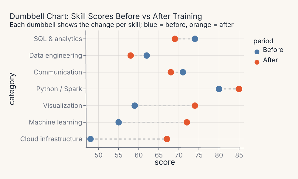
rule = fm.Chart(df).mark_rule(stroke="#cccccc").encode(x="score_before", x2=fm.X2("score_after"), y="category")+fm.Chart(df_pts).mark_point().encode(x="score", color="period")Before-and-after per category. Connecting rules use
x+x2encoding; a categorical color range pins "Before" and "After" to consistent hues. -
Time Series with Events
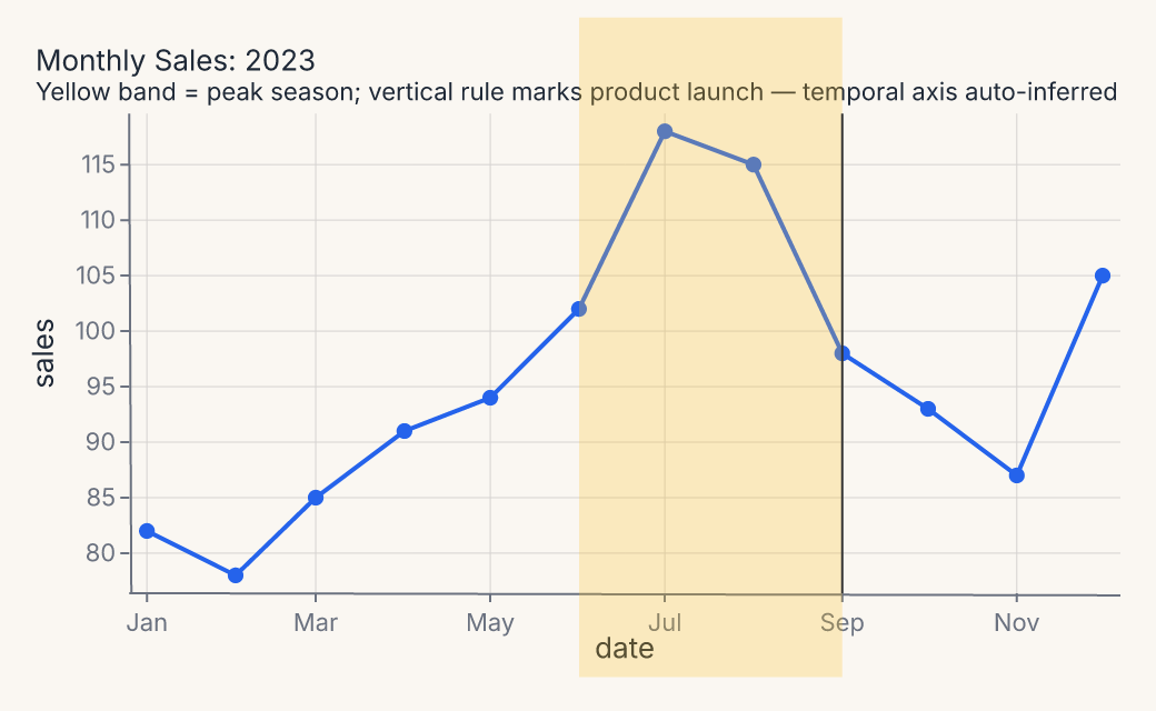
fm.annotate_rect(x1="2023-06-01", x2="2023-09-01", y1=70, y2=125, fill="#fbbf24")+fm.Chart(df).mark_line().encode(x=fm.X("date", axis=fm.Axis(label_format="%b")))+fm.annotate_vline(x="2023-09-01")Temporal columns auto-infer their scale. Annotation coordinates accept ISO date strings. The yellow band is
annotate_rect; the rule isannotate_vline.
Ranked and sorted
Sorted layouts for ranked comparisons — sorted along the axis, not alphabetically.
-
Cleveland Dot Plot
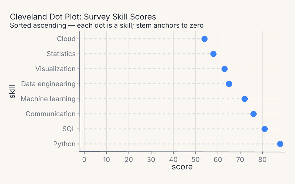
stem = fm.Chart(df).mark_rule(stroke="#d1d5db").encode(x=fm.X("score_zero", axis=fm.Axis(title="score")), x2=fm.X2("score"), y=fm.Y("skill", scale=ordinal))+fm.Chart(df).mark_point(fill="#3b82f6")Lollipop composition: a
mark_rulestem anchored to zero plus amark_pointdot. Category order is explicit viaOrdinalScale(domain=sorted_domain).
Small multiples
Faceted panels with shared scales and consistent encodings across categories.
-
Faceted Small Multiples
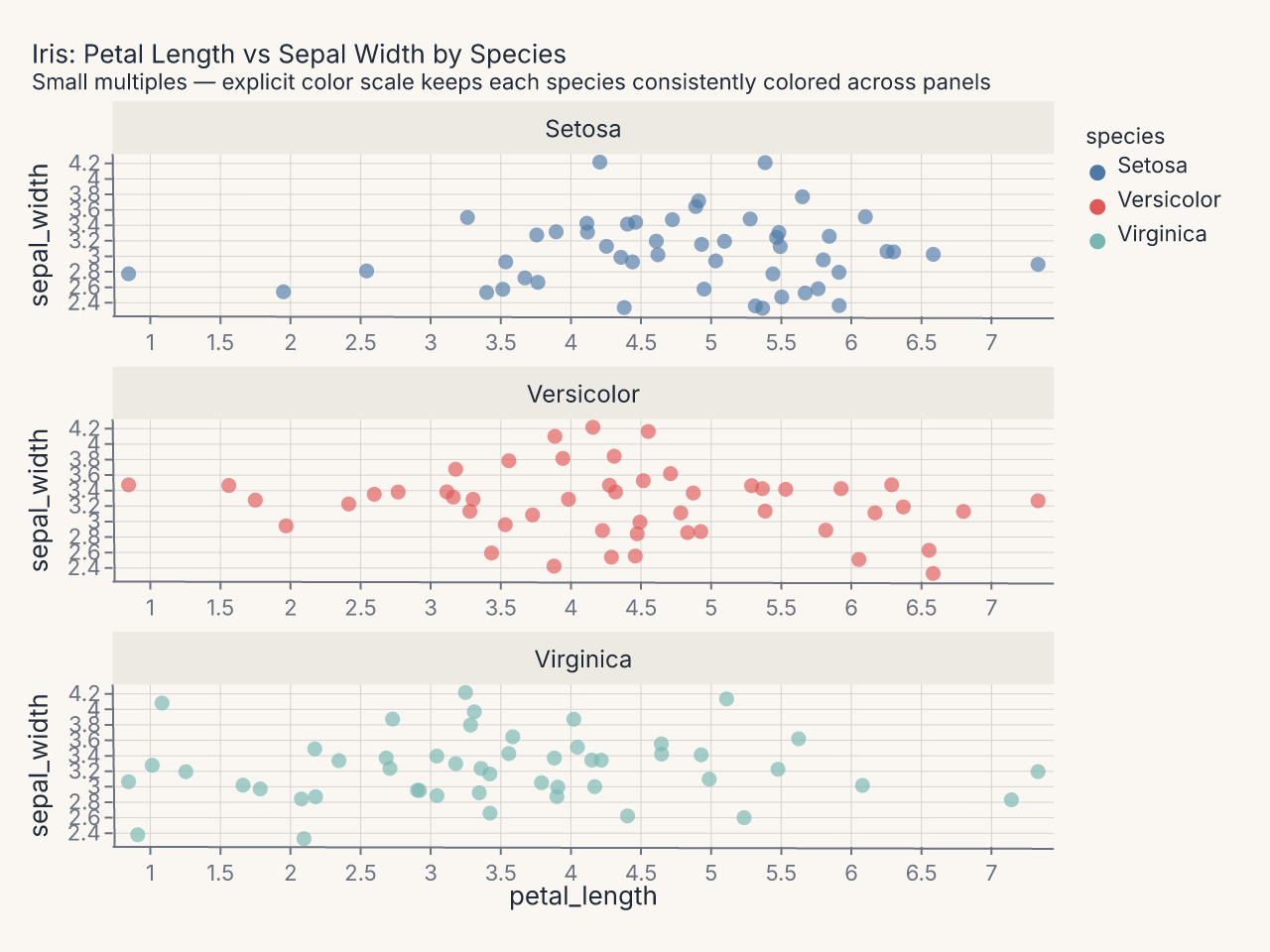
fm.Chart(df).mark_point(opacity=0.65).encode(x="petal_length", y="sepal_width", color=fm.Color("species", scale=fm.OrdinalScale(domain=species_order, range=colors))).facet(col="species")Three scatter panels sharing a common axis range. An explicit
OrdinalScale(domain=..., range=...)keeps each species consistently colored across facet panels. -
Two-Way Facet Trellis
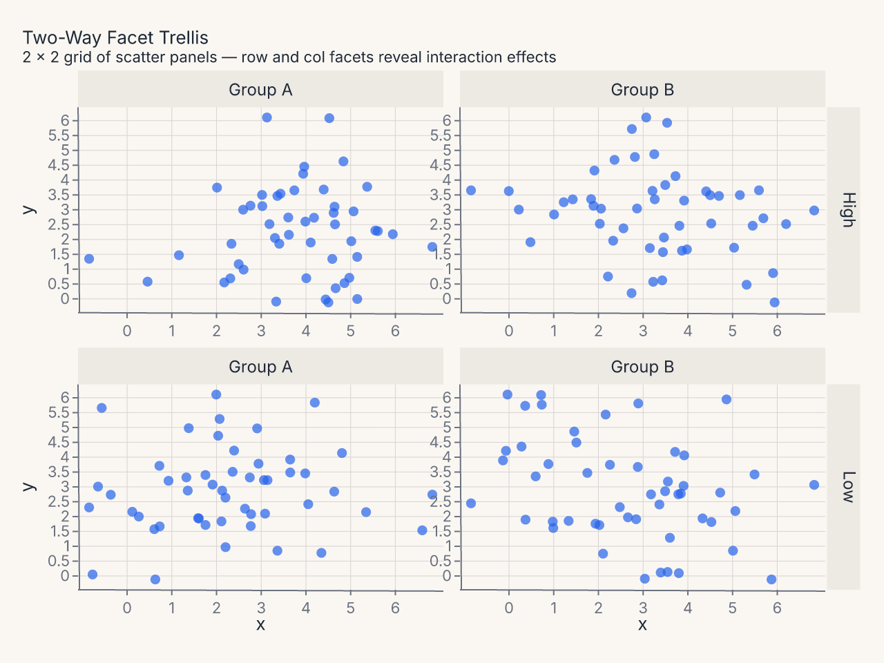
fm.Chart(df).mark_point().encode(x="x:Q", y="y:Q").facet(row="row", col="col")A 2 × 2 grid of scatter panels driven by simultaneous
row=andcol=facet keys — two-way faceting reveals interaction effects across both dimensions.
Polar and radial
Circular layouts where angle encodes a categorical dimension.
-
Coxcomb / Wind-Rose
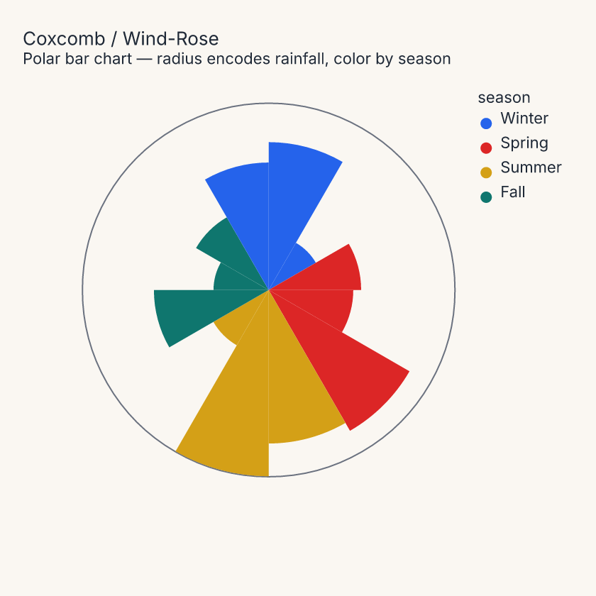
fm.Chart(df).mark_bar().encode(x="month:N", y="rainfall:Q", color="season:N").coord(fm.CoordPolar(theta="x"))Equal angular slices whose radius encodes magnitude.
CoordPolar(theta="x")maps the nominal x channel to arc angle; coloring by 4-category season avoids palette wrapping across 12 months while adding a meaningful grouping.
Financial and categorical geometry
Floating geometry via X2/Y2 encodings plus variable-column-width mosaic layouts.
-
Candlestick (OHLC)
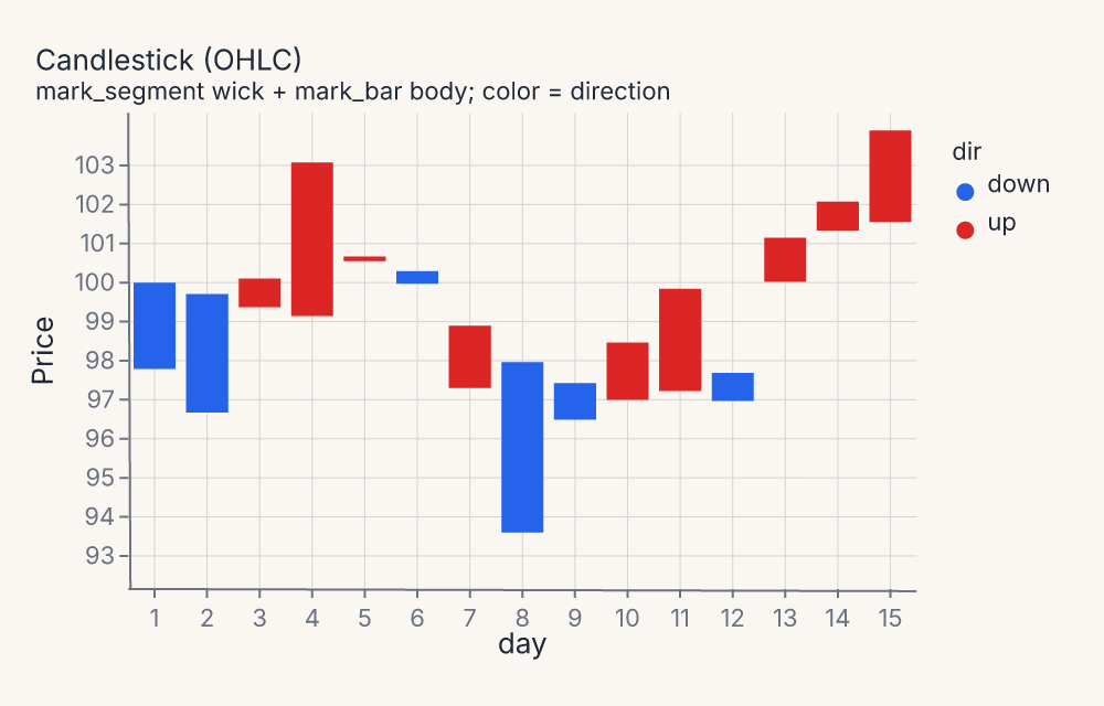
body = fm.Chart(df).mark_bar().encode(x="day:O", y=fm.Y("open:Q", axis=fm.Axis(title="Price")), y2="close:Q", color="dir:N")+wick = fm.Chart(df).mark_segment(stroke="#333333", stroke_width=1.5).encode(x="day:O", x2="day:O", y=fm.Y("low:Q", axis=fm.Axis(title="Price")), y2="high:Q")→(body + wick)Body uses
mark_barwithy/y2for the open-close range; wick usesmark_segmentfor the high-low tail. The wick layer renders on top so tails are visible at both ends. -
Marimekko / Mosaic
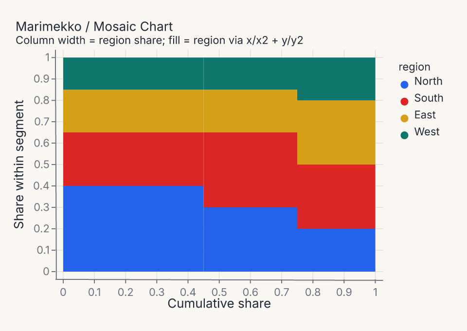
fm.Chart(df).mark_rect().encode(x="x0:Q", x2="x1:Q", y="y0:Q", y2="y1:Q", color="region:N")Variable-width stacked columns: precompute
x0/x1per product (column widths proportional to revenue share) andy0/y1per region (stacked proportions).mark_rectwith four positional encodings places each tile precisely. -
Diverging Likert
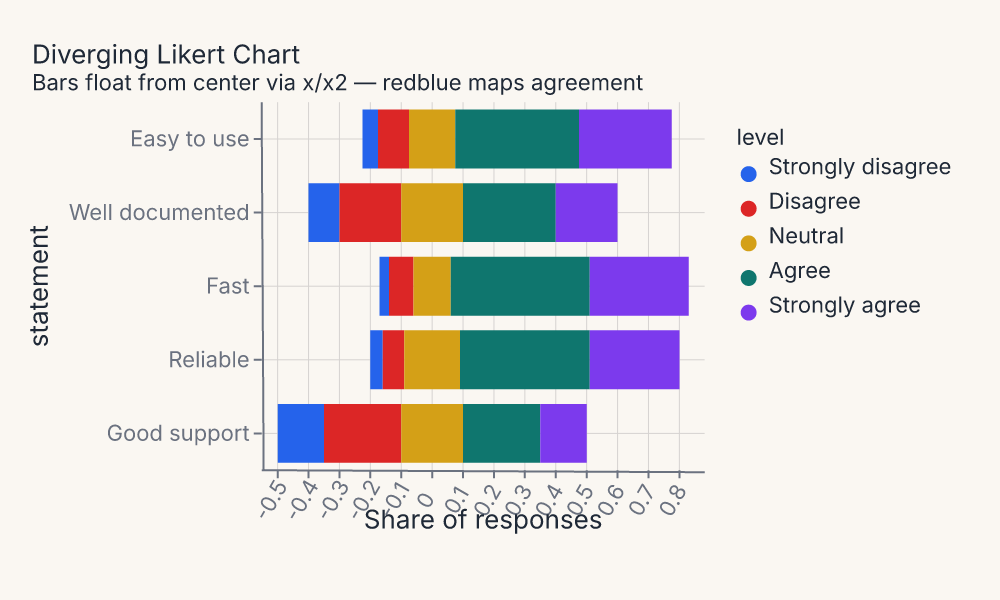
fm.Chart(df).mark_bar().encode(x="x0:Q", x2="x1:Q", y="statement:N", color=fm.Color("level:N", scale={"scheme": "redblue"}))Bars float from a center axis by precomputing
x0/x1that straddle zero. Theredbluescheme maps agreement levels from negative (red) to positive (blue);x/x2encoding places each segment without any stacking transform.
Continuous color and density
Sequential and diverging continuous-color scales, plus multi-group density layouts.
-
Continuous-Color Heatmap
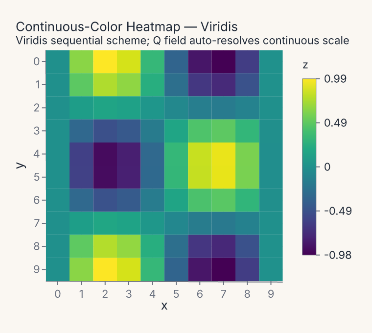
fm.Chart(df).mark_rect().encode(x="x:O", y="y:O", color=fm.Color("z:Q", scale={"scheme": "viridis"}))A quantitative color field automatically resolves to a continuous sequential scale. The
viridisscheme maps the full[-1, 1]domain from dark-purple to bright-yellow; a gradient legend replaces the usual categorical swatches.
Distribution comparisons
Violin and error-band marks that split or stratify by a hue variable.
-
Split Violin by Hue
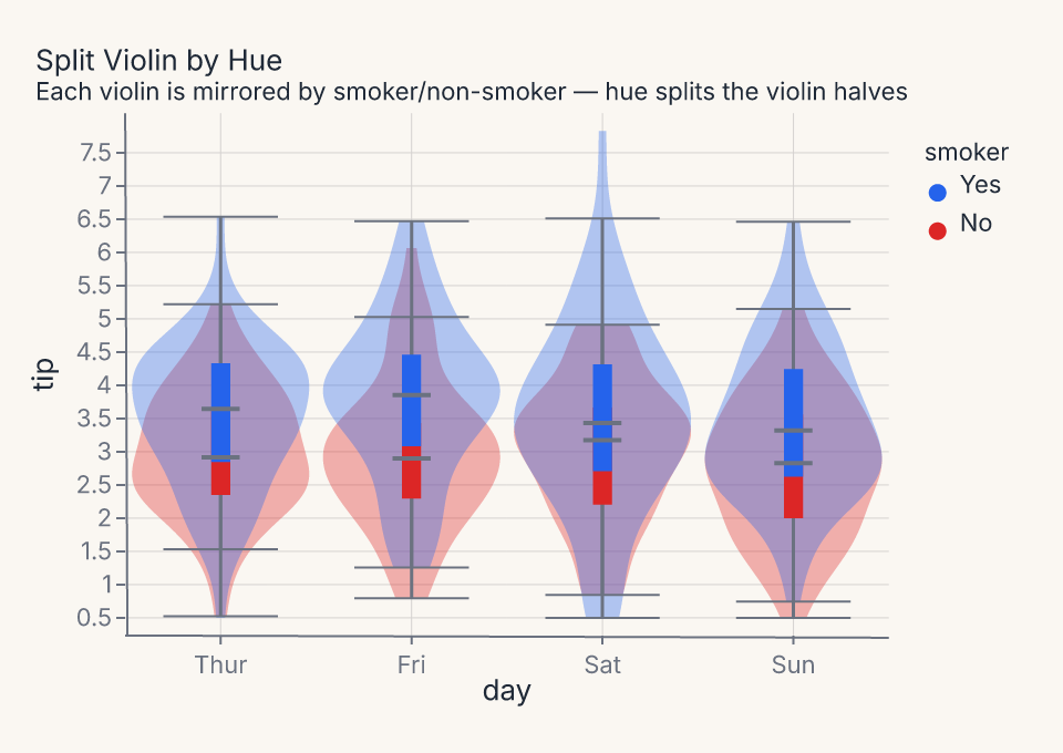
fm.Chart(df).mark_violin().encode(x="day:N", y="tip:Q", color="smoker:N")When
color=maps to a two-level nominal variable, each violin is automatically mirrored — left half for one group, right half for the other. The inner box-plot whiskers remain for both halves. -
Per-Hue Error Band
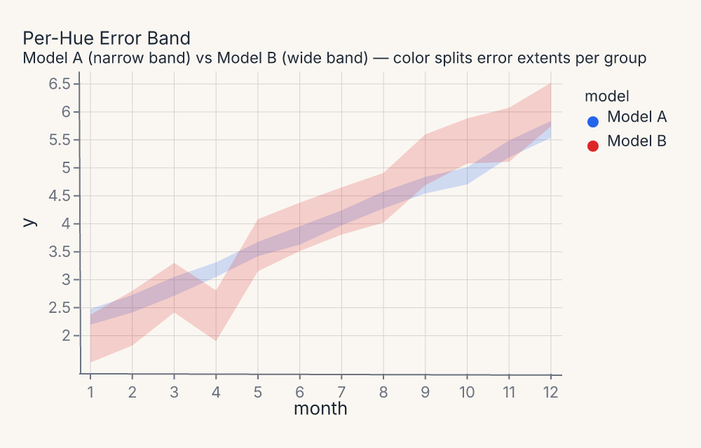
fm.Chart(df).mark_errorband().encode(x="month:Q", y="y:Q", color="model:N")mark_errorbandcomputes a confidence interval per(x, color)group. Two models with different noise levels produce visibly different band widths — Model A narrow, Model B wide — at every x position.