Secondary Axes
SecondaryY adds a second y axis to a chart with an independent scale. The secondary
series reads from the same DataFrame as the primary chart but maps to a different field and
a different y scale. The secondary y axis appears on the right side of the plot.
chart + SecondaryY(...) is sugar over ferrum's general per-layer independent-y
mechanism: LayerChart(a, b, resolve={"y": "independent"}) renders the same kind
of dual axis directly, and SecondaryY desugars to exactly that — an appended
layer flagged independent-y. Reach for SecondaryY when adding one secondary
series to an existing chart with +; reach for resolve={"y": "independent"}
directly when building a LayerChart from scratch, or when you need more than
one independent layer stacked on the right (each additional independent layer,
whether from another SecondaryY or a directly-constructed LayerChart, gets
its own right-side axis, stacked outward — there is no hard cap). Only the
y-axis can be independent this way today; per-layer independent x (dual x-axis)
is tracked separately as GH #55
and remains unsupported.
The secondary series is a real chart layer, not a cosmetic overlay: its plot area
genuinely reserves a right-side margin band for the secondary axis (the primary
plot area narrows to make room, rather than the secondary axis overdrawing it),
and the secondary series is fully interactive — tooltips, zoom/pan, and
hit-testing all work on it like any other layer. If color is omitted, the
secondary mark falls through to its own per-theme default color rather than a
hardcoded fallback.
Basic usage
Compose a SecondaryY onto a chart with +:
import ferrum as fm
import polars as pl

df = pl.DataFrame({
    "month": ["Jan", "Feb", "Mar", "Apr", "May", "Jun"],
    "revenue": [125000, 138500, 112000, 161000, 183000, 172000],
    "growth_rate": [0.0, 0.107, -0.191, 0.438, 0.137, -0.066],
})

chart = (
    fm.Chart(df)
    .mark_bar()
    .encode(x="month:N", y="revenue:Q")
    .labs(title="Revenue and Month-over-Month Growth")
    + fm.SecondaryY(field="growth_rate", mark="line", color="#e74c3c")
)
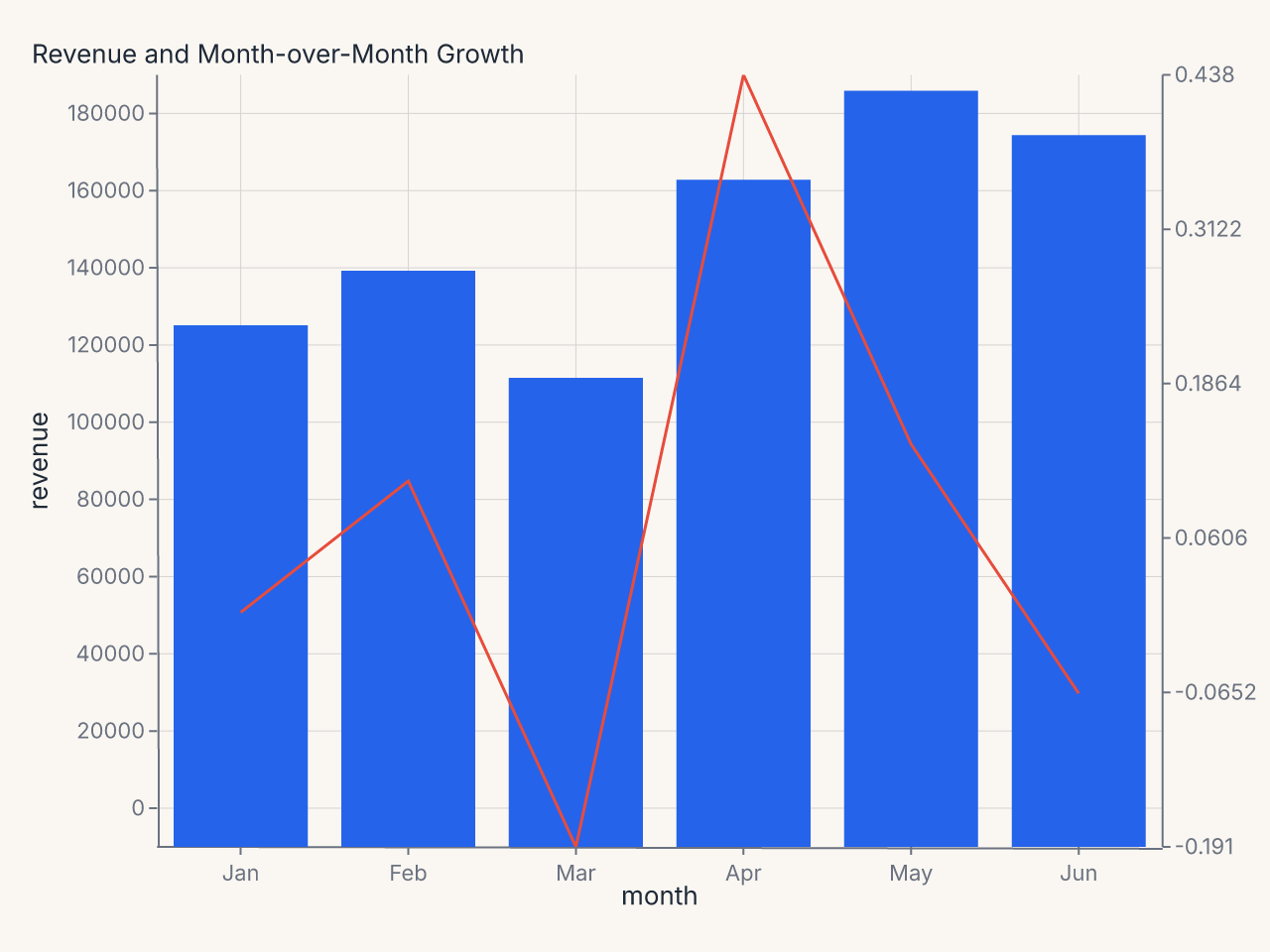
The bars measure revenue on the left y axis; the line measures growth rate on the right y axis. Both axes are independent — their domains, ticks, and formats are computed separately.
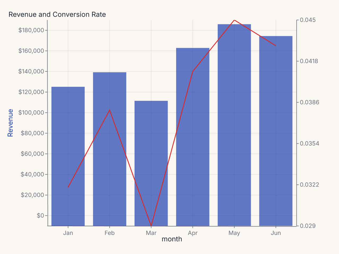
Recipe: color-coded dual-axis chart
import polars as pl
import ferrum as fm

df = pl.DataFrame({
    "month": ["Jan", "Feb", "Mar", "Apr", "May", "Jun"],
    "revenue": [125_000, 138_500, 112_000, 161_000, 183_000, 172_000],
    "conversion_rate": [0.032, 0.038, 0.029, 0.041, 0.045, 0.043],
})

chart = (
    fm.Chart(df)
    .mark_bar(opacity=0.7, color="#1e40af")
    .encode(x="month:N", y="revenue:Q")
    .configure(
        axis_y=fm.AxisConfig(label_format="currency", title_color="#1e40af"),
        axis_y2=fm.AxisConfig(label_format="percent", title_color="#dc2626"),
    )
    .configure_padding(right=80)
    .labs(title="Revenue and Conversion Rate", y="Revenue")
    + fm.SecondaryY(
        field="conversion_rate",
        mark="line",
        color="#dc2626",
        axis=fm.Axis(title="Conversion Rate"),
    )
)
Constructor reference
fm.SecondaryY(
    field,              # str: data field for the secondary y axis (required)
    mark="line",        # str: mark type for the secondary series
    axis=None,          # Axis | None: per-axis configuration for y2
    color=None,         # str | None: mark color
    opacity=None,       # float | None: mark opacity
    scale=None,         # Scale | None: scale configuration for y2
)
Parameters
| Parameter | Type | Default | Description |
|---|---|---|---|
field |
str |
required | Data field mapped to the secondary y axis |
mark |
str |
"line" |
Mark type: "line", "point", "bar", etc. |
axis |
Axis | None |
None |
Per-axis config applied to the right-side y2 axis |
color |
str | None |
None |
Mark color |
opacity |
float | None |
None |
Mark opacity |
scale |
Scale | None |
None |
Scale config for the secondary y axis |
Configuring the secondary axis
Use the axis parameter on SecondaryY to configure the y2 axis directly:
+ fm.SecondaryY(
    field="growth_rate",
    mark="line",
    color="#e74c3c",
    axis=fm.Axis(
        title="Month-over-Month Growth",
        label_format=".1%",
        title_color="#e74c3c",
    ),
)
Alternatively, use configure(axis_y2=...) at the chart level:
axis_y2 in .configure() applies to the secondary y axis. It follows the standard
cascade: per-channel axis= on SecondaryY beats the chart-level axis_y2 config.
Color coding the axes
When a dual-axis chart has two distinct series with different units, it helps to color-code
the axis labels to match their series. Set title_color on each axis:
chart = (
    fm.Chart(df)
    .mark_bar(opacity=0.7, color="#1e40af")
    .encode(x="month:N", y="revenue:Q")
    .configure(
        axis_y=fm.AxisConfig(label_format="currency", title_color="#1e40af"),
        axis_y2=fm.AxisConfig(label_format="percent", title_color="#dc2626"),
    )
    .labs(title="Revenue and Conversion Rate", y="Revenue")
    + fm.SecondaryY(
        field="conversion_rate",
        mark="line",
        color="#dc2626",
        axis=fm.Axis(title="Conversion Rate"),
    )
)
Scale configuration
Use scale= to control the secondary y axis scale. For example, to use a log scale for
the secondary series:
Interaction with BreakAxis
SecondaryY and BreakAxis are independent. A break on the primary y axis (BreakAxis(axis="y", ...))
does not affect the secondary y axis scale. Both operate on their own domains and the
relationship between them is not constrained.
Common patterns
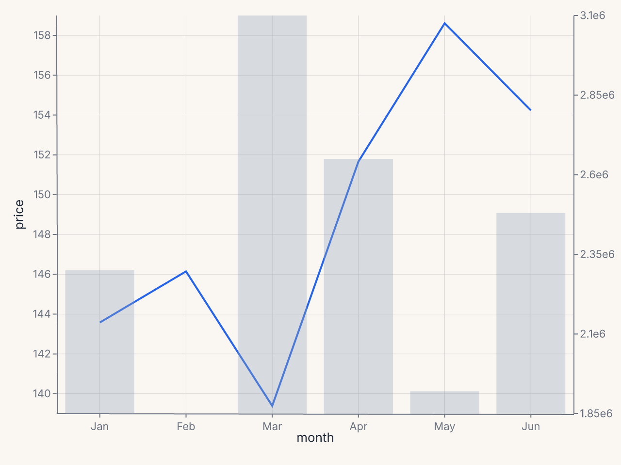
Volume overlay (bars + line)
df = pl.DataFrame({
    "month": ["Jan", "Feb", "Mar", "Apr", "May", "Jun"],
    "price": [142.5, 145.2, 138.1, 151.0, 158.3, 153.7],
    "volume": [2300000, 1850000, 3100000, 2650000, 1920000, 2480000],
})

chart = (
    fm.Chart(df)
    .mark_line(stroke_width=2)
    .encode(x="month:N", y="price:Q")
    + fm.SecondaryY(
        field="volume",
        mark="bar",
        color="#94a3b8",
        opacity=0.35,
        axis=fm.Axis(title="Volume", label_format=".2s"),
    )
)