Break Axes
BreakAxis splits a continuous scale into segments, omitting one or more ranges to
prevent outlier values from compressing the rest of the data. A visual break indicator
marks the gap.
The problem it solves
When one data point is far from the rest — a revenue spike, a measurement error, a special event — the scale adjusts to include it, compressing all other values into a small band that makes differences hard to read.
BreakAxis removes the intermediate range [150, 850] and renders the two segments at
different vertical extents, with a visible gap indicator:
Basic usage
Compose a BreakAxis onto a chart with +:
import ferrum as fm
import polars as pl
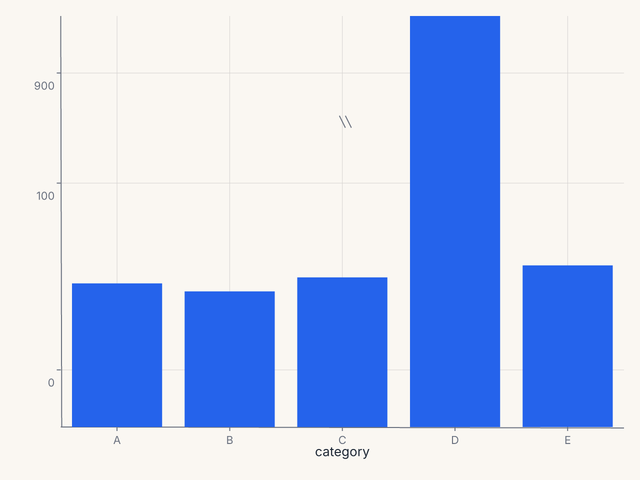
df = pl.DataFrame({
"category": ["A", "B", "C", "D", "E"],
"value": [72, 68, 75, 900, 81],
})
chart = (
fm.Chart(df)
.mark_bar()
.encode(x="category:N", y="value:Q")
+ fm.BreakAxis(axis="y", gap=(150, 850))
)
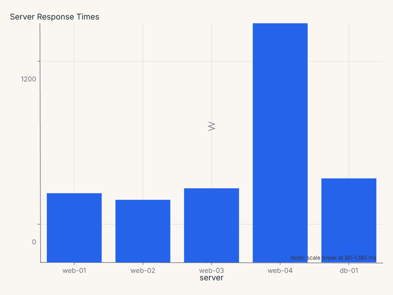
Recipe: server response times with color scale and break annotation
import polars as pl
import ferrum as fm
import ferrum.annotation as ann

df = pl.DataFrame({
    "server": ["web-01", "web-02", "web-03", "web-04", "db-01"],
    "response_ms": [42, 38, 45, 1240, 51],
})

chart = (
    fm.Chart(df)
    .mark_bar()
    .encode(
        x=fm.X("server:N", sort=None),
        y="response_ms:Q",
        color=fm.Color(
            "response_ms:Q",
            scale=fm.SequentialScale(scheme="oranges"),
            legend=None,
        ),
    )
    .labs(title="Server Response Times", y="Response Time (ms)")
    + fm.BreakAxis(axis="y", gap=(80, 1180), break_style="zigzag", break_size=14)
    + ann.text(
        fm.norm(0.98), fm.norm(0.98),
        "Note: scale break at 80–1,180 ms",
        font_size=9, color="#666", anchor="end",
    )
)
Constructor reference
fm.BreakAxis(
    axis,               # str: "x" or "y" (required)
    gap,                # tuple | list[tuple]: break region(s) to remove (required)
    break_size=12,      # float: visual height of break indicator in pixels
    break_style="slash" # str: break indicator style
)
Parameters
| Parameter | Type | Default | Description |
|---|---|---|---|
axis |
str |
required | Which axis to break: "x" or "y" |
gap |
tuple | list |
required | A (start, end) pair or a list of pairs |
break_size |
float |
12 |
Visual size of the break indicator in pixels |
break_style |
str |
"slash" |
Break indicator: "slash", "zigzag", "wave", or "gap" |
Validation
axismust be"x"or"y".break_stylemust be one of the four named styles.- Invalid values raise
ValueErrorat construction time.
Break styles
| Style | Appearance | When to use |
|---|---|---|
"slash" |
Two diagonal parallel lines (///) | Default; clear, compact |
"zigzag" |
Zigzag waveform | Emphasizes the break |
"wave" |
Smooth sine curve | Subtle, clean |
"gap" |
Plain whitespace with no indicator | Minimal; for dense charts |
Multiple break regions
Pass a list of (start, end) tuples to break multiple regions:
Breaks are applied in order. Overlapping or adjacent ranges are handled gracefully.
Behavior with spanning marks
A mark whose value spans a break is clipped into the two visible segments. For example, a bar from 0 to 900 with a break at (150, 850) renders as two bar segments: one from 0 to 150 and one from 850 to 900. This is the semantically correct behavior — the full extent of the bar is preserved, just displayed in the two non-broken regions.
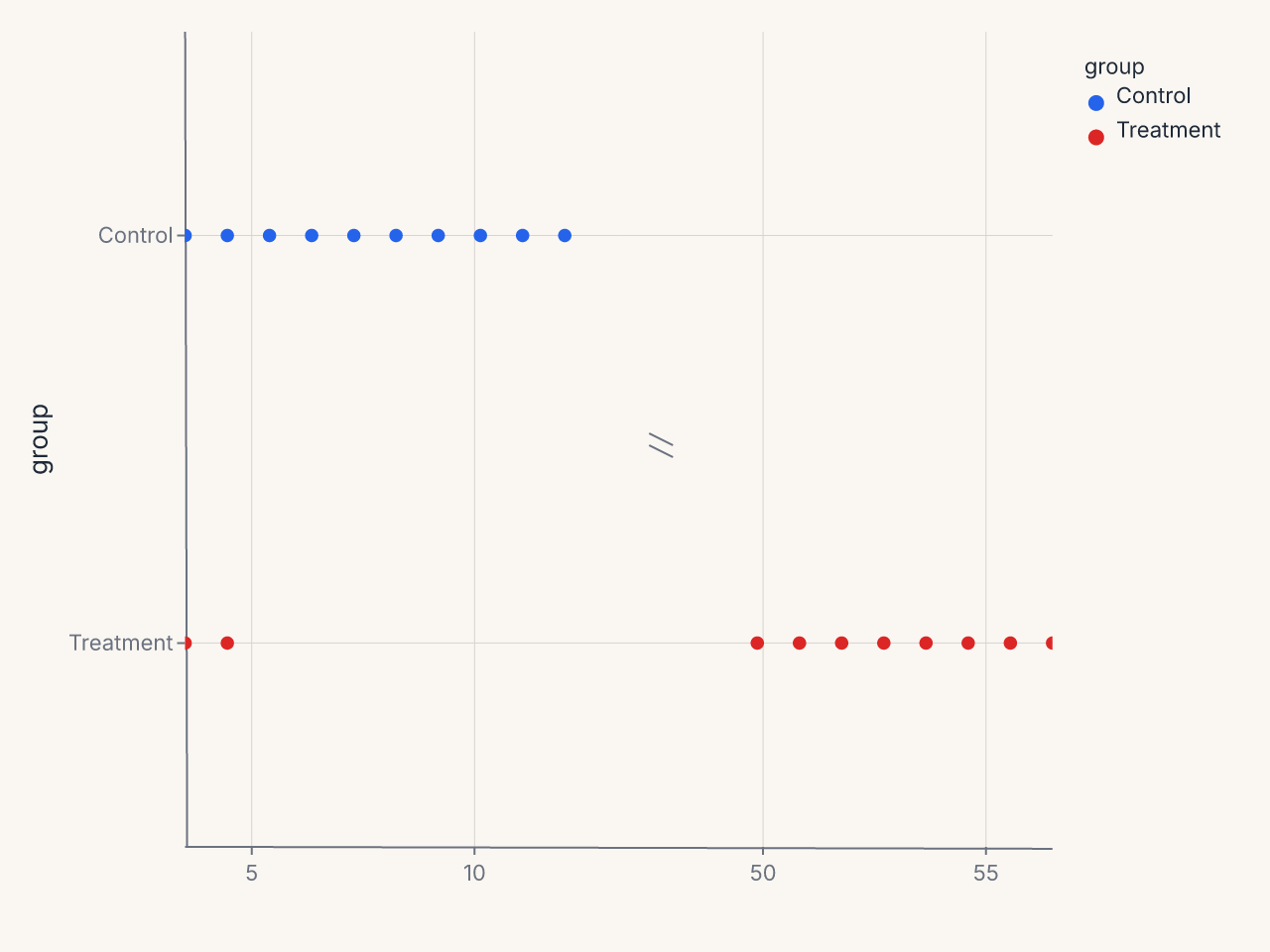
Horizontal break axes
BreakAxis works on either axis:
df = pl.DataFrame({
    "group": ["Control"] * 10 + ["Treatment"] * 10,
    "measurement": [1, 2, 3, 4, 5, 6, 7, 8, 9, 10, 1, 2, 50, 51, 52, 53, 54, 55, 56, 57],
})

chart = (
    fm.Chart(df)
    .mark_point()
    .encode(x="measurement:Q", y="group:N", color="group:N")
    + fm.BreakAxis(axis="x", gap=(12, 48))
)
Interaction with annotations
Annotations whose positions fall within a break region are suppressed with a warning. The warning names the annotation and its position so you can decide whether to move it or accept the suppression.
Interaction with SecondaryY
BreakAxis applied to the primary y axis has no effect on a secondary y axis (SecondaryY).
The two y axes have independent scales and the break applies only to the primary scale.
Common patterns
Suppress a single outlier
Time series with a data gap
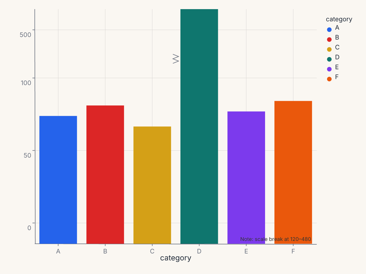
Comparative bar chart with outlier suppression
df = pl.DataFrame({
    "category": ["A", "B", "C", "D", "E", "F"],
    "value": [85, 92, 78, 510, 88, 95],
})

chart = (
    fm.Chart(df)
    .mark_bar()
    .encode(x="category:N", y="value:Q", color="category:N")
    + fm.BreakAxis(axis="y", gap=(120, 480), break_style="zigzag", break_size=16)
    + fm.annotation.text(fm.norm(0.98), fm.norm(0.98), "Note: scale break at 120–480",
                         font_size=9, color="#666", anchor="end")
)